
horror magazine & poster drafts
in this section, you will find drafts that relate to our trailer. We have included 5 posters and magazines to annotate and use for our inspiration. Further
down, you will also find our hand drawn drafts and Photoshop versions of the drafts which are a quick guide to the final products.
down, you will also find our hand drawn drafts and Photoshop versions of the drafts which are a quick guide to the final products.
5 magazine inspirations...
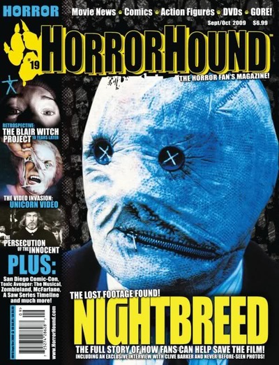


we like the colour scheme which is blue, yellow and white. The light blue connotes night time which is gloomy and mysterious. It links to the title of the movie which has 'nightbreed' within it which correlates very well. Also the image has been contrasted to be light blue as well which we like because it is very effective in a way that it makes it ancient and spooky/illuminative.
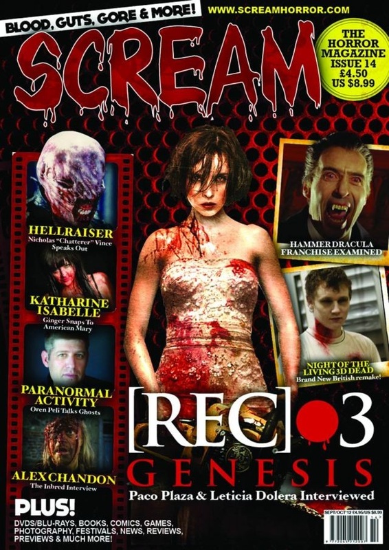
we also like the layout where there are cover lines on the left hand side of the magazine neatly. The texts look 3D and bold by overlapping the images. we like the cover line images because they are very varied. The top one is done in a close up shot which shows good Nvc of a person being scared/ panicking which brings the horror element. Also it was taken in a dark place and the lighting used was very good where we can see her eyes and some parts of her face. The shadow does a nice job by blending in with the black banner background. The image underneath it has a cartoon effect and the NVC is captive by seeing an old woman ripping off a mask in a goring way. The bottom image is in black and white which connotes its an ancient horror movie. |
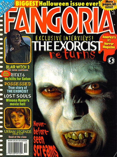
we like the Fonts throughout the magazine. The selling line is simple bubble writing but does the job of catching the readers eyes by the boldness and colour of it. The font is easy to read also. Another font i liked was the cover-line next to the image. it is done in a way where it looks like blood is dripping and the editor was very smart and making the top of the text smaller; then as it goes on it, gets bigger which fits well beside the image and the banner at the other side. It enforces the dripping of blood how it starts of small and becomes a large lump while it drops. There is yellow writing that has 'Blair witch 2' the text is blurry and not organised showing a disequilibrium where it doesn't look normal. This is more eye catching and the font is very horror generic.
I like the puff the surrounding around the text is of splattered blood which looks very engaging and reminds the reader it is a horror magazine. The yellow text inside the blood contrasts well with the red vibrant blood which makes the audience notice and read it quickly. |

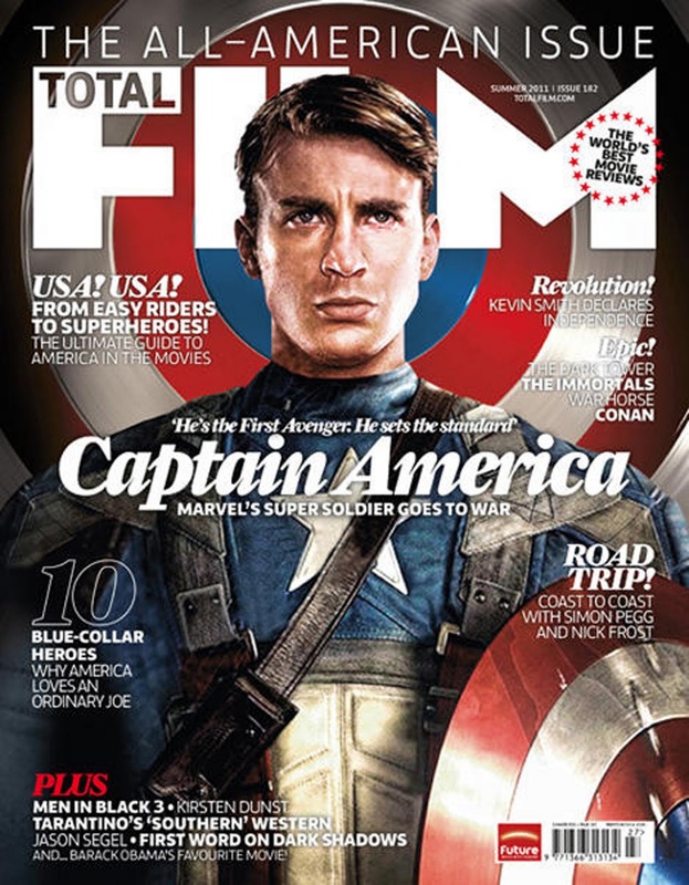
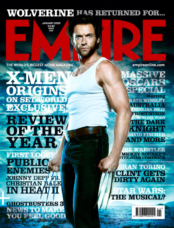
we like how the text of the movie title is done in a layout where it is slanted down which is unique because compared to the other horror magazines this is the only one that has it. we were impressed by the font style of the writing of the movie title the way it glows connotes a ghostly effect. This is effective because it links to horror and ghosts are an iconic character in some movies. we also liked the way the image is in front of the masthead-this creates a realistic feel that the image is near the audience. We also like the bright colours used such as green and yellow to capture the audiences attention the green connotes aliens and gruel.
|

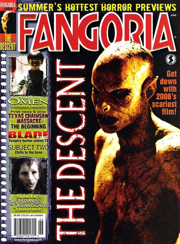
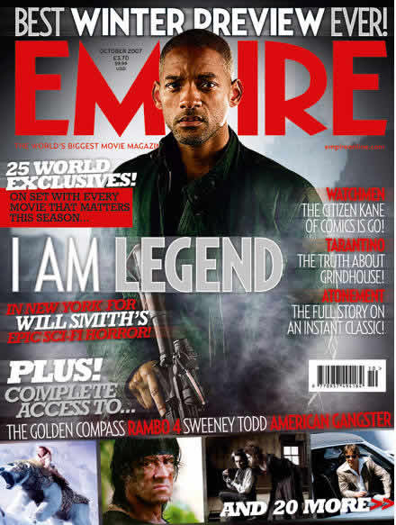
This magazine was interesting because the way the main image is laid out, it almost looks 3 Dimensional and is also scary due to the prop of the chainsaw coming across in the readers direction. The picture doesn't have much lighting which is different because most pictures I've seen have lighting. The darkness in the picture can connote how dark and gruesome the movie is . |

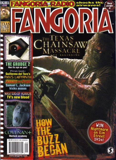
we took inspiration from how the main image looks where the antagonist is a medium close up of a zombie and a medium long shot contrasting with the protagonists which are the group of humans who are smaller. This connotes status of power that the zombies have more power and also, in the background, there are more zombies which indicates that they have power in numbers. also, we were interested in the featured, horror related stories/events in the left-third so when making our own horror film magazine, we would consider including some of our own to intrigue our target audience.
|
5 poster inspirations...


we like how the image is done where the woman is in a mid shot with a Nvc of a serious face with an evil glance. I can see the evil glance within her eyes and The red lipstick can connote danger, seduction and many more which can lead to her being a killer. we like how it is on top of the location of an isolated house in the woods which gives it a mysterious and horror feel. we like how the text is simple and stays the same through out only change is in the colour and font size. The font size denotes which is more important and needs to be visualized first which is the movie title.
|
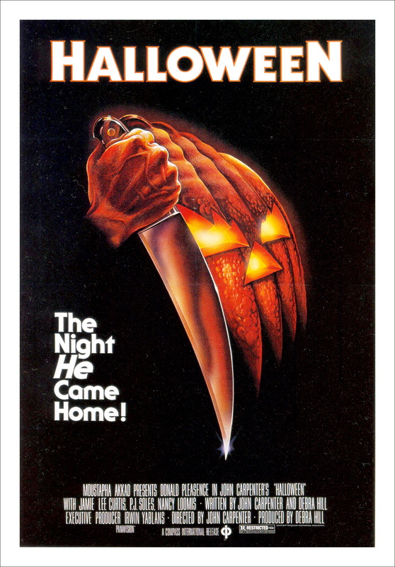
we like the simplicity of the poster as the colour scheme is clear which are orange black and white. The orange represents the pumpkin very well. we like how The image is set out- the fact that it does not show the whole image-some parts missing such as the bottom of its face. Also the fiery orange makes it look more evil and scary. The fire connotes danger. |
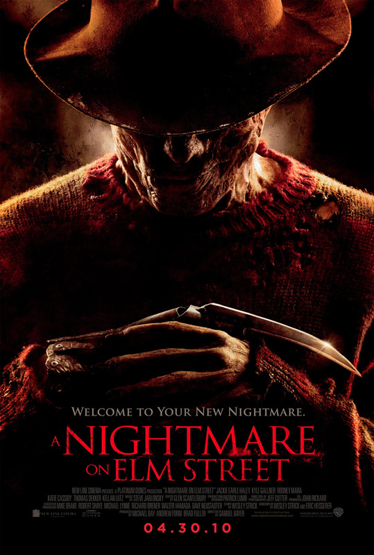
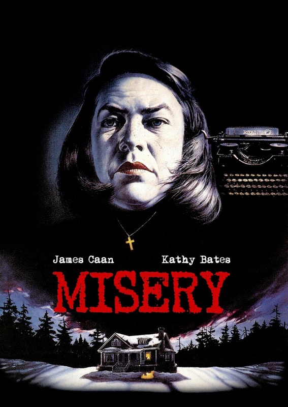
we like this poster because its rich in colour using very dark colours such as dark red, dark brown and dark orange. I like how in the image, the prop of the hat is hiding the antagonists face which gives off mystery and makes the audience cautious. we like how the tag line is nicely placed on top of the movie title and the colour section contrasts with the background making it more noticeable.
we like how the date is in a different font style which makes it stand out more and is in a different red compared to the movie title, giving it a more modern feel. |
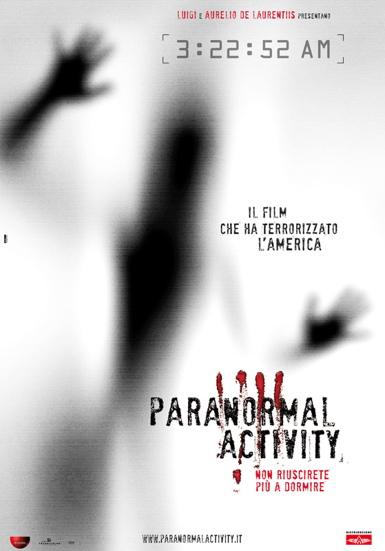
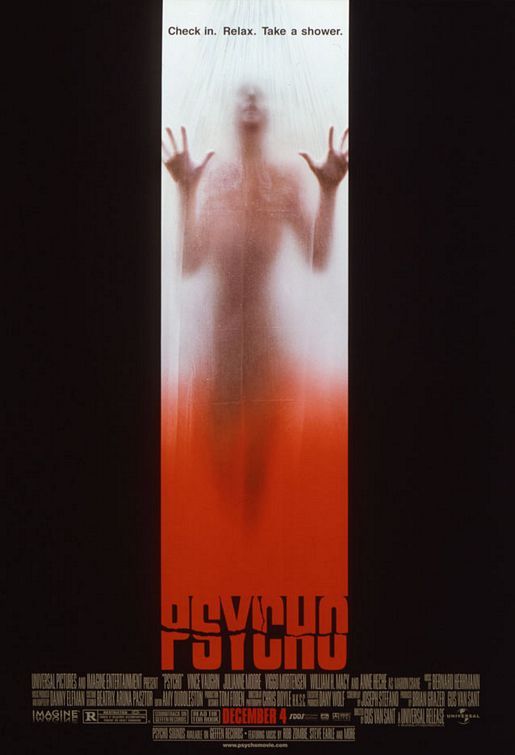
we like how the image does not reveal much but gives off hints of things; e.g. that the person looks like they need help/panicking, trapped-touching the close door or window for help. It enforces the movies sub genre which is psychological which we don't really see the antagonist. I like how they did a scratch of blood over the movie title which makes it more eye catching and shows how bloody it is. Also, it can link to the person's blood scratched on the window.
we like the colour scheme which is mainly black and red which are the minority but effective. we liked how there is more than one production logo at the bottom and the website in the middle bottom of the page. |
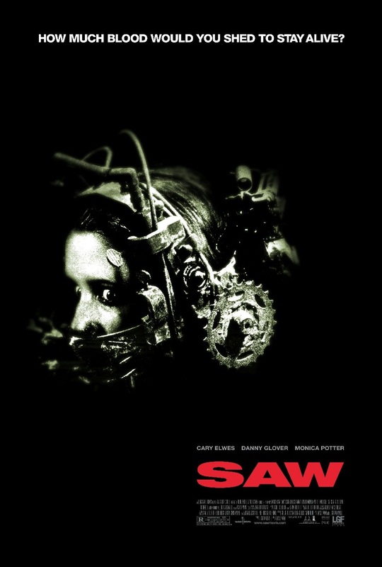
we liked this image because it made us think of the torture theme we are incorporating into our movie. The image looks frightening and causes the audience to feel sympathy towards the victim on the poster but also eagerness as they would want to go and watch it to see the outcome.The prop is used effectively which is the sharp weapon around the females face; bringing the fear factor. Also it has a CCTV looking camera which represents someone is watching behind the scenes, the cruelty and inhuman activities happening. So we also learnt how the image can also help give hints of what happens in the synopsis/story of the movie.
|
6 magazine drawn drafts
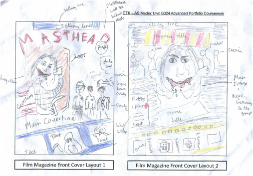
in Film magazine front cover 1, i decided to use the colour scheme of red and blue mainly because the red symbols blood, danger and was used to intrigue the reader with the vibrancy/ brightness of the colour. The blue was used because it's a calm colour which represents the equilibrium in a horror movie and connotes peace, So i used these two colours to contrast each other.
I thought of how the image should be laid out deeply. I concluded that the antagonist which is Scarlett, to be big and she's behind the door listening. This NVC is suppose to link to the title of the movie's name which is 'I hear you'. Also to give off the horror feel, i gave scarlett a prop of a weapon in the image. In addition there is a smaller image of the group who look calm but do not know they are being heard which links to the synopsis of the movie. The props are what they are wearing such as a hat for instance.
From looking at the other professional magazines, i saw a continuity of the masthead being at the top so i did that also in the draft. Also, i saw that many magazines used an old fashioned film tape effect as a background to fit small images in and some texts so included that at the bottom.
IN film magazine front cover 2, for the image i drew scarlett in the middle of the magazine in big with her hands holding her ears to denote shes listening which again links to the movie title. The group of teenagers are behind her to show scarlett is a few steps ahead in taking her revenge on them. The movie title will be right under scarlett in big, bold writing and in a ticket of a film layout background. This magazine will have a 'plus' section with extra information given within the magazine. The colour scheme is mainly red and yellow but there would be a bit of black and white also in some areas such as the coverline . The selling line would be at the top of the magazine above the masthead where it should be in red.
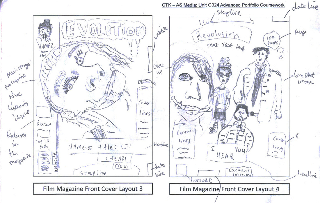
in the third magazine draft, we included an idea for a magazine name which was 'evolution' so we incorporated that into this draft. There would be a blood patch around it with blood dripping to enforce the splatter effect.
we thought to make the main image more 3d and make the image come in front of the side cover line banner. It would be a close up shot and the NVC shows her leaning in to listen to the group (in synopsis) which also links to the movie title 'I hear you' and There will be another coverline on the left side of the page . Also, the website will be going along the side of that page in small print. There would be the tag line/strap line at the bottom of the page and the bar code would be on the right page corner.
We thought to make the movie title look distinct and unique by putting it in a ladder kind of way or stairs way which can represent a feature from the location which is the college.
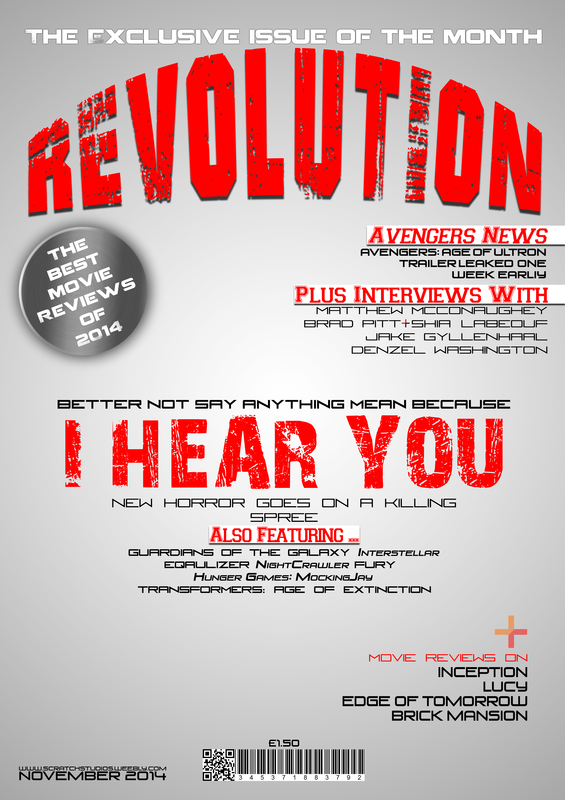
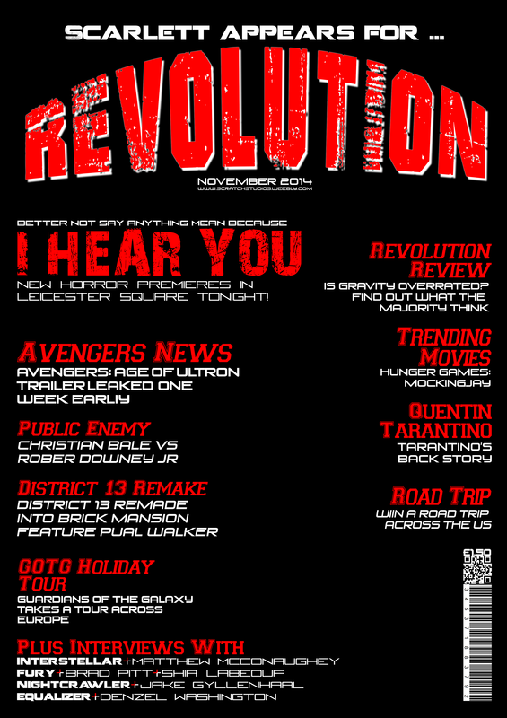
in the fourth magazine draft, we thought to use another masthead idea name which was revolution to see how it would look. There would be a skyline at the top where features of the magazine will be displayed. Also, we added a puff to this magazine in a splatter of blood surrounding it. The main image is of the main cast /characters where the group of boys are in long shots and Scarlett is in a close up. we were thinking if half of her face should be in the magazine or all. Under scarlett, the girl with the scarred smile there would be coverlines . The movie title would be in the middle bottom of the page. date line would be at the top right corner.
we thought to make the main image more 3d and make the image come in front of the side cover line banner. It would be a close up shot and the NVC shows her leaning in to listen to the group (in synopsis) which also links to the movie title 'I hear you' and There will be another coverline on the left side of the page . Also, the website will be going along the side of that page in small print. There would be the tag line/strap line at the bottom of the page and the bar code would be on the right page corner.
We thought to make the movie title look distinct and unique by putting it in a ladder kind of way or stairs way which can represent a feature from the location which is the college.
in the fourth magazine draft, we thought to use another masthead idea name which was revolution to see how it would look. There would be a skyline at the top where features of the magazine will be displayed. Also, we added a puff to this magazine in a splatter of blood surrounding it. The main image is of the main cast /characters where the group of boys are in long shots and Scarlett is in a close up. we were thinking if half of her face should be in the magazine or all. Under scarlett, the girl with the scarred smile there would be coverlines . The movie title would be in the middle bottom of the page. date line would be at the top right corner.
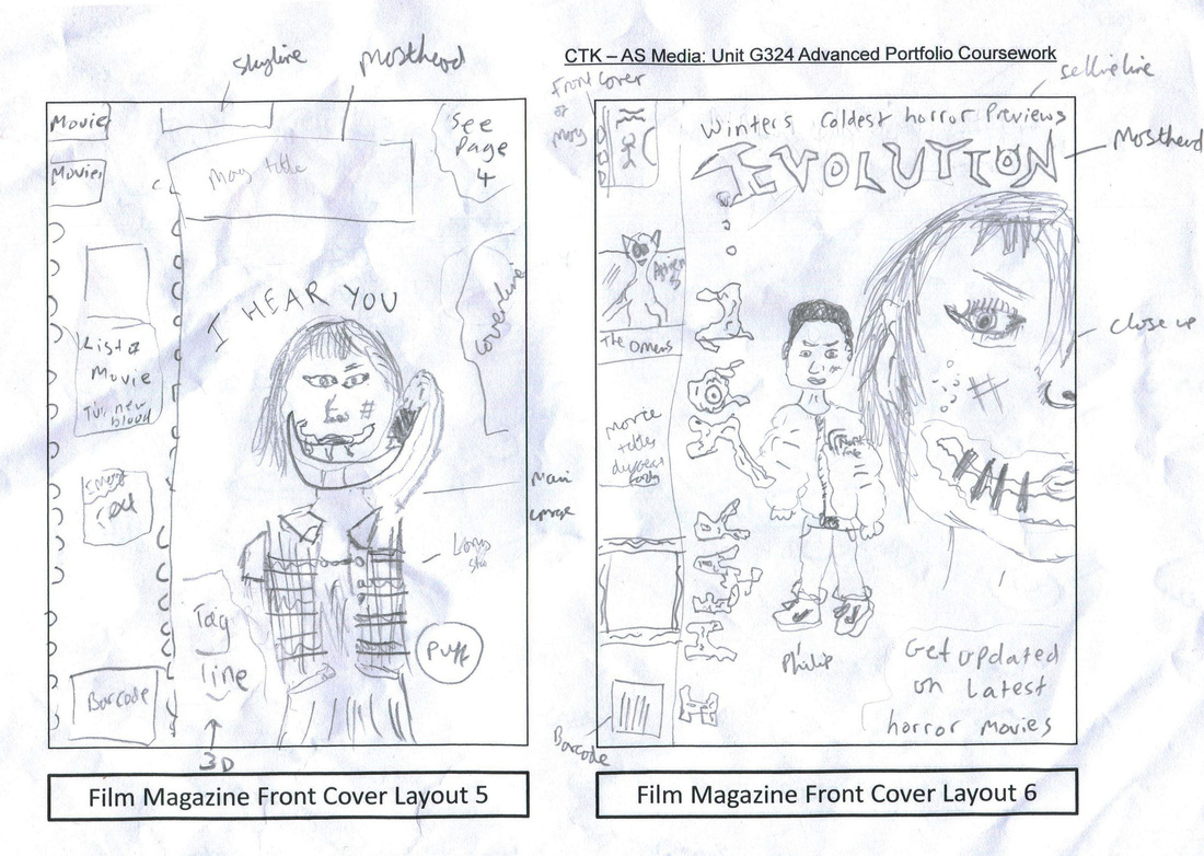
in the 5th magazine draft, we thought of letting the antagonist scarlett have a prop of a curved knife. we chose it because it reflects her Chelsea smile scar that looks evil. Her NVC is of her holding it across her face near her scarred mouth. The image is a long shot so it shows her costume. The movie title would be going around her head for creativity. we thought to have list of movies on the left side of the page in different horror themed fonts. we were thinking to do them in different colours to make it more eye catching. Also, some of the pictures would be with the text.
in the 6th magazine draft, we put the selling line on top of the masthead which will have word play in it. The image has half of scarlett's face revealing her ears which could probably be done with a 3d effect and Philip, the boy in the bomber jacket will be beside her. we decided to do this to illustrate that scarlet hears Philip who is the leader of his group in a way so he represents the group. We tried to be original and try to imitate a magazine's way of putting the movie title along the side of the banner on the right side of the page.
in the 6th magazine draft, we put the selling line on top of the masthead which will have word play in it. The image has half of scarlett's face revealing her ears which could probably be done with a 3d effect and Philip, the boy in the bomber jacket will be beside her. we decided to do this to illustrate that scarlet hears Philip who is the leader of his group in a way so he represents the group. We tried to be original and try to imitate a magazine's way of putting the movie title along the side of the banner on the right side of the page.
6 poster drawn drafts
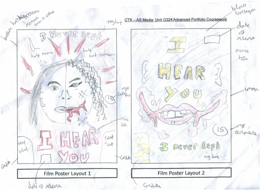
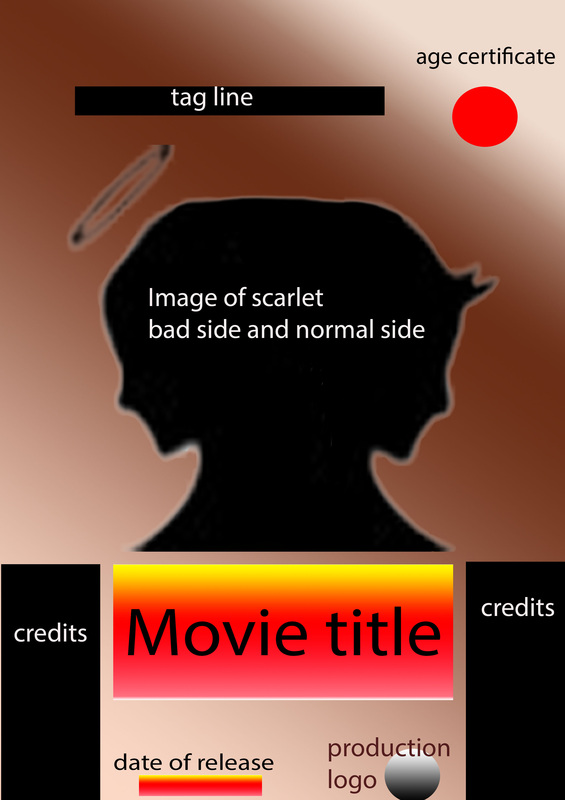
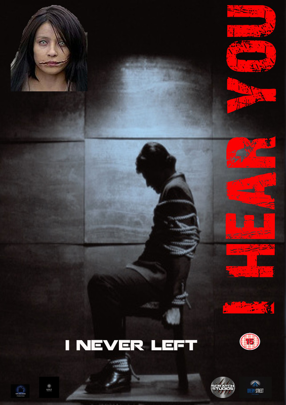
In the film poster 1, we focused more on the image because that is what drives the audience to see the poster mainly and reveals what the movie in-tells. I drew half of scarlet's head to be good and normal which signifies her before the horrific change which is shown on the other half of her face. On this half she has a scar on her lips also she has dark eye-liner around her eyes, her hair goes frizzy and so on. we put splatter of blood around the whole head to enforce the movie is of the splatter sub -genre. The tag line is at the top in smaller writing compared to the movie title which is at the bottom in a red highlight effect. Also there will be credits/text at the side of the movie title and the age of certificate on the right of the left of the poster. The background of the poster will be brown because it represents the door that Scarlett is listening through.
In the film poster 2, we did it in a way where it causes mystery and does not give off too much information about the film. I only put scarlet's mouth which will be iconic in the movie and her trade mark. Also, the ear connotes that she's listening and correlates with the title 'i hear you' which is placed where the rest of her face is. The date of the release would be at the top left corner in white small print, probably in bold writing. The colour scheme is yellow, green and red because they are all bright colours and eye catching. There will be also a black background to infer shes hidden in the dark before she goes to get revenge on the teenagers.
In the film poster 2, we did it in a way where it causes mystery and does not give off too much information about the film. I only put scarlet's mouth which will be iconic in the movie and her trade mark. Also, the ear connotes that she's listening and correlates with the title 'i hear you' which is placed where the rest of her face is. The date of the release would be at the top left corner in white small print, probably in bold writing. The colour scheme is yellow, green and red because they are all bright colours and eye catching. There will be also a black background to infer shes hidden in the dark before she goes to get revenge on the teenagers.
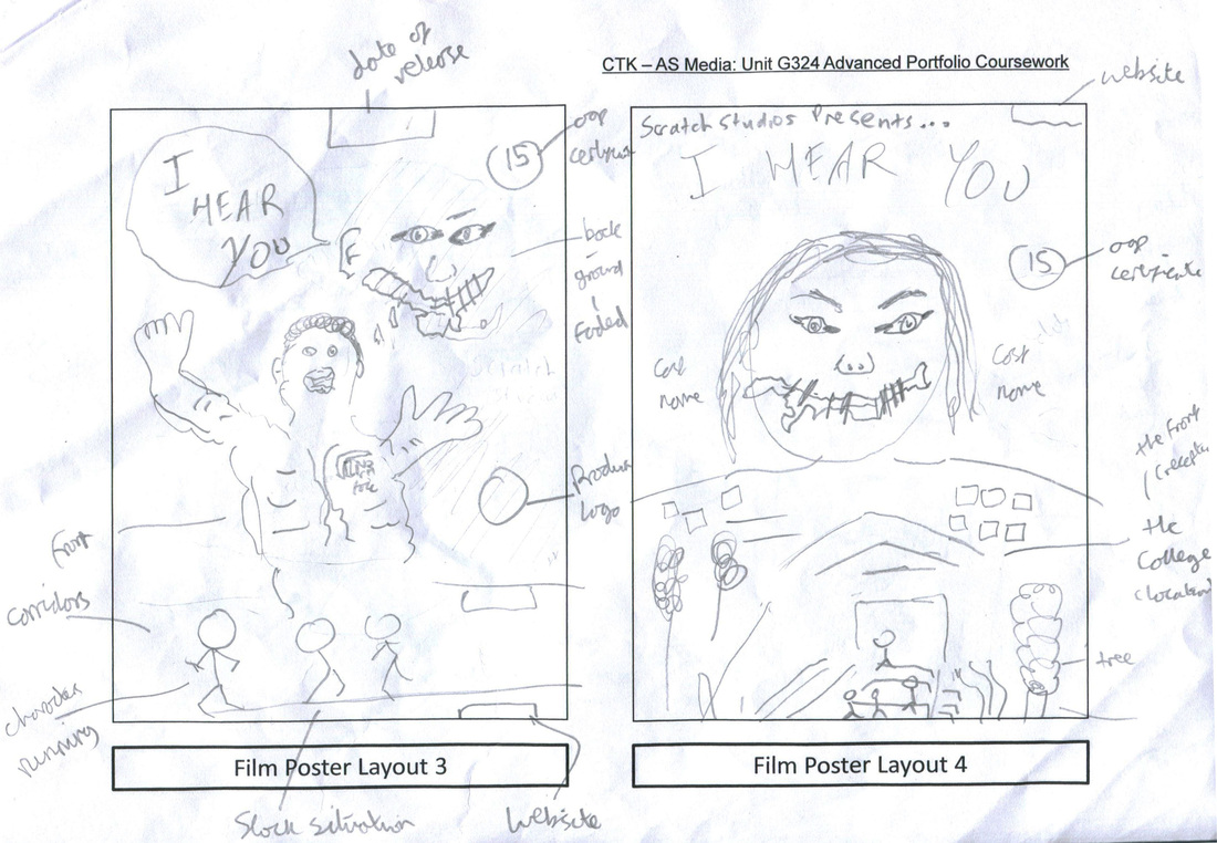
In the third film poster, the image has Philip, the protagonist looking helpless with his hand in the air, also i thought with good Photoshop skills i could make the hands fade so it looks like the hands are waving, so there will be more than one hand shown but some will be faded to show the movement of the hand. At the bottom is another image of the rest of the teenagers Michael, Jessica and Leo are running in the corridors showing they are scared Whereas, scarlett the antagonist is in the background at the top left corner smiling/smirking showing only some of her features such as eyes, nose, ears and mouth; the rest is faded into the background. This makes her look mysterious and evil. A website would be at the bottom left corner in small black print.
In the 4th poster, we thought of introducing the movie by saying 'scratch studio presents..' which glorifies the studio behind the movie. Then the title is at the bottom in large. The main image is of scarlett's head in a close up shot and under her is the location of the college. Where on the stairs are the teenagers going back to the college to get back a phone that one of them left. This image gives off hints of what happens in the movie. Also, it shows that scarlett has power by being at the top of them. The college would be within the shape of her body. In addition, there will be cast names that would draw the attention of the audience as if they were famous actors and actresses. The website this time, is at the top left corner of the poster.
In the 4th poster, we thought of introducing the movie by saying 'scratch studio presents..' which glorifies the studio behind the movie. Then the title is at the bottom in large. The main image is of scarlett's head in a close up shot and under her is the location of the college. Where on the stairs are the teenagers going back to the college to get back a phone that one of them left. This image gives off hints of what happens in the movie. Also, it shows that scarlett has power by being at the top of them. The college would be within the shape of her body. In addition, there will be cast names that would draw the attention of the audience as if they were famous actors and actresses. The website this time, is at the top left corner of the poster.
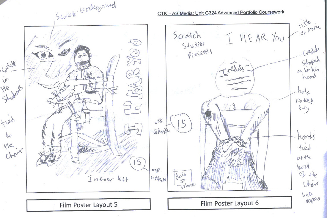
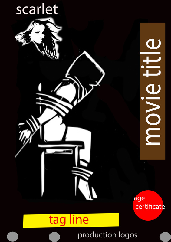
in the 5th poster, we decided to think of a different prop except a weapon but use rope and a chair to denote torture. The male who is probably going to be Philip is strapped up to a chair. In the background, is scarlett which connotes that she is behind all the torture he is undergoing. The movie title will be going alongside the right side of the page in a horror effect font. Also the tag line will be at the bottom in a small font.
In the 6th poster, we carried on to think of using the chair but just took the picture from another angle showing how helpless the victim is and letting the audience see from the villains angle who is behnid them. We thought to add more text by adding scratch studios presents.. then the movie title in big. date of release woud be in bold white writing in the left corner. We thought to be more creative and put the credits in the shape of the victims head.
In the 6th poster, we carried on to think of using the chair but just took the picture from another angle showing how helpless the victim is and letting the audience see from the villains angle who is behnid them. We thought to add more text by adding scratch studios presents.. then the movie title in big. date of release woud be in bold white writing in the left corner. We thought to be more creative and put the credits in the shape of the victims head.
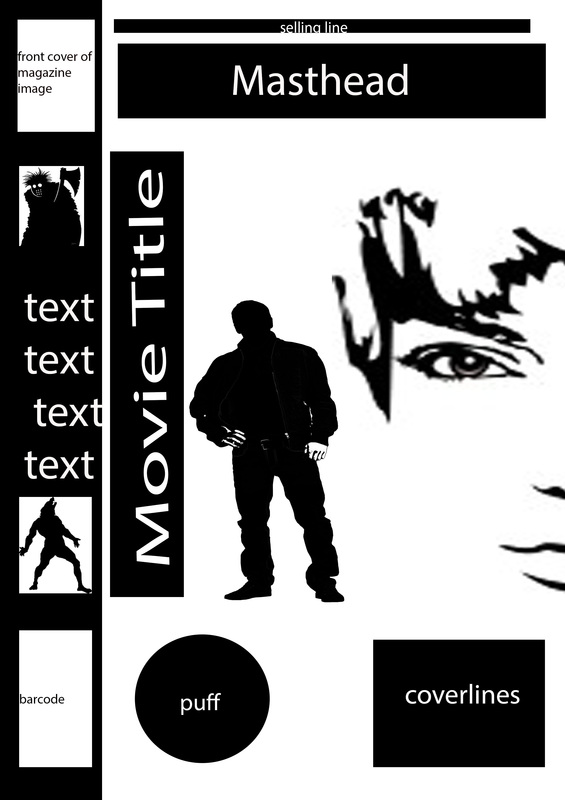
4 simple drafts of horror magazines on photoshop
This is photoshop simple draft layout 1. in terms of placement, conventions stayed the same. Except from the fact that i added a price and date line to be near the barcode which is a common convention for a magazine. |
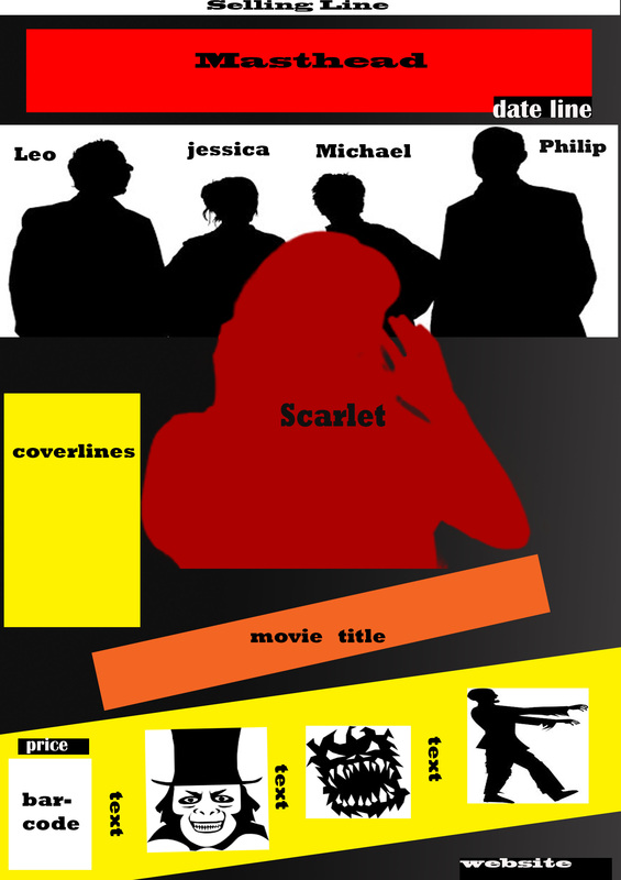
This is photoshop simple draft layout 2, we used silhouette pictures now to represent images and the images had the Nvc of the actual people. For example, scarlet holding her ears-looking like shes listening to the group behind her. Also by doing this Photoshop layout we thought of how to do the images at the bottom whether they be the same size or vary, depending on the shot-long shot or close or mid shot. Everything remained the same except where the dateline was.
|
This is Photoshop draft 3, we added price on to this which we forgot to do in the draw draft. Also by doing this Photoshop draft we see that there is space to be filled in between scarlet and the masthead. |
This is photoshop simple draft layout 4, i carried out the same layout as the drawn draft except from i only added a puff to fill up space which was at the bottom right corner. |
4 simple drafts of horror poster on Photoshop
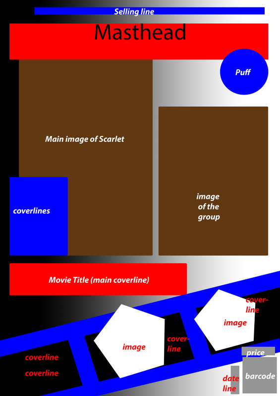
This was basically simply the use of silhouettes, boxes and circles that have been annotated for the reader and our group to know what goes where. Some changes were made particularly in adding new features that were forgotten in the Drawn drafts so this was very helpful to do. It gives a good guide line for when we do complex drafts.
this is the first simple draft poster, we kept the layout the same, however we added the production logo at the bottom where we have seen many of the logos are placed. 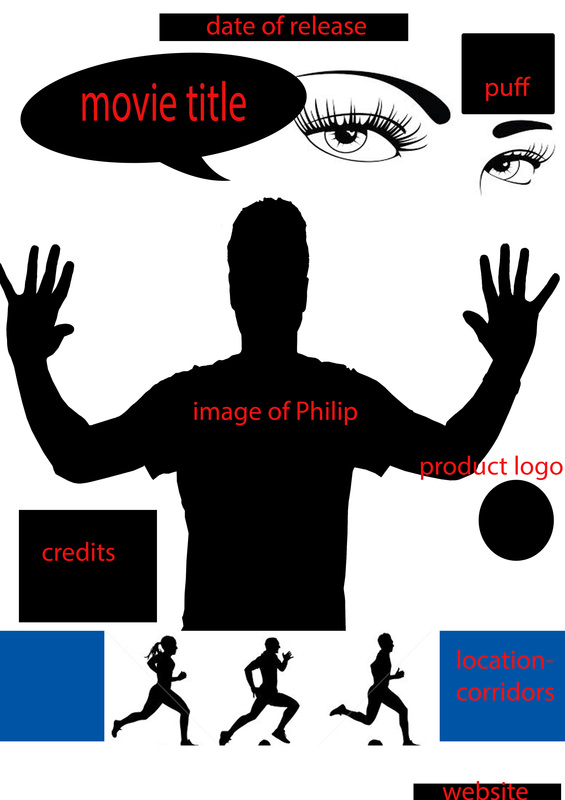
this is the third simple draft of a poster, we concluded to keep everything the same. Also we decided to include a puff too fill in space at the top right side of the page. |
This is the second simple draft of a poster, we added more then one production logo because there is more productions endorsed into a movie. 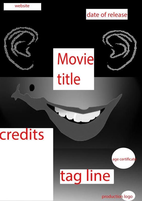
this is the fourth simple draft of a poster, we kept everything the same except adding production logo at the bottom of the page. |
complex drafts
This is where we take it up a notch and add professional images(some from test shots) also we have a play about with fonts to see what works and what doesnt. This helps lead to our final magazine and poster choice.
magazines
|
|
posters
|
|
test shots
These images were taken for us to come to a conclusion on what type of lighting would be great for our magazine and poster. Also to look at and decide on what type of lighting we can use to show both the antagonists and the protagonist or either just one of them. These pictures are example how how our images could look like for our magazine and poster. This will help us when we actually take our real pictures as we would beforehand know what camera shots work best.
I like...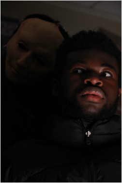
This shot is nice because it is from a low angle and a close up where you can see the Nvc of the victim-Philip. His NvC is scared/cautious of his surroundings. Also I like the lighting where it is darker behind Philip and only showing the antagonists face-scarlet who looks mysterious. |
i dislike...
This shot is a mid shot but the lighting is too lowkey where it hardly shows the antagonists hand-scarlet. It doesn't look scary at all and looks plain so is not an effective image for us to use |
final Drafts
This section is all about drafts that can be chosen to be used for the final poster and magazine. We played with different fonts and kept continuity with the font of the title of the movie. We followed the colour scheme of red, black and white with grey for the credits FOR THE POSTER. We looked at professional posters and magazines for inspiration TO THINK OF WHERE TO PUT SOME CONVENTIONS SUCH AS THE TAG LINE FOR POSTER AND COVER LINES FOR MAGAZINES.
Font Palette
Here is the font palette for the drafting of the Movie magazine and movie poster. the fonts are as shown in the palette below with the names and style of the font.
poster
|
magazine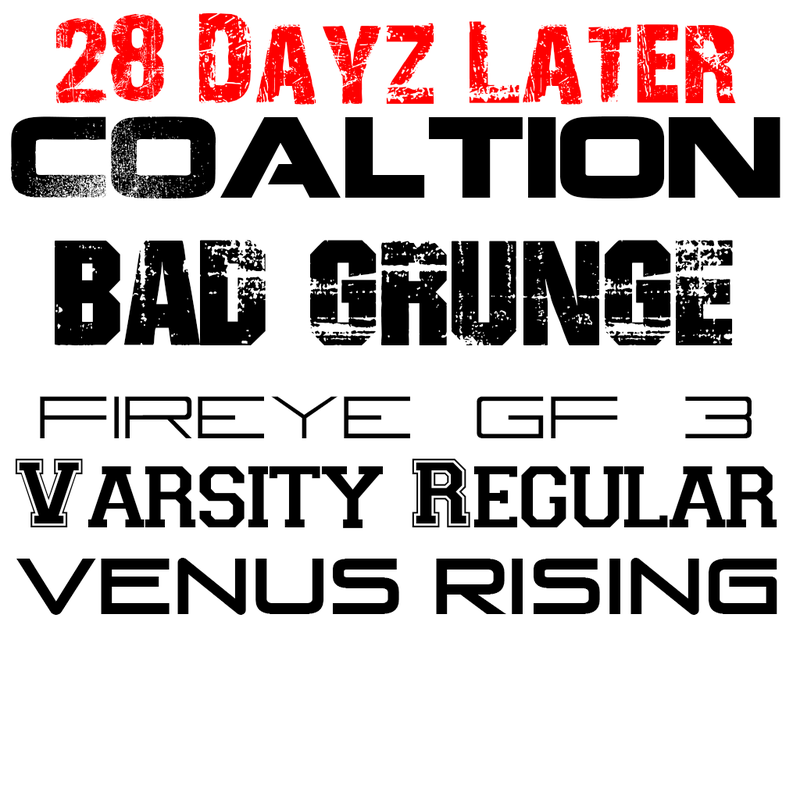
|
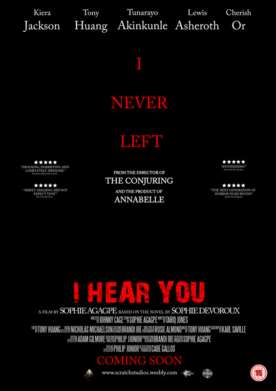
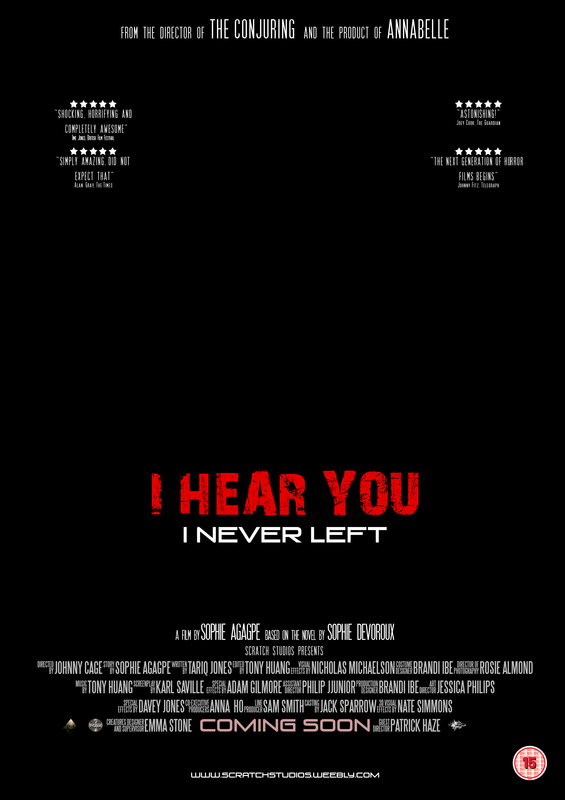
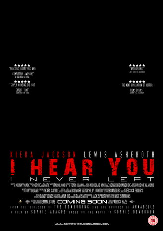
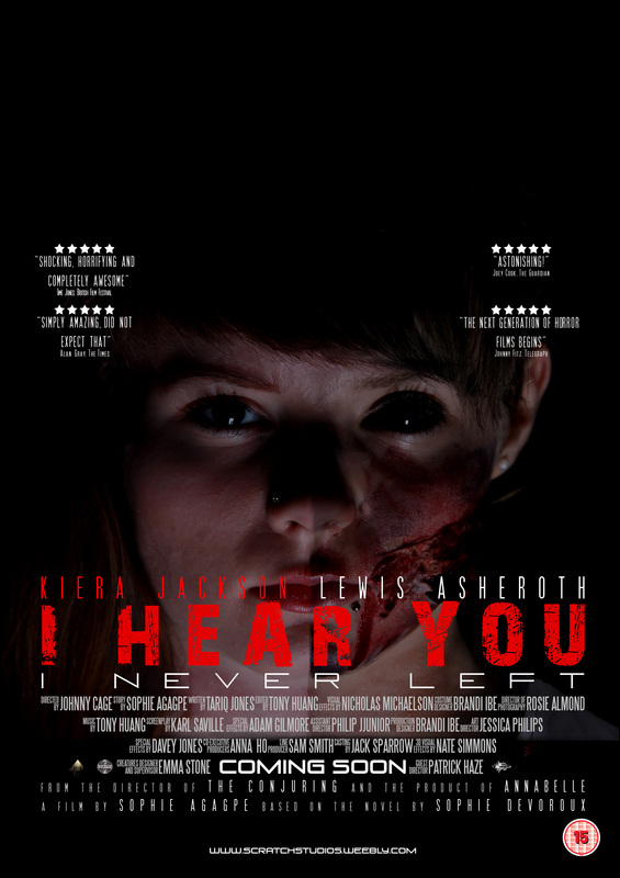
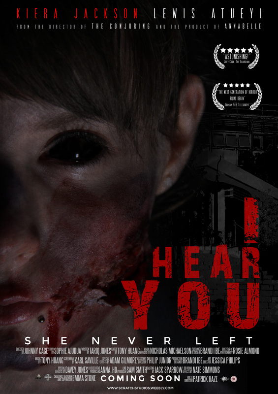
10 final posters
For the drafting of the poster, we first created a template in which would consist of all the poster conventions. afterwards, we manipulated the conventions changing the layout to our own desires and in comparison to real media texts. We created logos for sound and distribution to add to our posters aswell.
We made the credits 4 lines to show how many people have worked on the movie also it makes the poster look better and more professional.
In this draft, we was influenced by another poster and tried to add all the conventions of a poster such as age certificate, movie title, tag line and so on which makes gives the audience more to look and gain information about the movie.
|
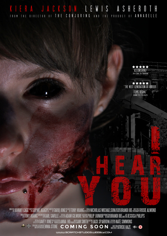
In this draft we made the name of the title slanted a bit for variation. 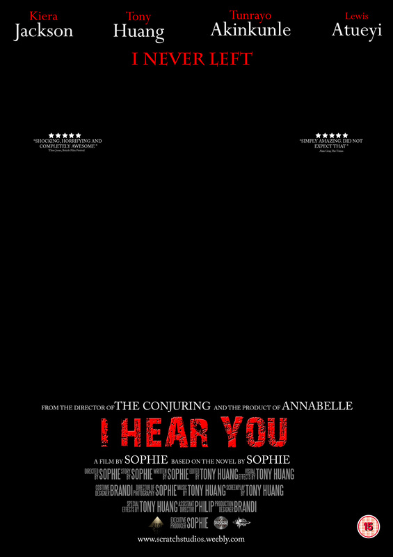
In this draft we really thought of working on the colour scheme and making patterns such as in the top line of the movie actors and actresses their first name is red and second name is in big white.
|
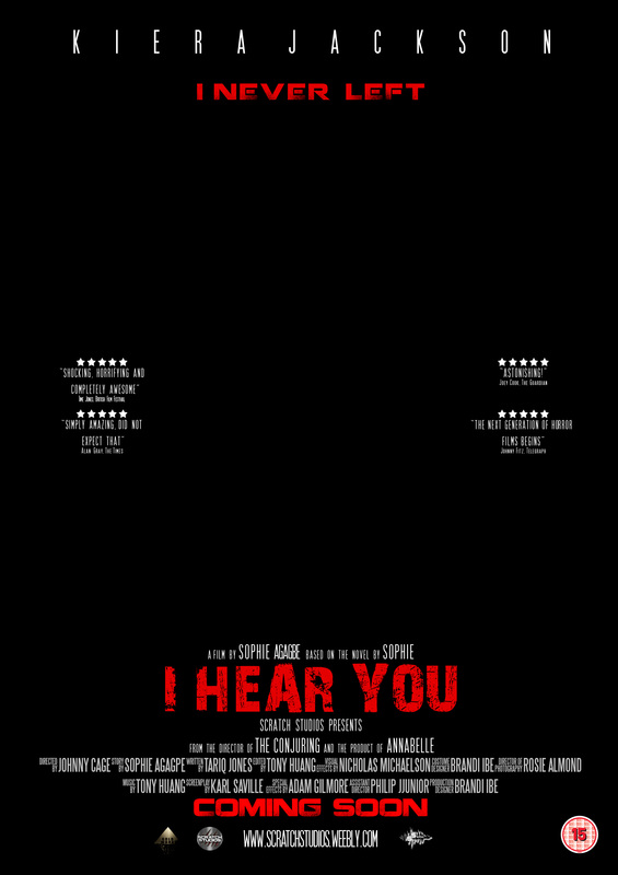
In this draft we changed the colour red of the movie title to be more brighter to see how it would look whereas the other drafts have a darker red. Also i spaced the fonts on Photoshop so it can fill the top line and it is the name of the main actress (antagonist)
This one is different from others because it has no credits which I have seen some professional posters do. It makes it simple and eye catching Showing maybe how important the image is more than anything where the focus should be. Due to the fact it gives off some hints of the movie visually.
|
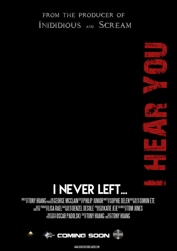
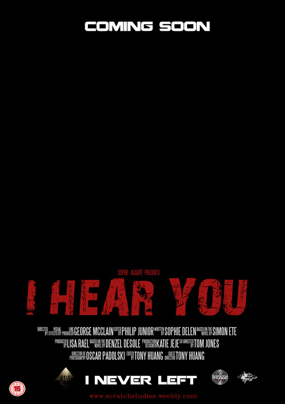
With this draft we got inspired with one of the drawn drafts and carried it on by putting the layout of the movie title along the side.
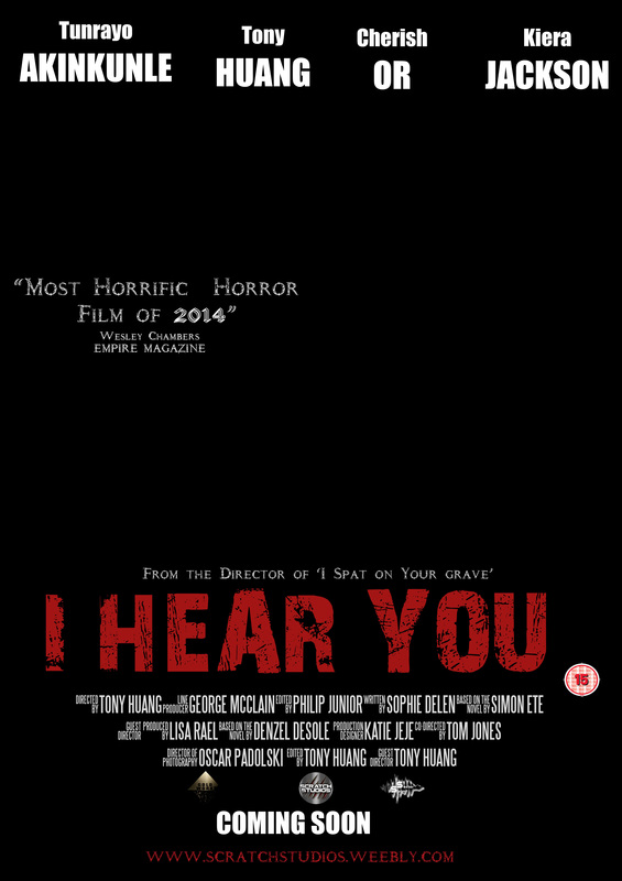
This draft was quite complex where there is a lot going on but we made it work in layout. We kept continuity of the font with putting movie ratings from magazines and so on and also the line of actors and actresses featuring in the movie.
|
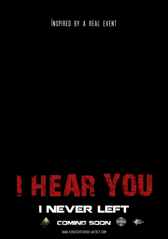
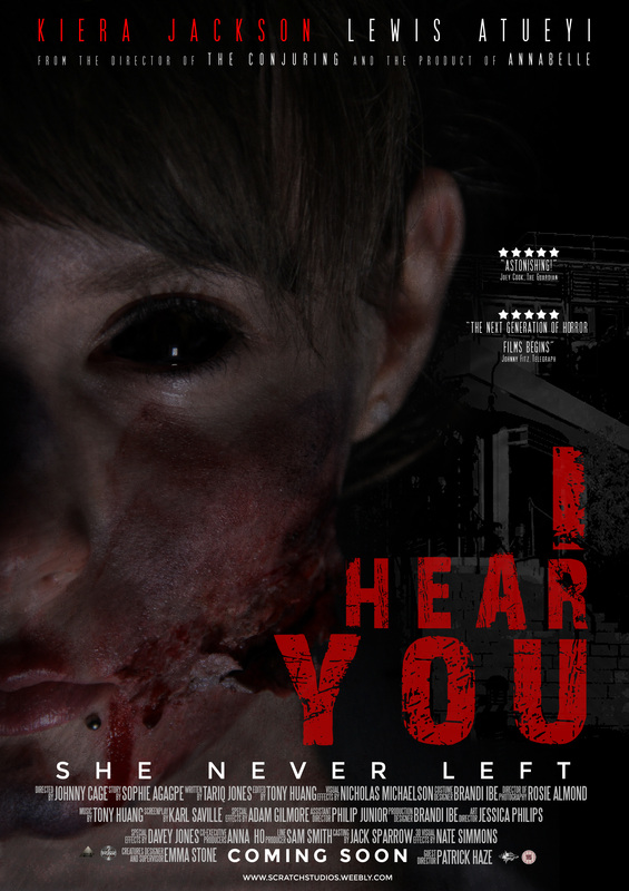
In this draft we moved the name of the title nearer to the middle to make it stand out more and isolate it with the tag line. |
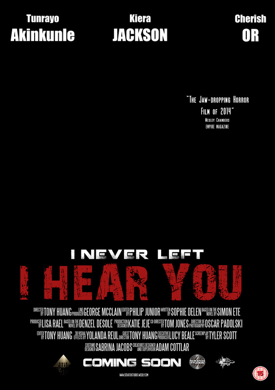
IN this draft the name of the movie has the biggest font size and also we added a lot of text at the bottom of the poster because looking at professional posters they in corporate that also. We changed the font of the tag line to try out how it looks and it worked well by spacing the letters it made it same size under the movie title.
|
10 magazines layouts
similar to the poster, we created some drafts with all the conventions then, adjusting the layouts; adapting to different real media texts or experimenting with layouts. we used real media text layout to help us through the drafting stage.
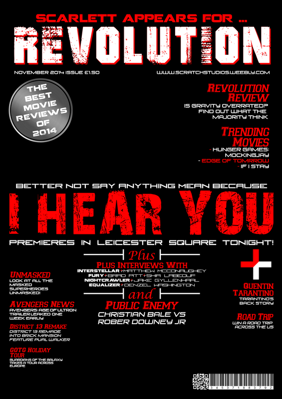
Our Draft #1
|
Real Media Text
|
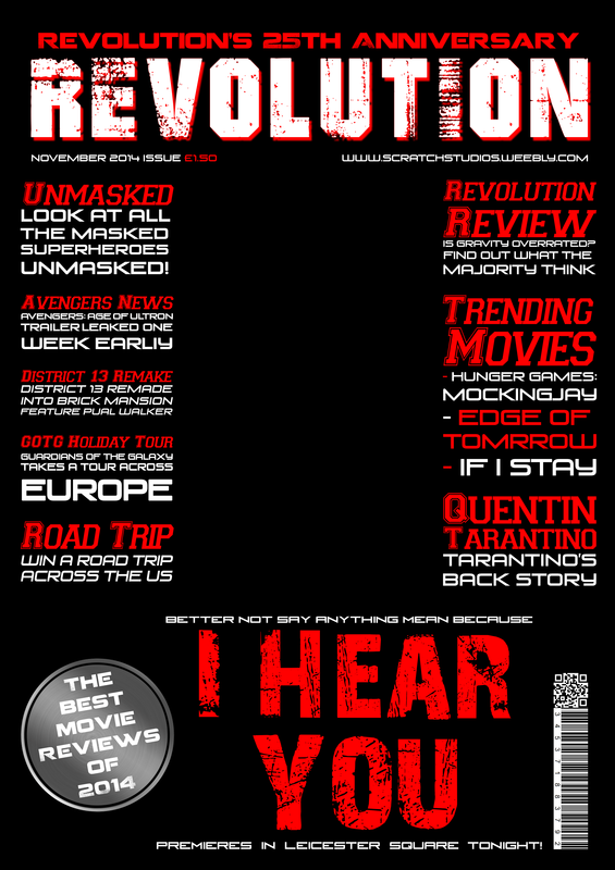
Our Draft #2
|
Real Media Text
|
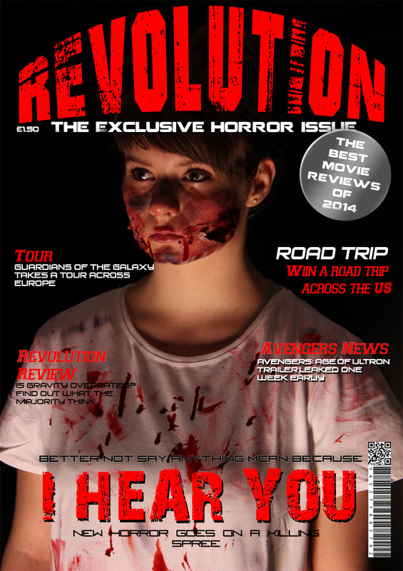
Our Draft #3
|
Read Media Text
|
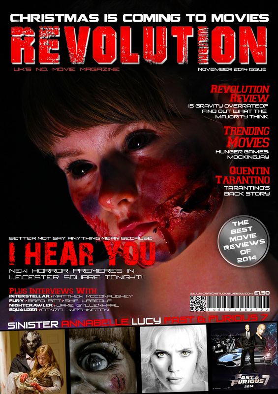
Our Draft #4
|
Real Media Text
|
Our Draft #5
|
Real Media Text
|
Our Draft #6
|
Real Media Text
|
Draft #7
|
Draft #8
|
Draft #9
|
Draft #10
|
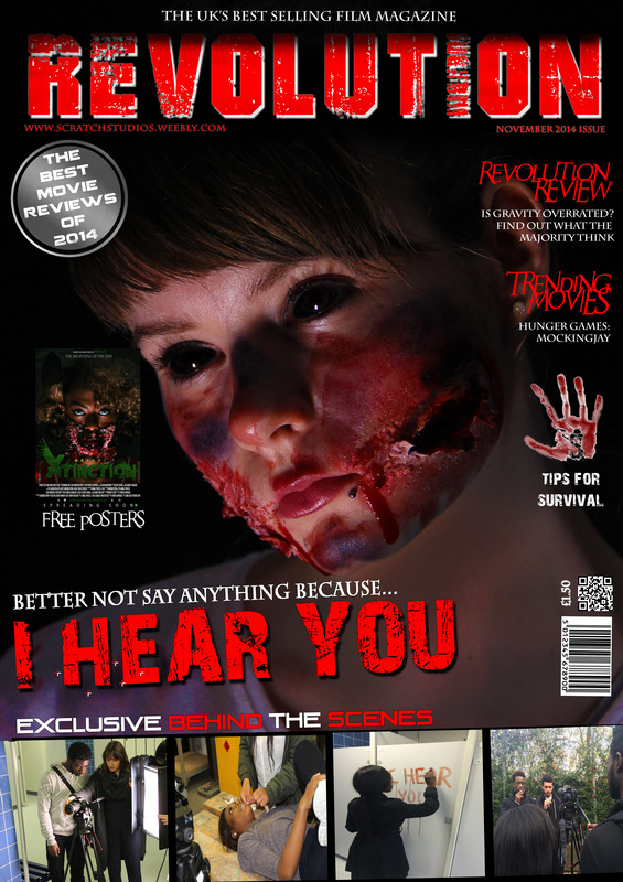
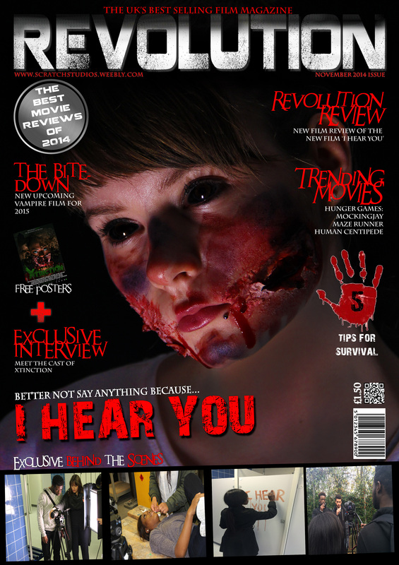
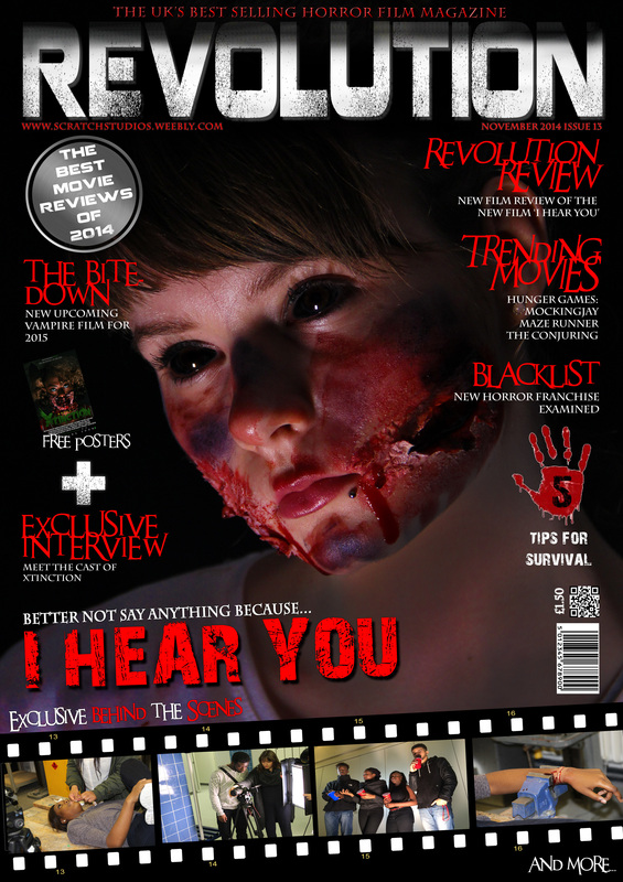
Final Product stages
magazine stages
Stage 1
|
Stage 2
|
Stage 3
|
Stage 4
|
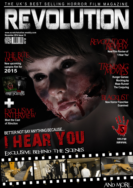
Final Magazine
poster stages
Stage 1
|
Stage 2
|
Stage 3
|
Stage 4
|
Final Poster

