
What have you learned from your audience feedback?
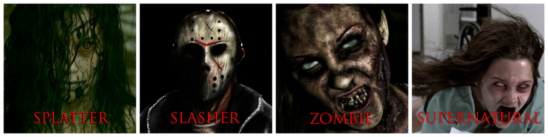
for our A2 media coursework, we produced a horror poster, magazine and a teaser trailer of the splatter horror sub-genre. in the post-production stage, we will be conducting further audience research to see whether or not we produced what our target audience really wanted as we obtain details of their opinions on all three of our final products. we will find out what went well and what went wrong; even potential areas for improvements if we were to do this project again. to conduct this research, we will be using different social media networks such as facebook, twitter and whatsapp along with some video interviews and group screenings. we will then ask our target audience (young people of age 15-26) 10 questions for each of the final products.

Facebook is a social networking site that was launched by mark zuckerberg in 2004 and has been proven to be one of the most used sites in history around the world which is why we chose to conduct some of our audience research there as our target audience would use facebook to keep in touch with friends, post photos, share links and exchange information. we also used facebook to advertise our horror film trailer by posting the youtube link.
|

twitter Is a social networking site which was founded in 2006 and enables its user to send and read messages called 'tweets' but are limited to 140 characters. although some find this irritating, this 140 character limit allows us to advertise our horror film in a short and sweet manner that would easily intrigue our target audience. the majority of our target audience own a smartphone so would download the app through their app stores for free.
|

Youtube is a free video-sharing website which was launched in February 2005 and operates as a google subsidiary - google is visited by approximately 5 billion people worldwide daily and youtube has more than 1 billion unique visitors each month. also, youtube is localized in 61 countries and across 61 languages so we decided to take advantage of youtube as it is a free form of advertisement for our horror film trailer and is easily accessible. we also used youtube to upload our videos for our audience research in both the pre-production and production stage.
|

WhatsApp Messenger is a cross-platform mobile messaging app which allows you to exchange messages without having to pay for SMS. WhatsApp Messenger is available for iPhone, BlackBerry, Android, Windows Phone and Nokia and can all messAGE EACH OTHER. In addition to basic messaging, WhatsApp users can create groups, send each other unlimited images, video and audio media messages. WE DECIDED TO USE WHATSAPP MESSENGER AS THE APP IS WIDELY USED AMONG OUR TARGET AUDIENCE AND HAD BECOME MORE POPULAR. WE USED IT TO GATHER AUDIENCE RESEARCH FROM OUR TARGET AUDIENCE.
|
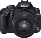
to conduct our audience research, we used a canon camera as well as the mac computer webcam to do a few face-to-face interviews with some of our target audience. we thought that this was a good way to gather some feedback as it allowed them to elaborate on their thoughts and opinions and we could easily explain to them, anything that they did not understand. we also found this method to be fairly beneficial as we were able to get more information out of our target audience better than any other method we used so by conducting video interviews, we were able to get detailed suggestions and improvements for our final products if we were to do them again as well as engage more with our target audience and visually show them our products instead of simply discussing it.
our final products
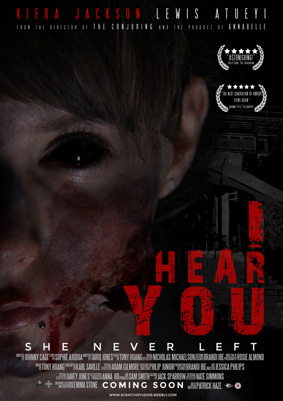
Our Final Poster
|
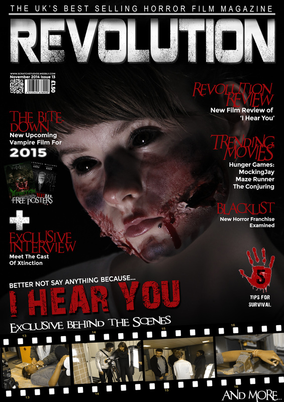
Our Final Magazine
|
poster
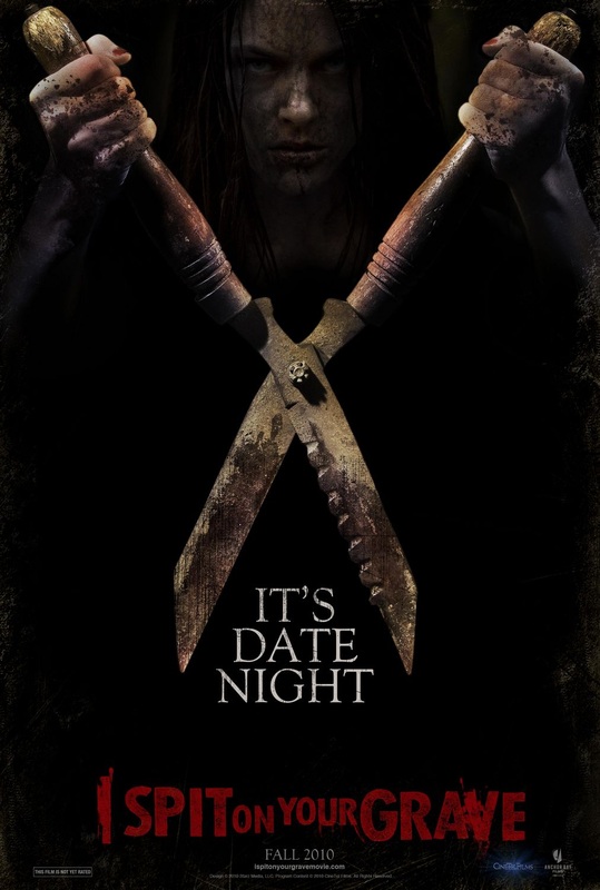
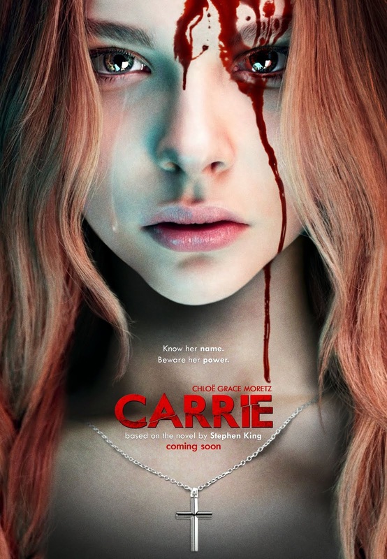
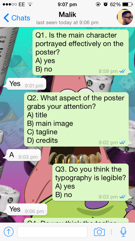
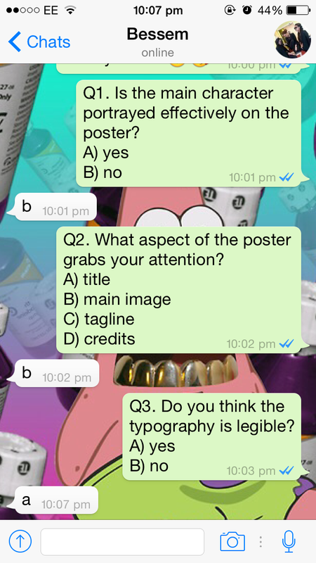
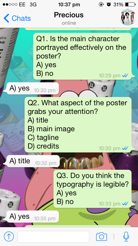
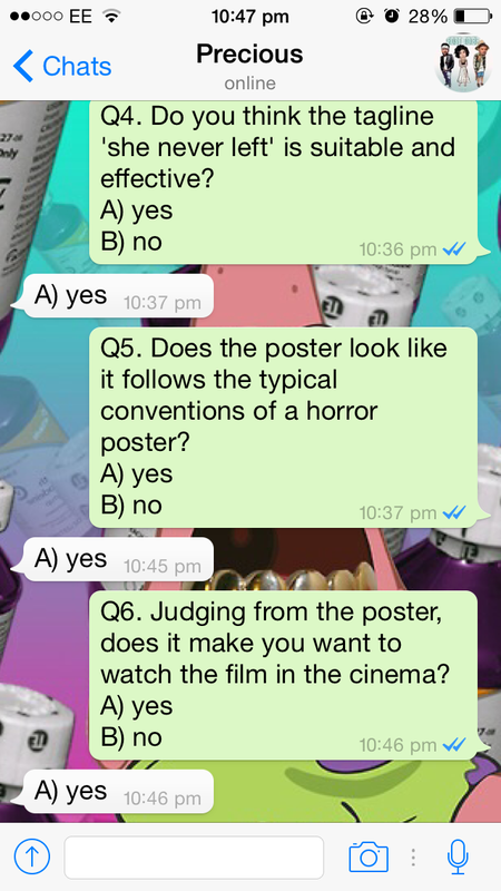
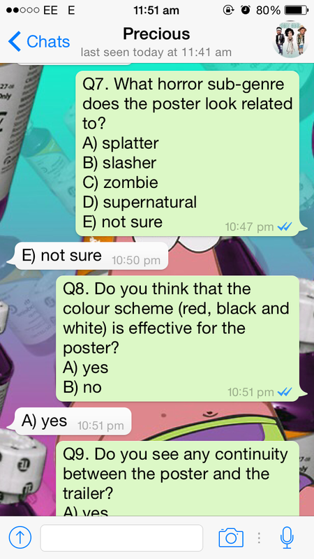
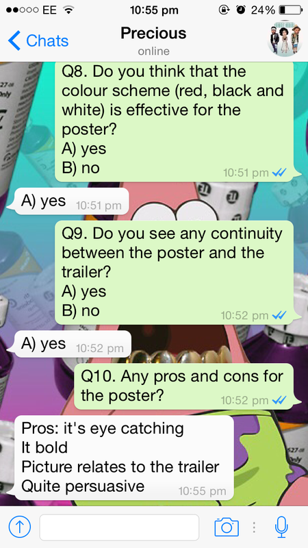
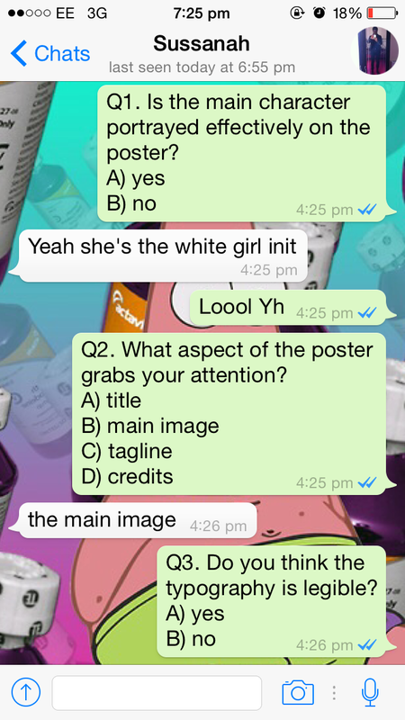
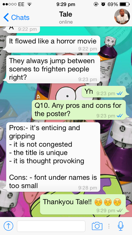
posters are one of the most common forms of advertisements which are widely used to promote new films around the world. they often tend to be quite simple as it would only include features of the film such as the main character(s), film title, credits and release date along with actor and actress names to avoid giving away too much information about the film. 'I spit on your grave' is probably our major film influence in terms of the narrative as it is based on a woman being raped who then later seeks revenge thereby becoming the antagonist while 'carrie' is another one of our main horror film influences as she gets bullied in school and mistreated by her mother who then also becomes the antagonists of the film as she seeks revenge on those who bullied and embarrassed her. to obtain feedback for the poster, we asked 10 people 10 questions (6 people on whatsapp and 4 people in video interviews) about their opinions on our final horror film poster. all participants were shown the poster and trailer before hand.
|

|
|
questions
|
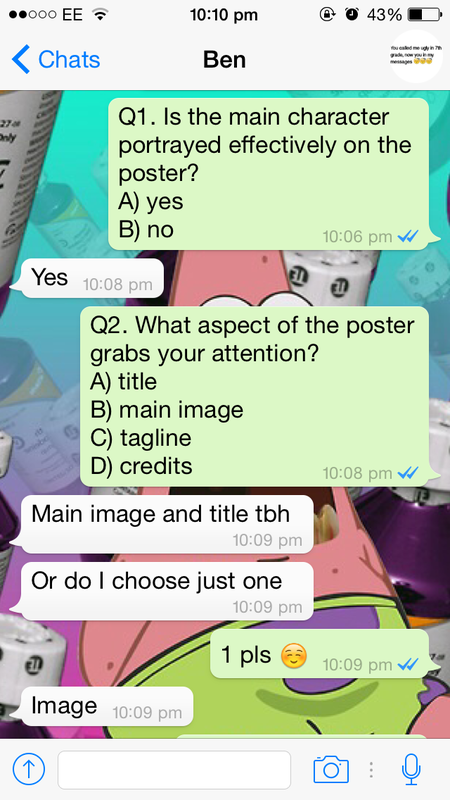
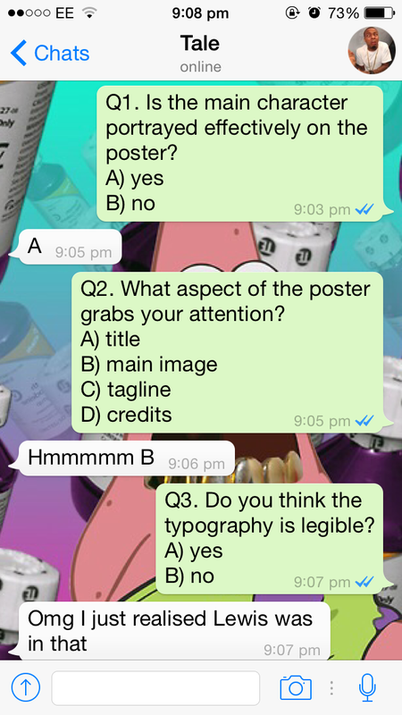
1) is the main character portrayed effectively on the poster?
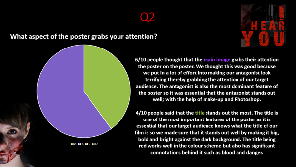
A) Yes B) No 2) What aspect of the poster grabs your attention?
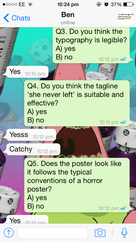
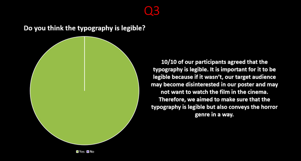
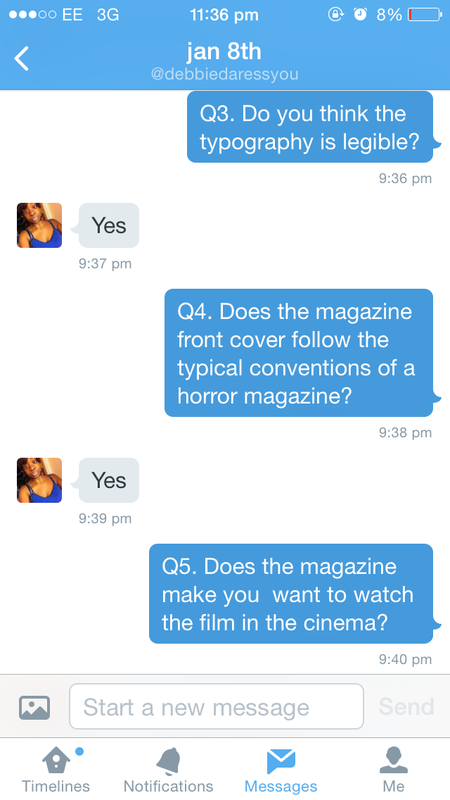
3) Do you think the typography is legible?
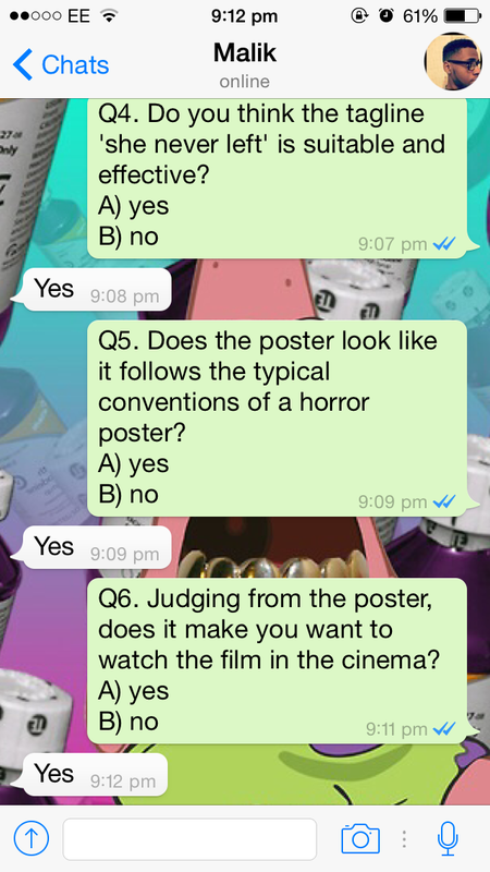
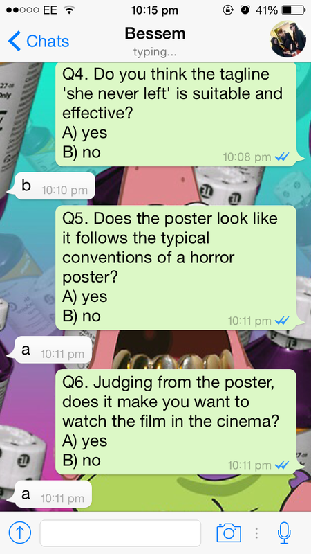
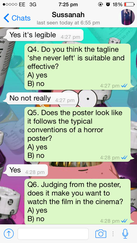
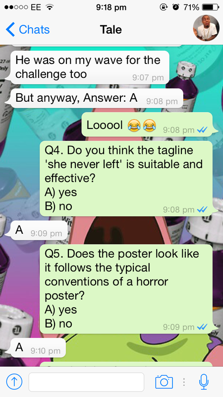
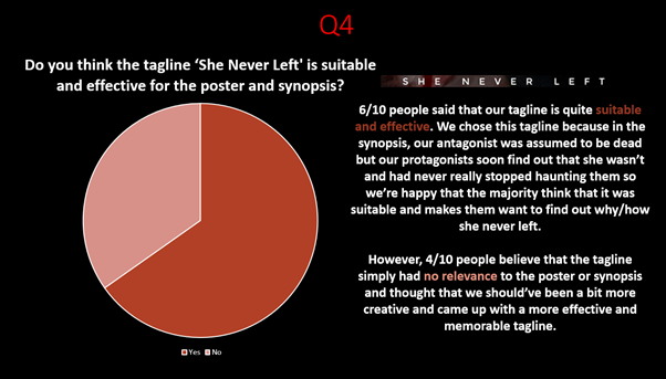
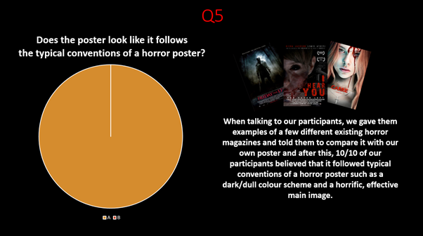
A) Yes B) No 4) Do you think the tagline 'she never left' is suitable and effective for the poster and synopsis? A) Yes B) No 5) does the poster look like it follows the typical conventions of a horror poster? A) Yes B) No |
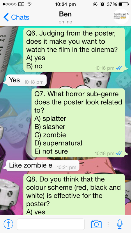
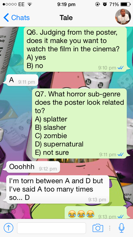
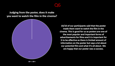
6) Judging from the poster, does it make you want to watch the film in the cinema?
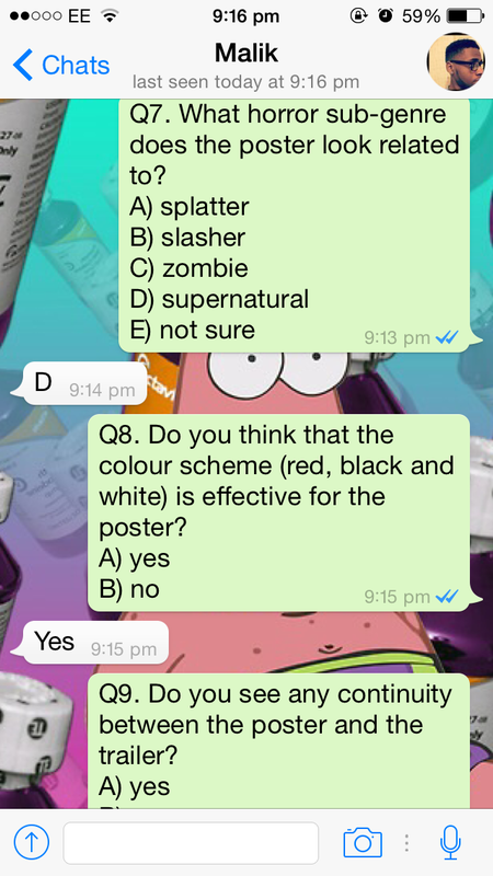
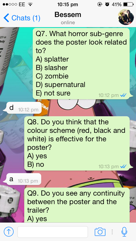
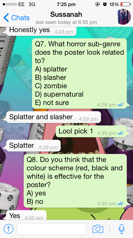
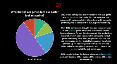
A) Yes B) No 7) what horror sub-genre does our poster look related to? 
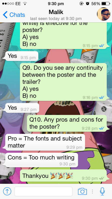
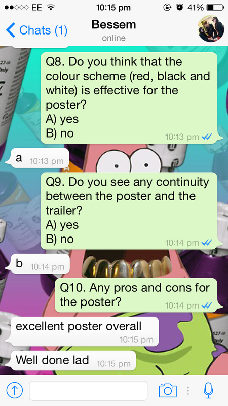
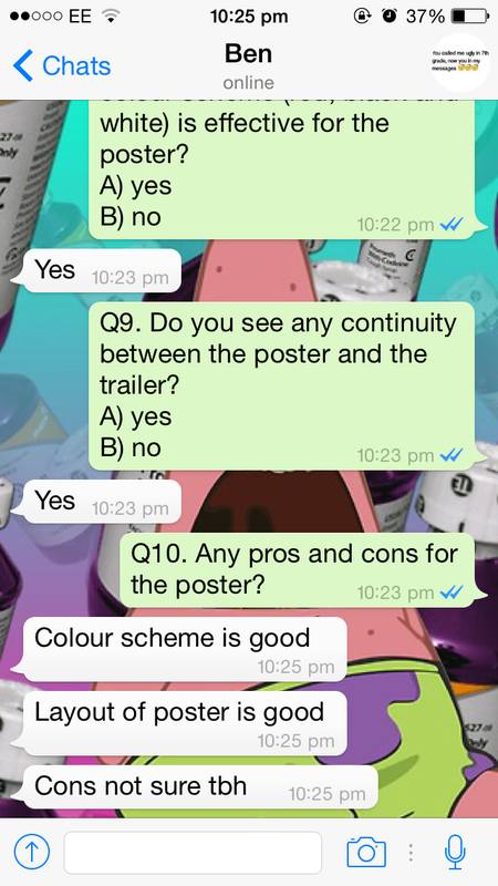
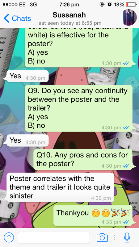
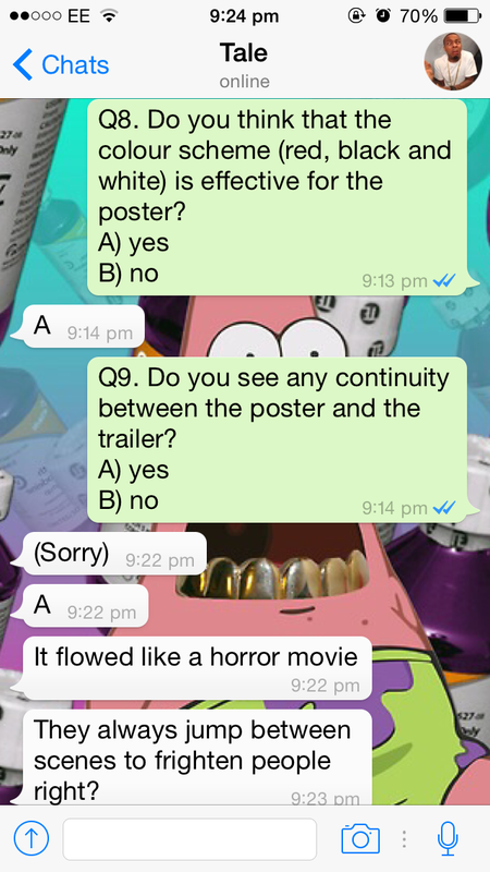
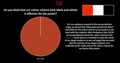
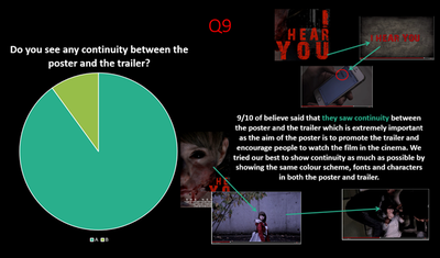
8) do you think that our colour scheme (red, black and white) is effective for the poster? A) Yes B) no 9) do you see any continuity between the poster and the trailer? A) Yes B) No 10) can you state any pros and cons for the poster? _____________________________________________________________________ _____________________________________________________________________ |

responses

Whatsapp
|
1
3
|
2
4
|
|
5
|
6
|
|
|
|
|
the main points that fadeke mentioned about the poster is that the tagline is not really effective as it is cliche but is understandable. she also pointed out that the sub-genre was definitely not a splatter (which it is) so suggests that we were not successful in portraying our sub-genre effectively. another problem she mentioned was also the fact that the age certificate wasn't visible so that would be seen as non-conventional of a horror poster
|
charles pointed out that the layout of the poster worked out well but he also mentioned that the tagline is only suitable but not effective if the viewers know the full synopsis so perhaps a more effective/vague tagline would've suited the poster a lot better. the aim of the poster is to promote and advertise the film trailer so the poster should be able to make sense on its own rather than only understanding it when the audience knows the full story
|
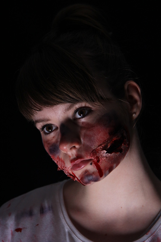
soton and jessica in this interview pointed out that the visible conventions of horror films portrayed on this poster would be the use of make-up and blood on our antagonist which was used to make our main image look effective for our target audience. soton also pointed out that the use of red, black and white for the colour scheme makes the poster look more horrific and alerting so could easily catch the eyes of our target audience which are people aged 15-26
|
minor changes
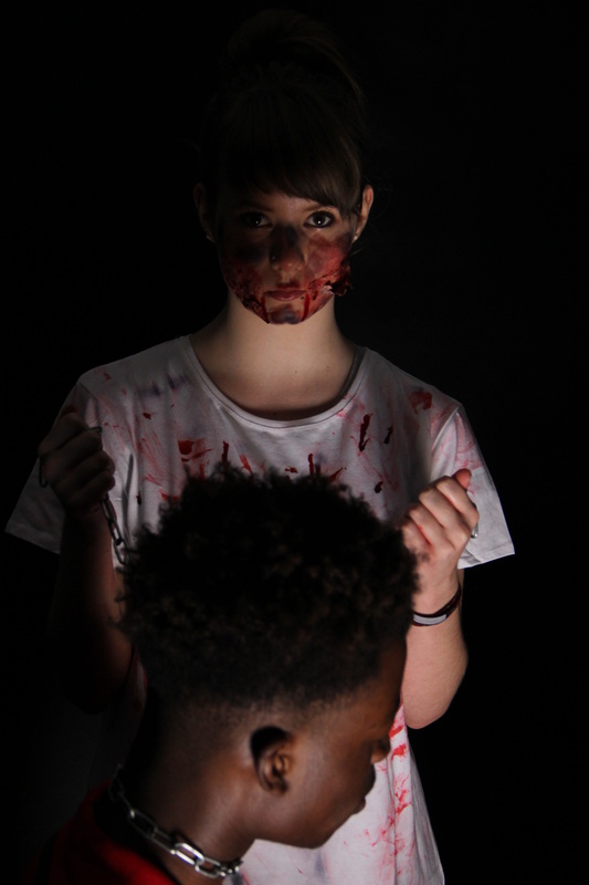
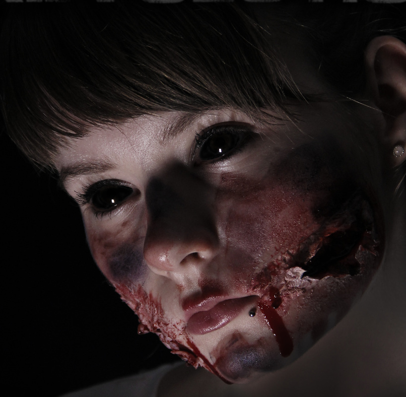
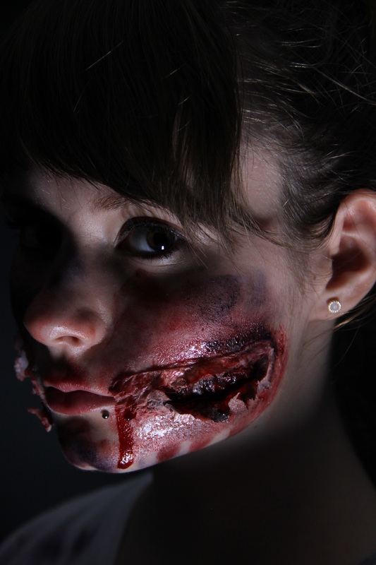
from the pre-production feedback, we were meant to use a mid close-up shot for the main image of our poster. however, we thought that using a close-up shot of our antagonist for the main image would probably be more effective as the poster is more simple form of advertisement for our horror film trailer so having an effective main image that portrays our sub-genre well is extremely important. also, after the photo shoot, we had just generally obtained better close-up shots than any other type of shot that we took so we decided to use one of them which our target audience was very happy with due to a bit of editing done on her eyes and face to make them look more horrific but realistic at the same time
|
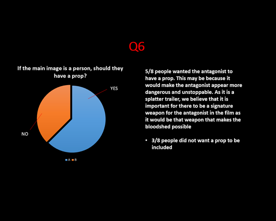
initially, our target audience said that they wanted our antagonist to have a prop in the shot. however, when it came to the photo shoot, we completely disregarded using the prop as we did not have a prop to use in the photo shoot at the time. we thought that the props which were available would have no significance/relevance to our synopsis (e.g clown mask) and the others seemed to be a bit cliche so we decided not to use them. judging from the photos that we obtained from the photo shoot, we think that including a prop may have made our main image slightly less effective as not all eyes would be on our antagonist. after conducting our post-production audience research, our target audience seem to be happy with our choice to not use a prop although we see several props in the trailer. we also thought that having the antagonist with a weapon is a bit typical but our audience was pleased with overall outcome
|

evaluation
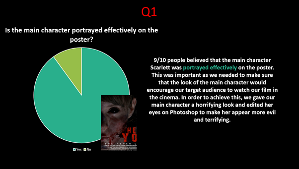
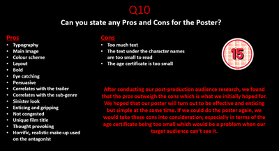
Overall, majority of the feedback for our poster was positive as it seemed to be very appealing towards our target audience. They particularly liked the close-up image of our antagonist scarlett which turned out to be quite effective with the help of the horror make-up although initially, our target audience wanted a mid-close-up shot for the main image on the poster but we decided that a close-up shot would be more effective and work better. unfortunately, our target audience found it extremely difficult to recognize our horror sub-genre as the majority thought that it was of the supernatural sub-genre when it was in fact of the splatter sub-genre. we think this might be due to the lack of splatter elements/denotations on the poster such as blood splatter or more blood on her face. based of our feedback, if we could do the poster again, we would probably change the positioning of the film title to make it stand out even more and also the film rating which we would make a lot bigger as we established from our post-production feedback that it's an issue. we would also consider making the credits a bit bigger so that it is more legible. from making this poster, we learnt that it is important to follow typical conventions in order for our final product to look professional and that the opinion and suggestions of our target audience actually matter. the poster appears to be a successful as 100% of our target audience say that the poster makes them want to watch the film in the cinema which is what the poster was designed to do.
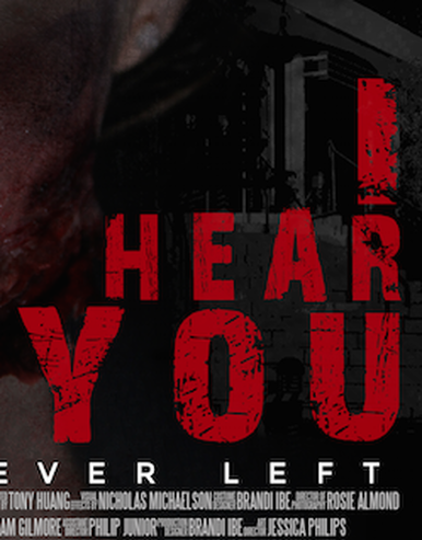
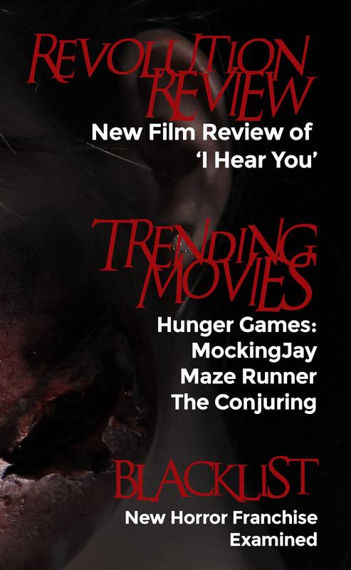
magazine
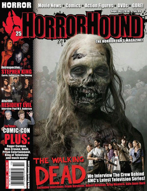
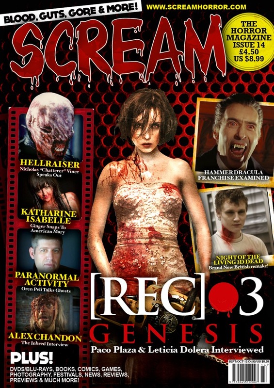
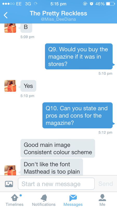
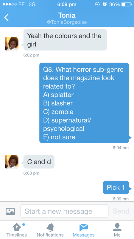
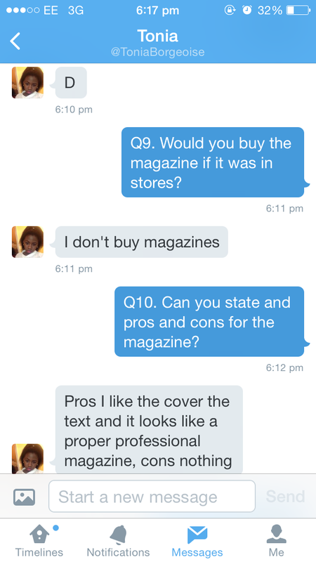
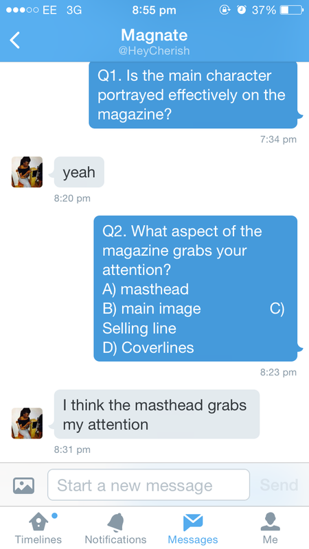
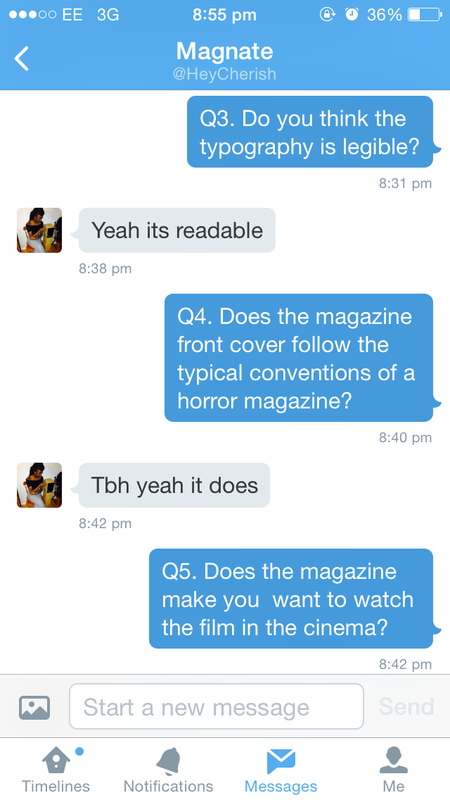
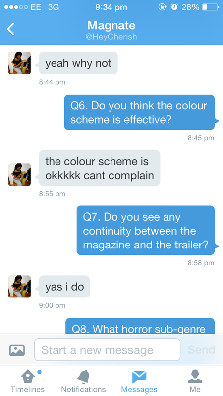
the main purpose of a horror magazine is to entice and frighten our target readers. 'horrorhound' and 'scream' magazine were our two major influences when we were creating our own magazine. we stuck to typical conventions of these magazines and their layouts in order to obtain a professional look. we found that the film tape feature is becoming more and more popular in horror film magazines so we thought it would be an attractive feature to include our magazine front cover. we also thought it was important that we keep one character as the main image although there are features characters on the page as it was what our audience wanted and it makes it look more effective. we also thought the colour scheme for these images worked really well as the colours were consistent for both text and images and was definitely something we had to consider. for the magazine, we asked 10 people (6 people using twitter and 4 people using video interviews) 10 questions and all participants were shown the trailer and magazine before hand.
|

|
|
questions
|
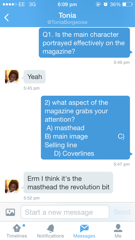
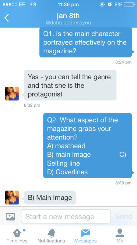
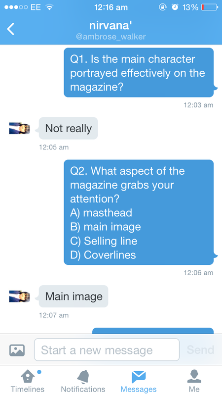
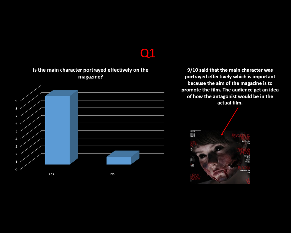
1) is the main character portrayed effectively on the magazine?
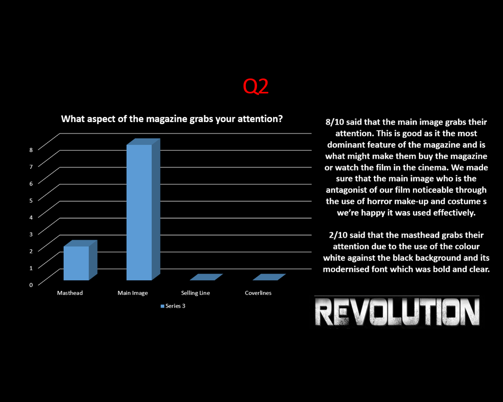
A) yes B) no 2) what aspect of the magazine grabs your attention?
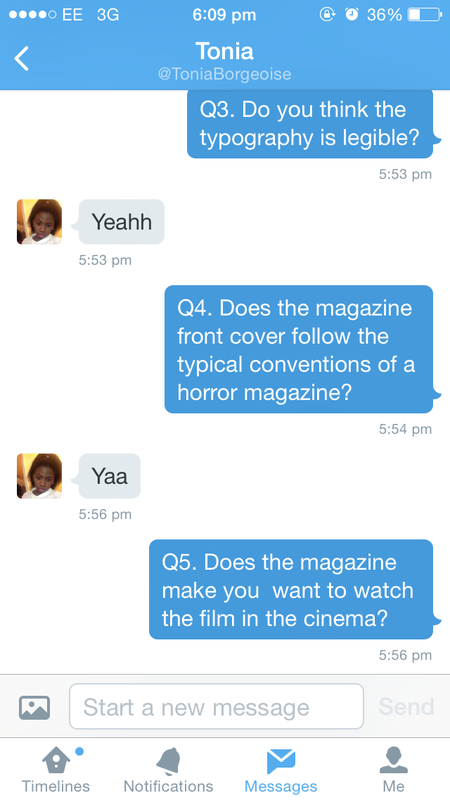
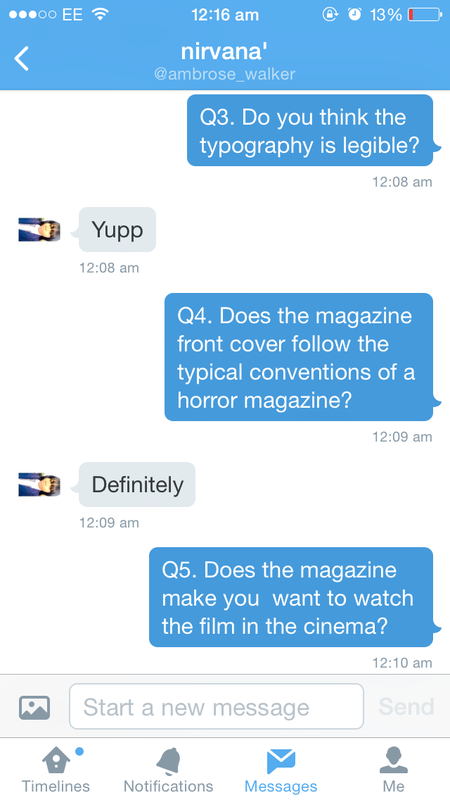
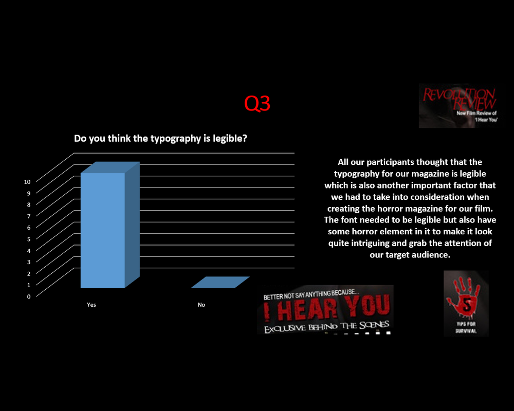
3) do you think the typography is legible?
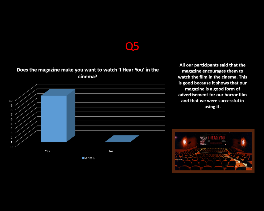
A) yes B) no 4) does this magazine front cover follow the typical conventions of a horror magazine? A) yes B) no 5) does the magazine make you want to watch 'i hear you' in the cinema? A) yes B) no |
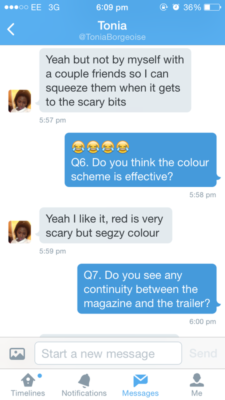
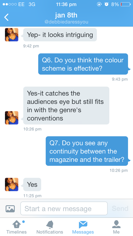
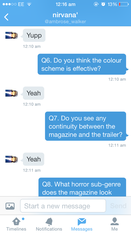
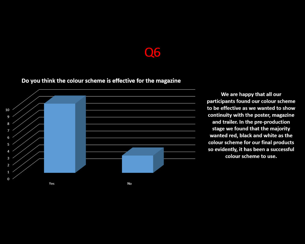
6) do you think the colour scheme (red, black and white) is effective for the magazine?
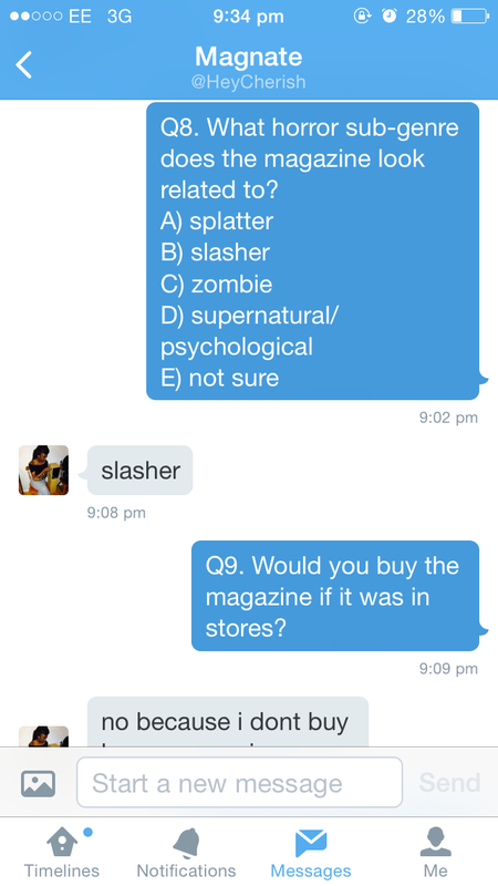
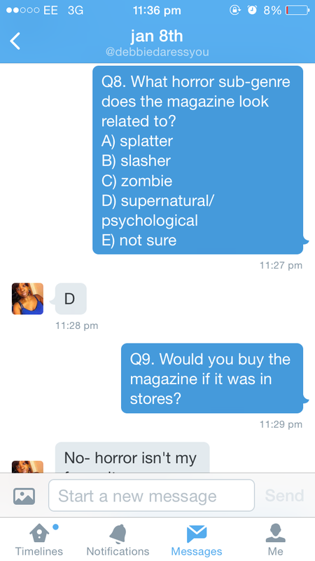
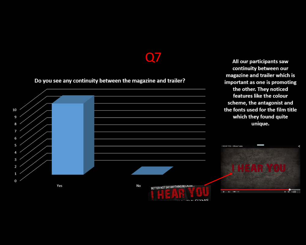
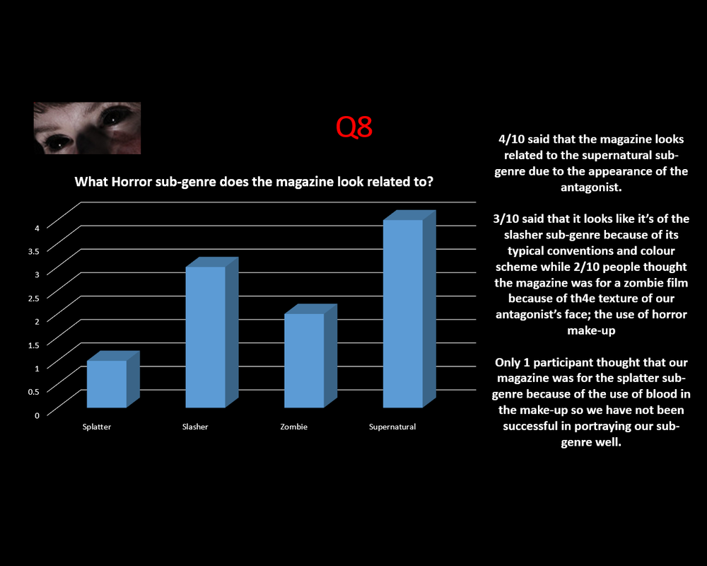
A) yes B) no 7) do you see any continuity between the magazine and the trailer? A) yes B) no 8) what horror sub-genre does the magazine look related to? 
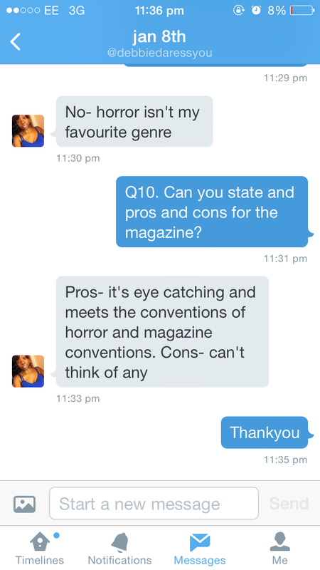
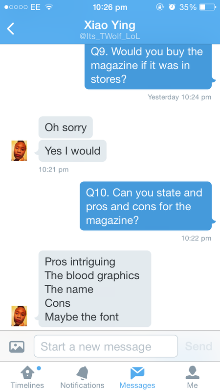
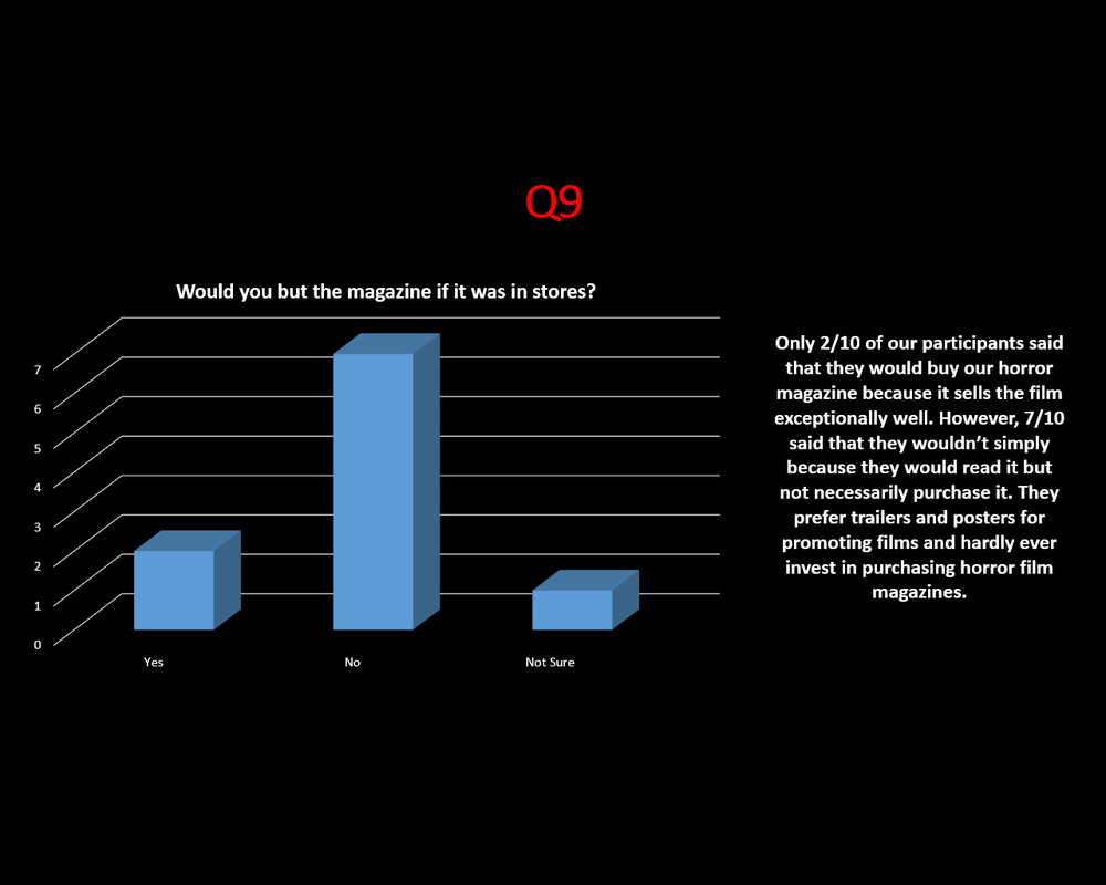
9) would you buy the magazine if it was in stores?
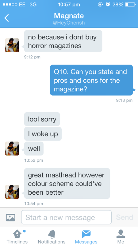
A) yes B) no C) not sure 10) can you state any pros and cons for the magazine? ____________________________________________________________________ ____________________________________________________________________ |


responses

Twitter
|
1
|
2
|
|
3
5
|
4
6
|
|
|
|
|
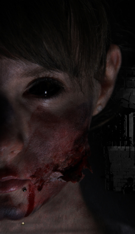
in this video interview, sussanah says the main image looks effective for our horror film magazine. however, she believes that the NVC of our antagonist along with the use of make-up almost makes her look inhuman. we are unsure of what that means to her but we see it as a good things as it could mean our antagonist looks even scarier than she should
|
in this video interview, she says that the make-up used on our antagonist looks extremely realistic which she believes would help sell the magazine well to the target audience as it is more likely to appeal to them. however, she pointed out that she did not like the positioning of the barcode as it is usually at the bottom so says that would be the only improvement
|
here, they say that the nvc of the antagonist is extremely effective as it suits the title 'i hear you' and suggests that something has already happened which would make the target audience even more intrigued because they would want to find out more about what has happened to her or why she would be listening out for the antagonists in the horror film
|
minor changes
|
before:

After:
in the pre-production audience research, the majority of our target audience voted for a close-up shot of our antagonist for the main image of our horror film magazine. however, after conducting the photo shoot, we found that all the close-up shots we had of our antagonist did not really suit the layout of our magazine because of things like the coverlines as we did not want to cover up our antagonist's face too much so we ended up using a mid-close up shot that we took of our antagonist instead which worked really well with our chosen magazine layout. our target audience were happy with our decision as they thought that our antagonist looked quite effective due to the use of horror make-up and her 'unusual' nvc which helped portray the horror genre in general. they also said that it is part of the typical conventions of a horror magazine for the main image to be of a mid-close up shot
|
in the pre-production stage, 2/8 people voted the initial font although this choice tied with two other options but we felt that this was the best one out of the three. however, during the production stages of our magazine, we felt that this font was not as effective as we thought it would be so we picked out a completely different font on photoshop which had a more modern and simple look to it. also, we made the font a bit bigger in terms of height in order to make it look like the most dominant piece of text on the page which we think made it stand out a bit more than it did initially. after doing this, we thought that changing the font and size of the masthead wan't enough so to make it stand out more, we made it white rather than red even though red was the main colour of the colour scheme chosen by our target audience as we felt that the colour red was used a bit too much on the page. after carrying out post-production audience research, we found that our audience was fine with the changes we made and says that the change was definitely effective
|
Evaluation
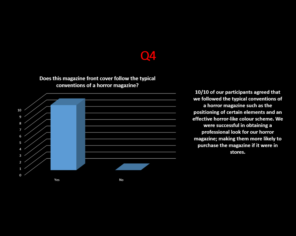
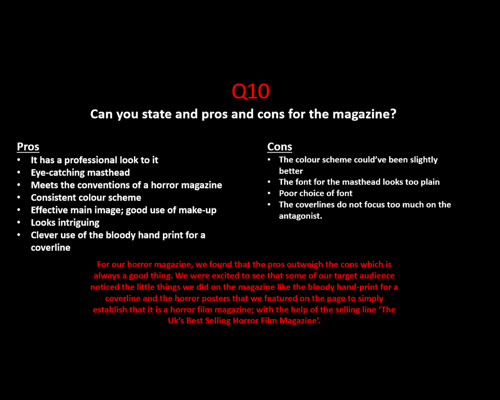
Overall, we believe that the magazine turned out to be quite a successful form of advertisement for our horror film trailer as our target audience believed that it generally looked like a typical, professional horror film magazine and had intriguing coverlines. Also, particularly the main image, appealed to our target audience as they thought the make-up looked realistic and part of horrific story line and the mid-close up shot that we used turned out to be quite effective as we see more of the antagonist in terms of costume and body language which they found engaging. however, a participant of ours did not like the positioning of the barcode as they thought it was quite odd for it to be positioned towards the top of the page when it is usually down the bottom right hand side of the page. if we were to do this magazine again, we would be more creative in terms of the typography used and try to link more of the coverlines to our actual horror film but we are pleased with the outcome.
trailer
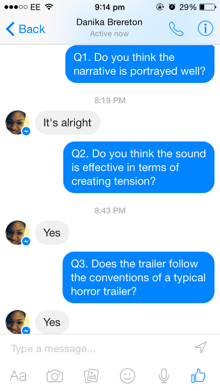
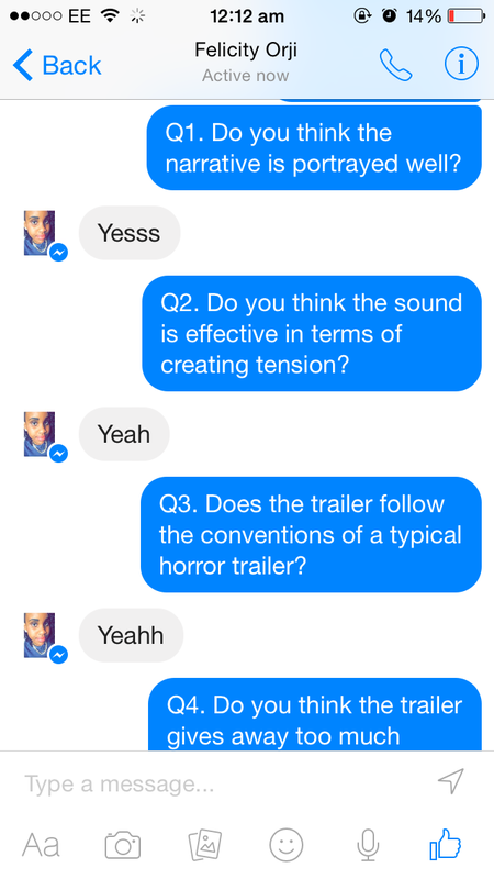
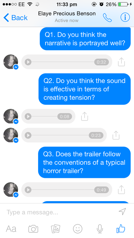
as well as being our two major film influences, we also designed our trailer to be similar to these; not only for the narrative but the pacing and the type of shots used. in the 'i spit on your grave' trailer the pace was fairly slow but then gradually got faster and faster as the disequilibrium takes place. we also noticed that the resolution of the film is not shown which is something our target audience wanted for our trailer. in the creation of our trailer, we used that trailer as a template to follow so that we knew where to put our captions and what type of shots would be most suitable in order to obtain a professional looking trailer. for the trailer, we asked 7 people (6 people using facebook and 1 video interview) 10 questions on their opinions of our final horror trailer. we even received feedback through voice notes on the facebook messenger and we thought that was another good method of collecting feedback because it allows our target audience to elaborate more on their opinions.
|
|
|
questions
|
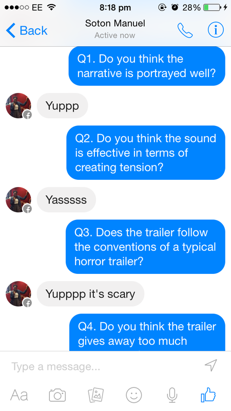
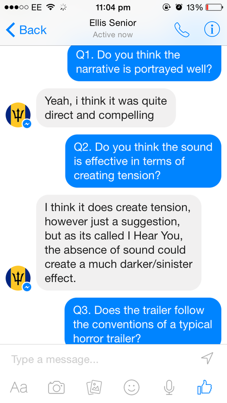
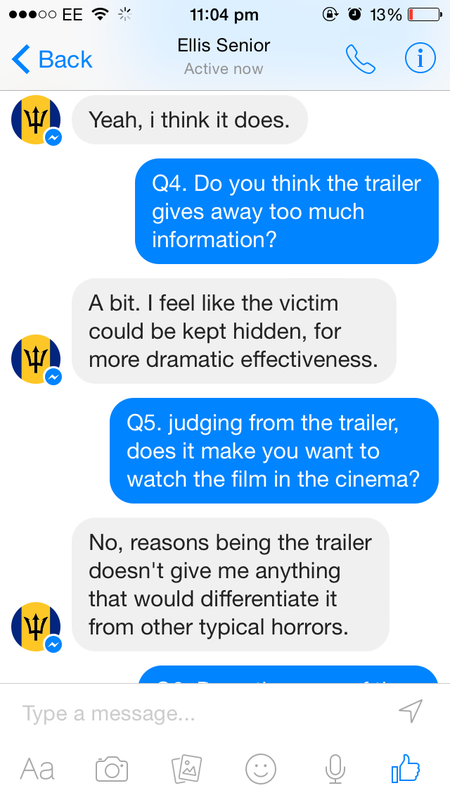
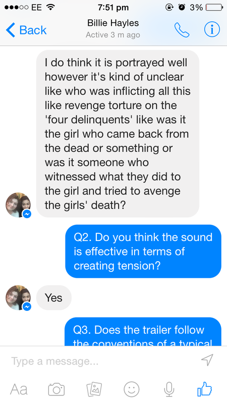
1) do you think the narrative is portrayed well?
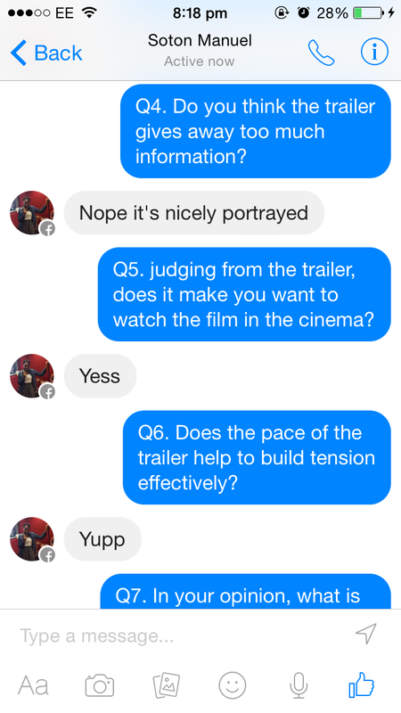
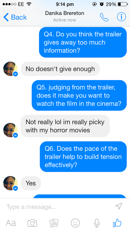
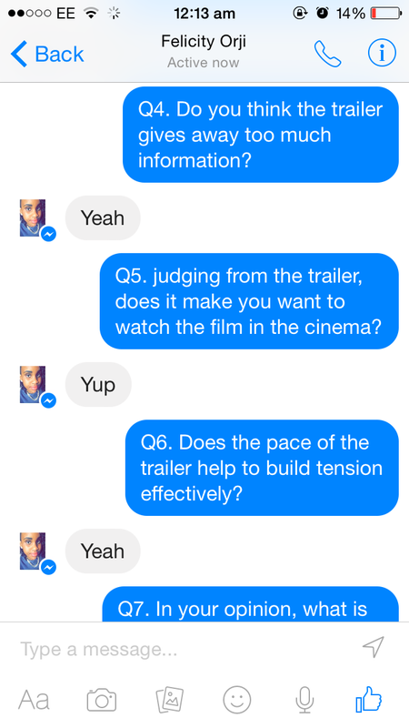
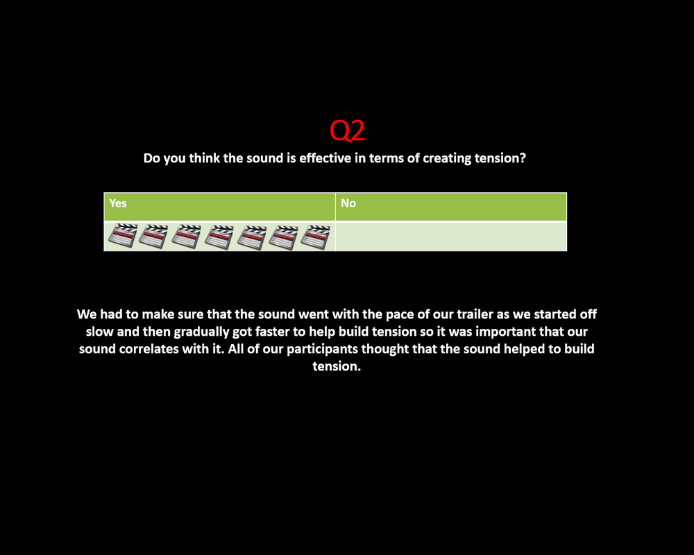
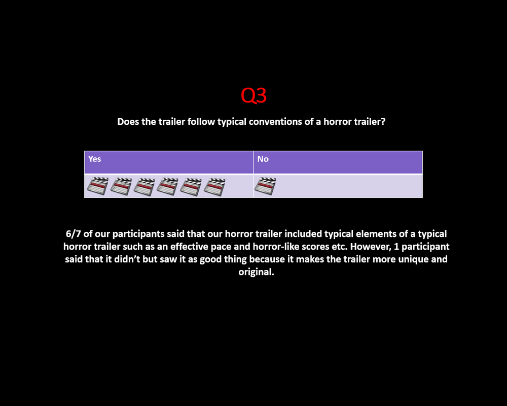
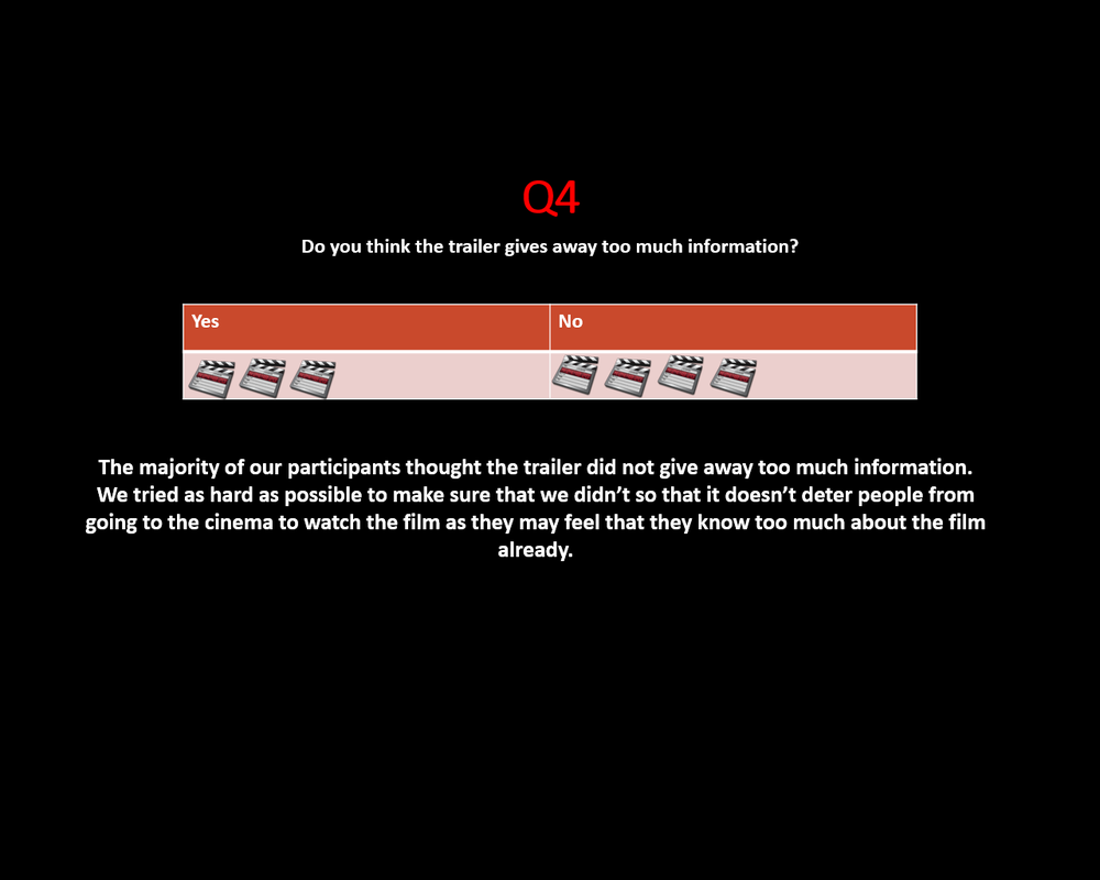
A) yes B) no 2) do you think the sound is effective in terms of creating tension? A) yes B) no 3) does the trailer follow the conventions of a typical horror trailer? A) yes B) no 4) do you think the trailer gives away too much information?
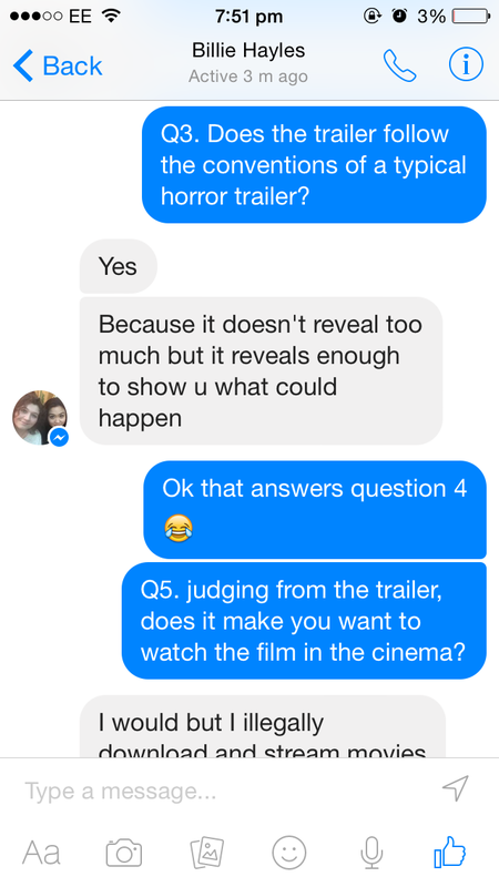
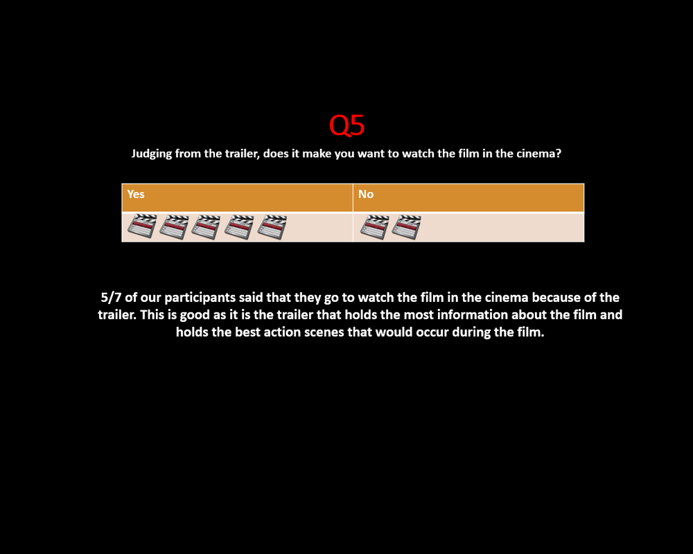
5) judging from the trailer, does it make you want to watch the film in the cinema?
A) yes B) no |
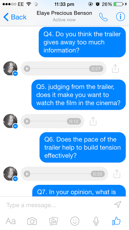
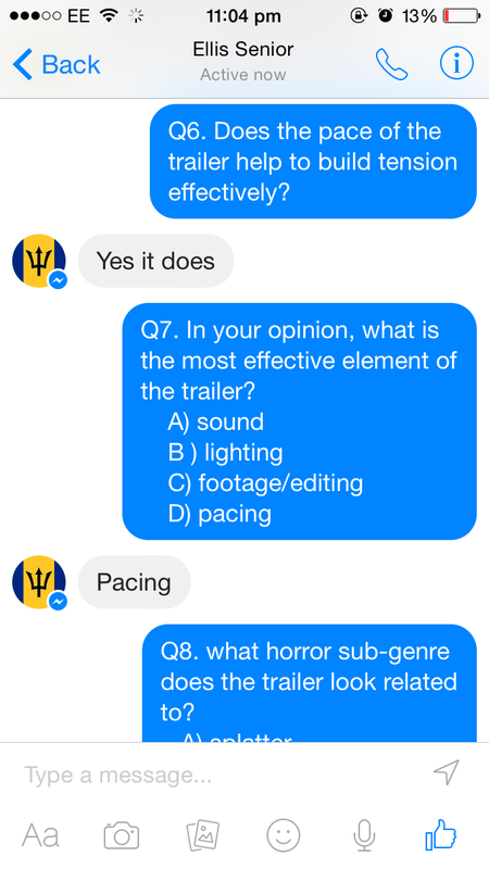
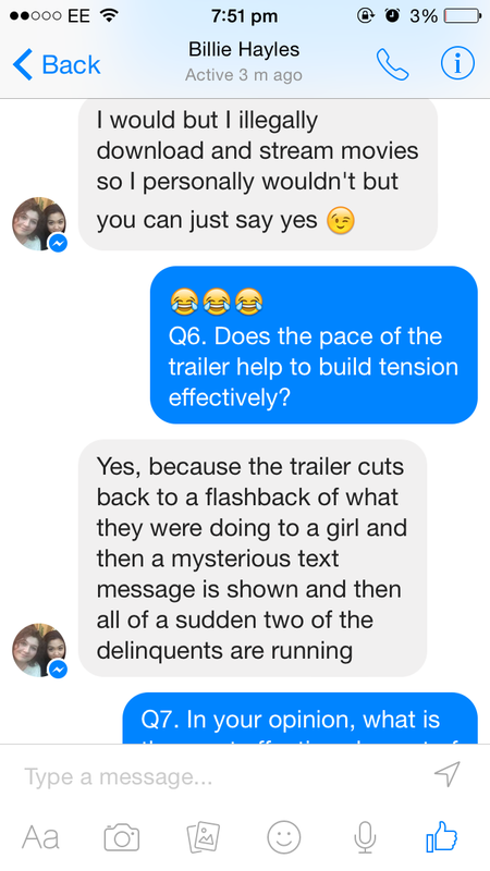
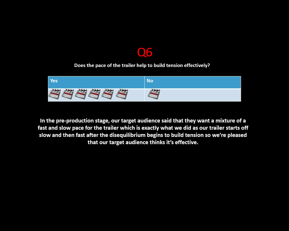
6) does the pace of the trailer help to build tension effectively?
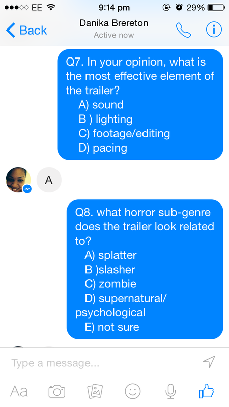
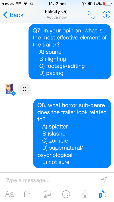
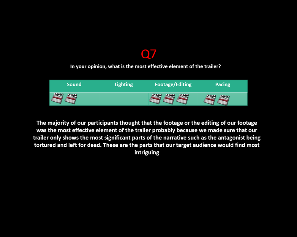
A) yes B) no 7) in your opinion, what is the most effective element of the trailer? 
A) SOund B) lighting C) Footage/Editing D) Pacing
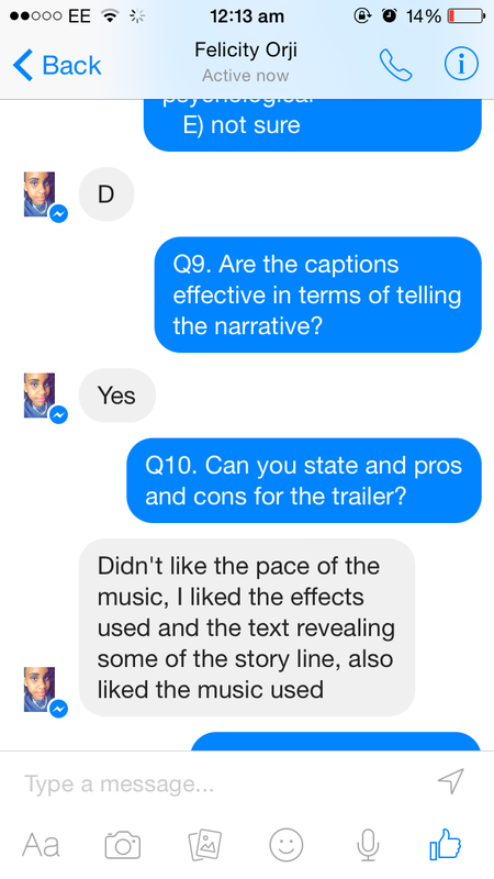
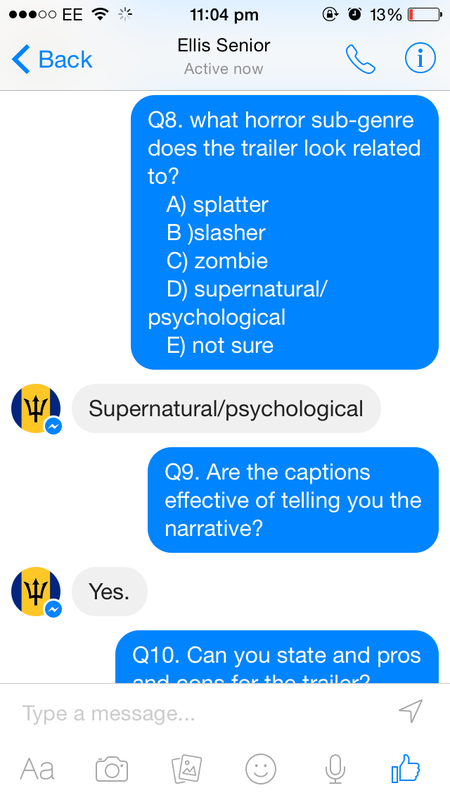
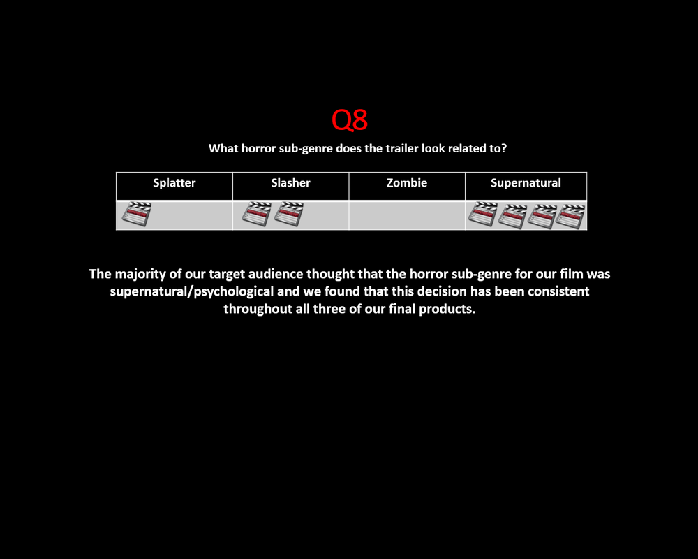
8) what horror sub-genre does the trailer look related to?
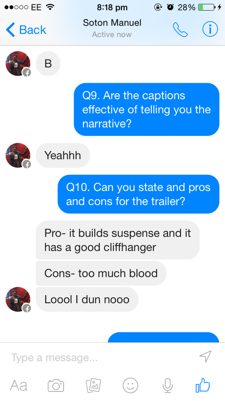
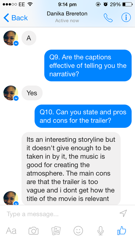
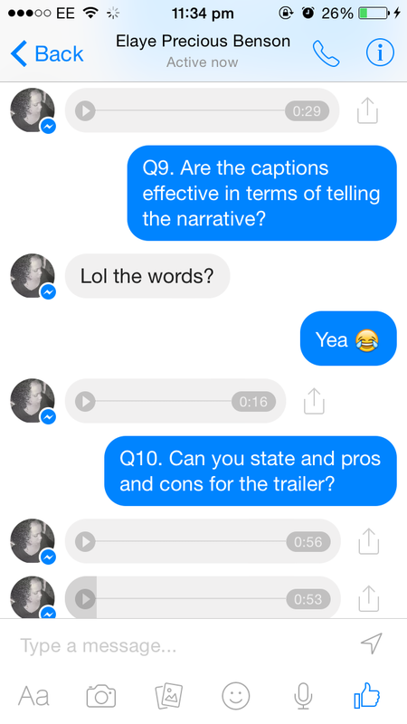
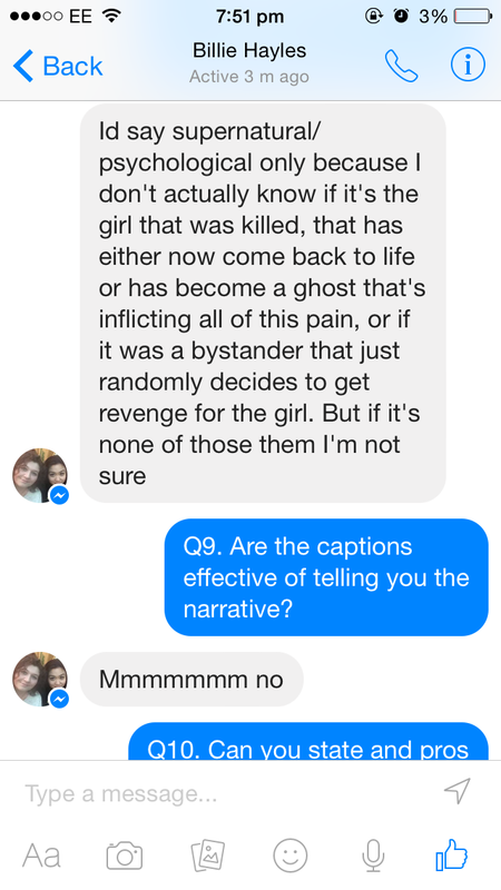
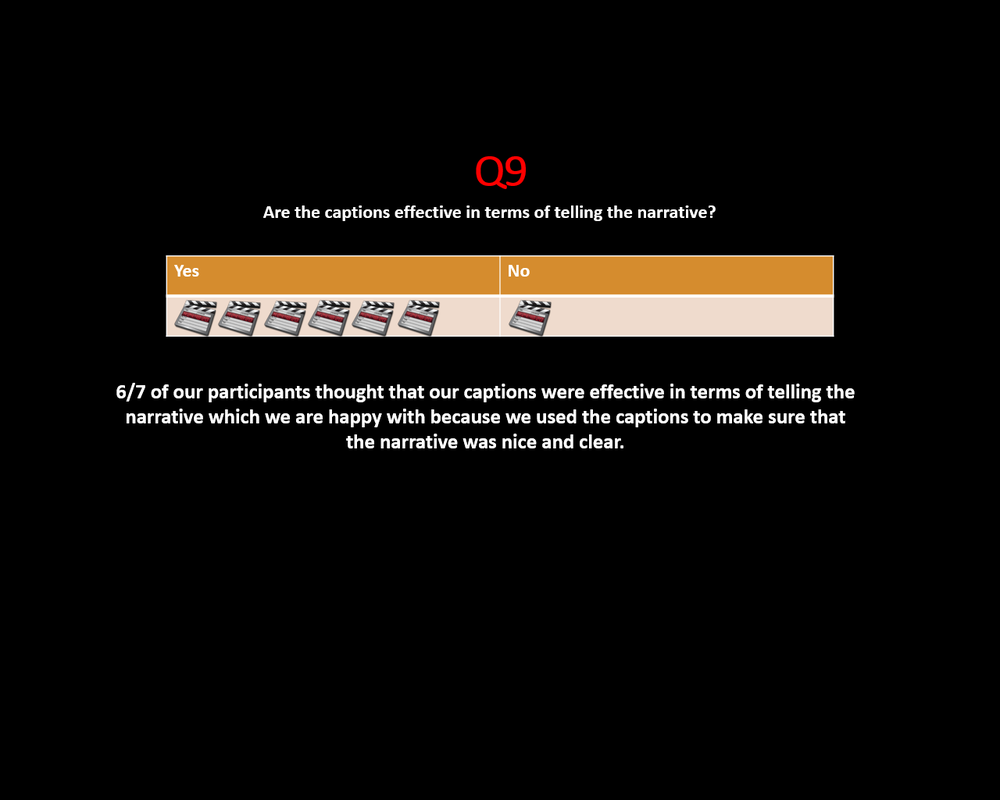
9) are the captions effective in terms of telling the narrative?
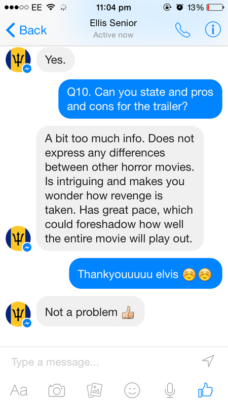
A) yes B) no 10) can you state any pros and cons for the trailer? ___________________________________________________________________ ___________________________________________________________________ |
responses

Facebook
|
1
3
|
2
4
|

|
5
|
6
|

|
|
|

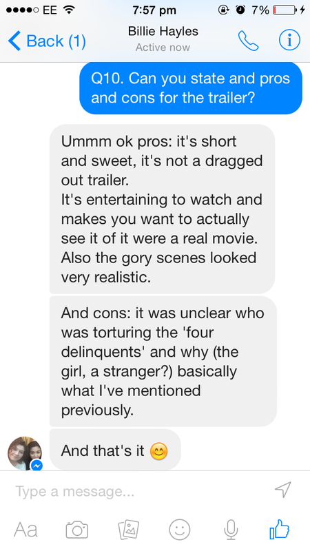
nas particularly liked the torture scenes towards the end of the trailer where one of our protagonists are being tortured in the design & technology room as there were three shots showing her pain. she also liked the shot in the changing room where it has 'i hear you' written on the doors in blood which she also says effective as it helps to portray the sub-genre of our horror film. however, she thought the flashback scene of our antagonist's head being smashed against the lockers looked too unrealistic which we thought might be an issue as some may find the scene humorous so our trailer may not reach its full potential as a horror film trailer
Evaluation
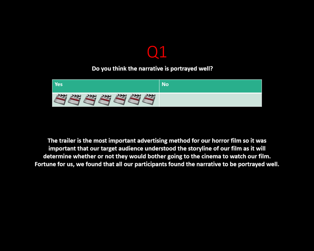
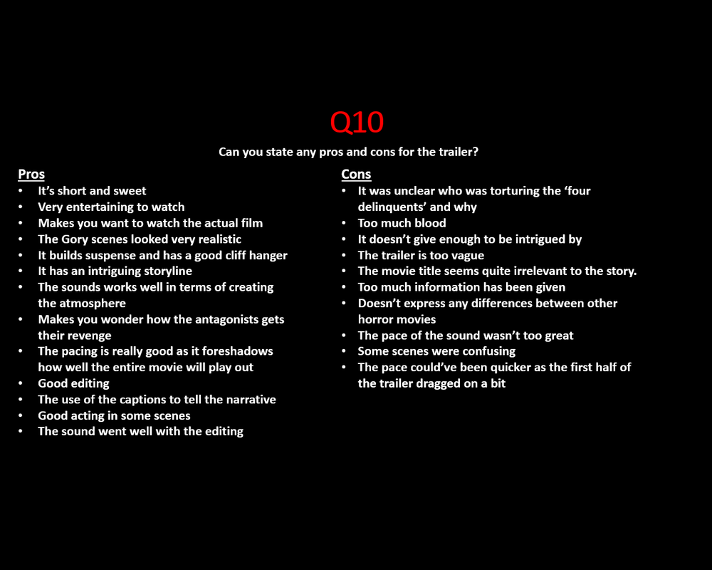
just like our horror poster and horror magazine, the majority of our target audience thought that our horror film was the supernatural/psychological sub-genre when it was in fact of the splatter sub-genre. this may be because we noticed that our trailer lacked some elements in it that would make it seems like a splatter movie. the only obvious splatter elements would be the dripping blood off the table and 'I hear You' written with blood in the changing rooms that our antagonist was tortured in -this shot seemed to be our target audience's favourite scene. however, certain aspects of the narrative in the trailer were vague. for example, one of our participants said that it was unclear who the four delinquent's were being tortured by which seems fair as we were unable to get a shot of our antagonist 'in action'. also, the trailer seemed a bit vague and cliche so may not appeal to our entire target audience. if we were to do our trailer again, we would aim to obtain as many relevant shots as possible (i.e our antagonist 'in action') and make the credits at the end of the trailer more visible in terms of size. overall, we had a good time filming the trailer and engaging with our actors and actresses so we are happy that our target audience were pleased with the outcome.

|
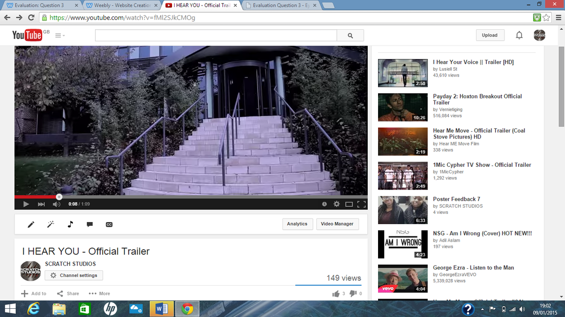
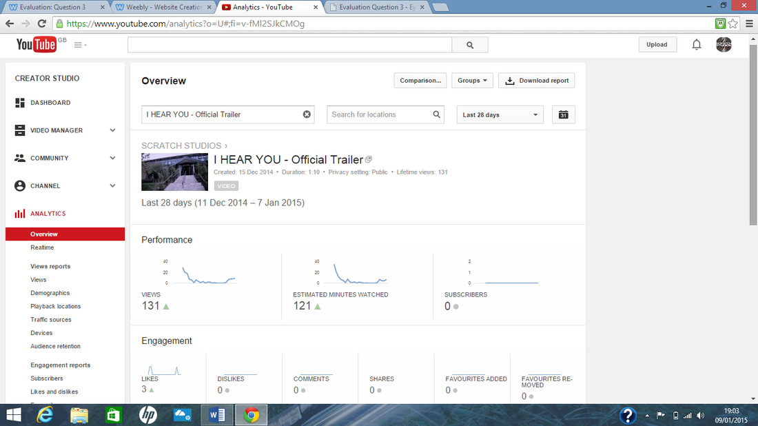
as well as uploading our horror film trailer to youtube, we were able to collect various data and statistics from the overview section. we managed to obtain over 100 views and 3 likes in the period of about 3 weeks which we think is quite good. we used various social media such as facebook and twitter to advertise our final product where we simply posted the link and told people to watch our trailer. |
|
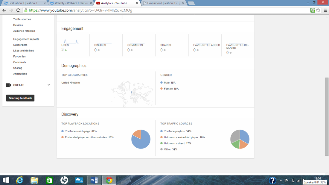
the statistics included things like the location of our viewers and how they accessed our trailer. the discovery sections shows that 82% of the people who watched our trailer accessed it directly from youtube while the other 18% accessed it through an embedded link on social media. this matters because it is evident that using youtube is very helpful and important in terms of easy advertisements but social media also helps to some extent. we found that all our viewers were located in the UK. |
|
overall conclusion
Overall, we've had a tough but enjoyable experience creating our three final products where we obtained valuable skills like using photoshop and operating a professional camera whilst working together as a team. from our audience research in both the pre-production and post-production stage, we have learnt the importance of the opinions of our target audience in order to obtain successful final products although we incurred a few minor changes such as the font for the masthead of the magazine to make it stand out more and the close-up shot for the poster instead of the magazine and a mid-close up shot for the magazine instead of the poster. even though we did not got through with 100% of the suggestions, we were pleased to find out that our target audience was pleased with our decision to make the minor changes we did.

