
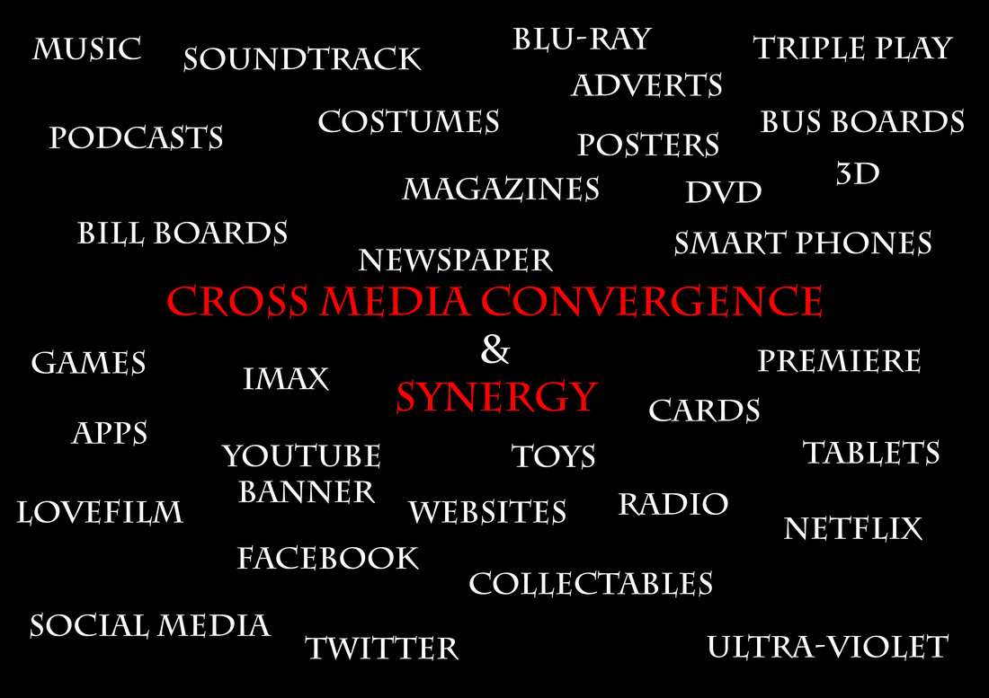
We’ll be looking at the promotion/cross media convergence (CMC) & synergy of real media texts and look at how we've done the same.
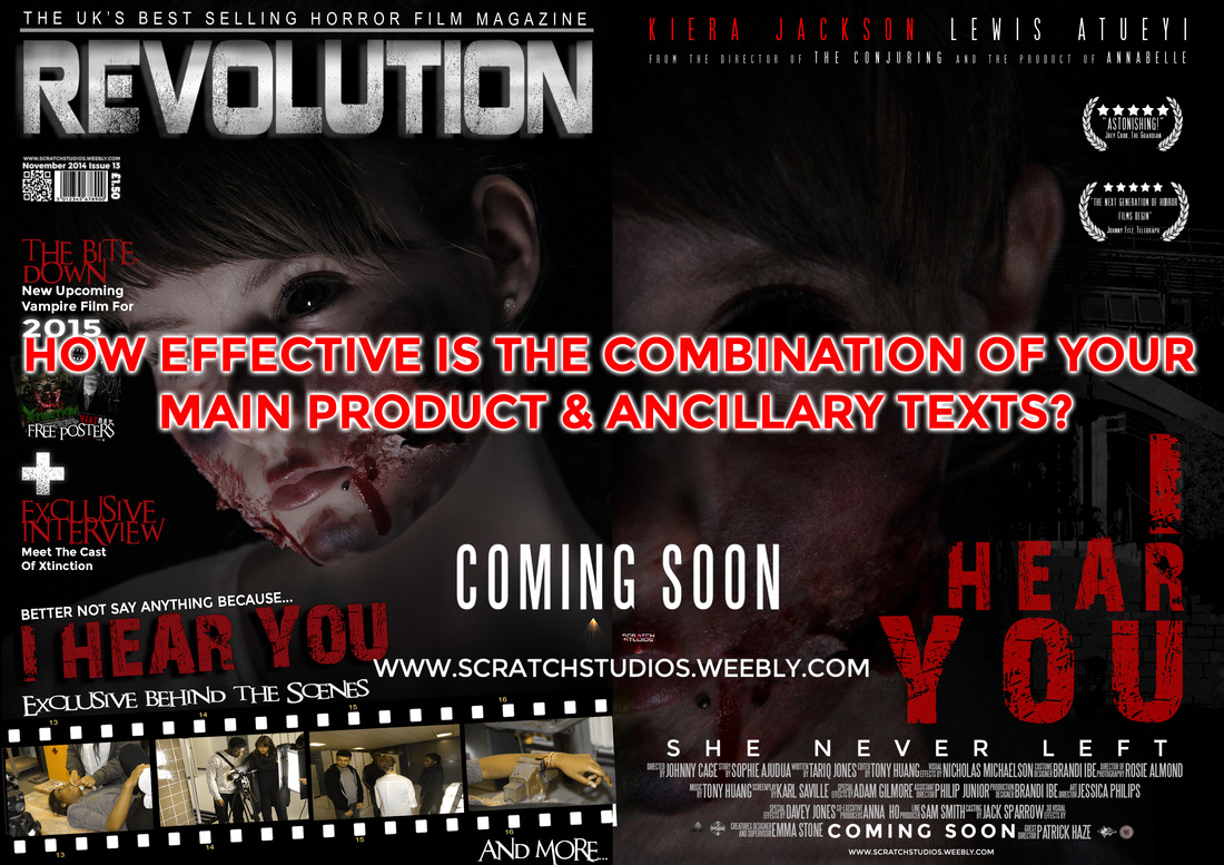
WE'LL BE COVERING HOW OUR MAIN PRODUCT (TRAILER) AND ANCILLARY TEXTS (Poster & Magazine) can be USED COHERENTLY through different media platforms. Examples would be Buying out YouTube banners, creating a website for the film, billboards, bus boards and TV/YouTube adverts.
A significant part of cross media Convergence & synergy is the brand identity and continuity. The use of the same conventions through out each product so the audience can recognize that it's all part of the same package/franchise.
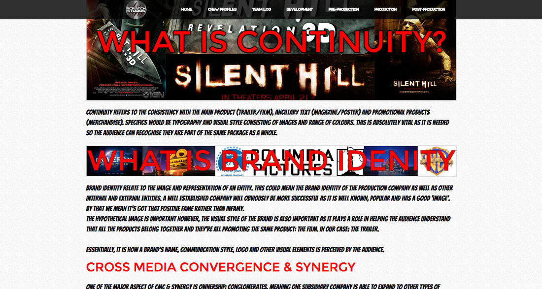
Continuity refers to the consistency with the main product (trailer/film), Ancillary Text (Magazine/poster) and promotional products (merchandise). Specifics would be typography and visual style consisting of images and range of colours. This is absolutely vital as it is needed so the audience can recognise they are part of the same package as a whole.

Brand identity relate to the image and representation of an entity. This could mean the brand identity of the production company as well as other internal and external entities. a well established company will obviously be more successful as it is well known, popular and has a good 'image'. by that we mean it's got that positive fame rather than infamy.
the hypothetical image is important however, the visual style of the brand is also important as it plays a role in helping the audience understand that all the products belong together and they're all promoting the same product: The film. in our case; the trailer.
Essentially, it is how a brand's name, communication style, logo and other visual elements is perceived by the audience.
Cross Media Convergence & Synergy
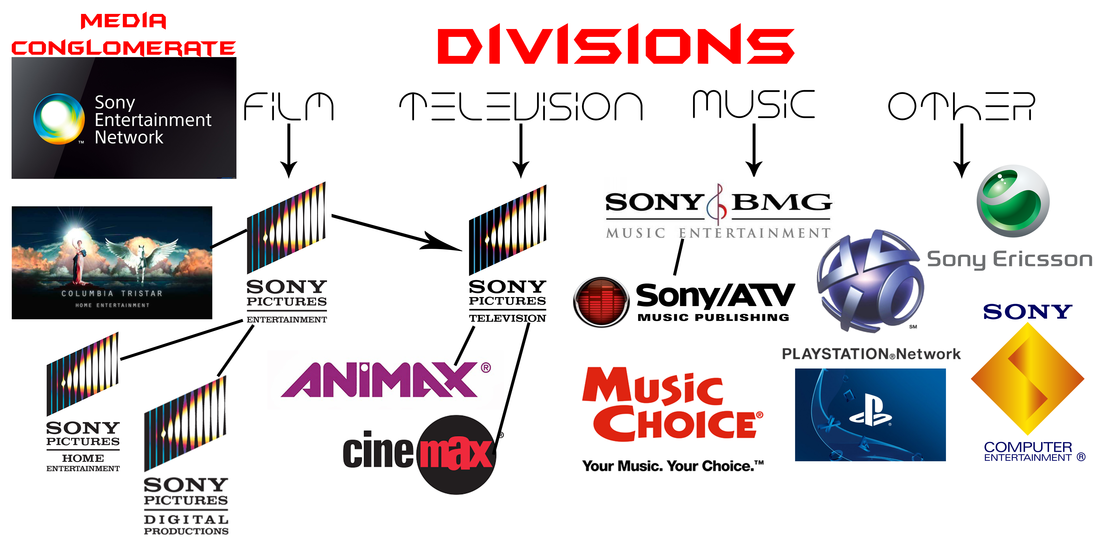
One of the major aspect of CMC & synergy is ownership: Conglomerates. Meaning one subsidiary company is able to expand to other types of industry to market and distribute as well as creating more merchandise. This is also known as horizontal integration.
Here is an example of Sony's horizontal integration with Sony Entertainment Network being the conglomerate with its different divisions.
With horizontal integration, you can create promotional products along with the main product and ancillary text to help promote the film. From the film division, if Sony wish to, they can put money into creating more merchandise to advertise the main product (film) as well as gaining more profit.

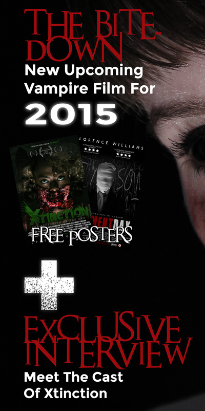
Example of how the hunger Games franchise created more merchandise and used other industries such as subway to create more products to sell and advertise.
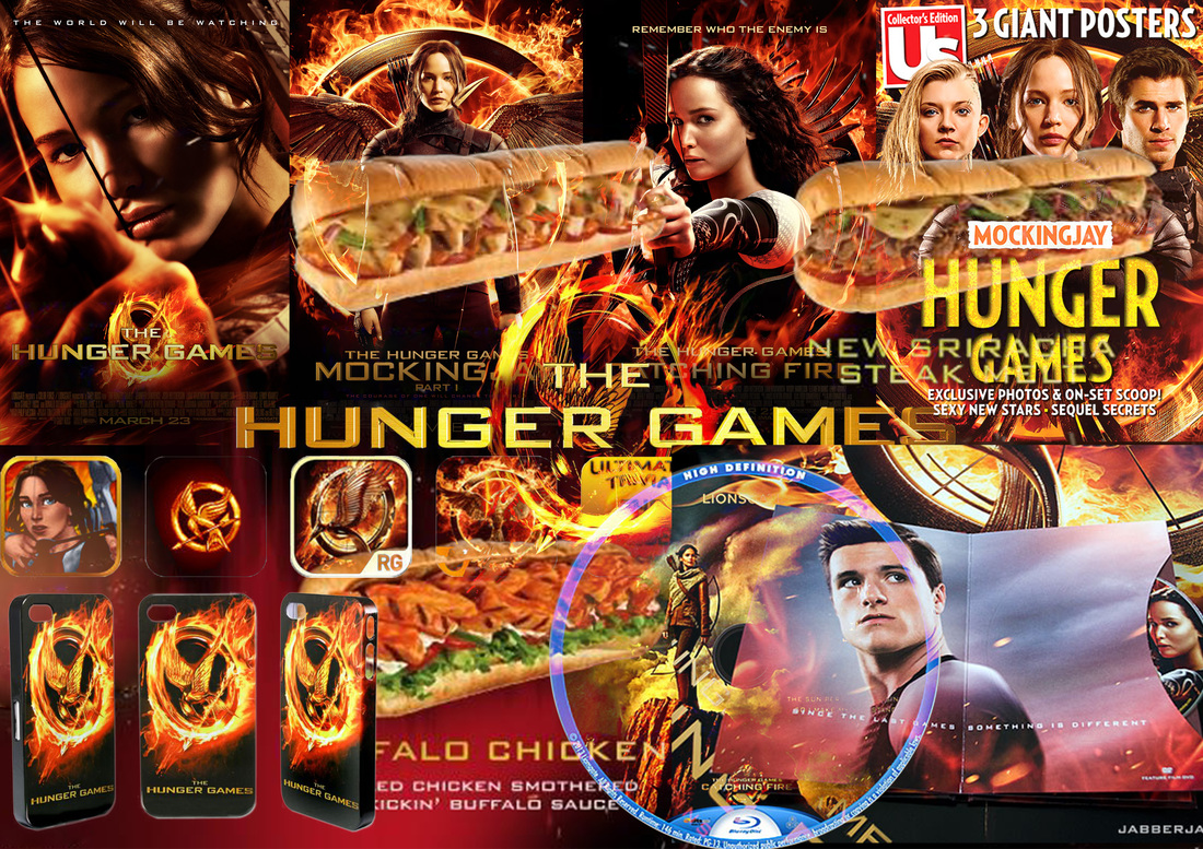
Ideas for products used in CMC & Synergy


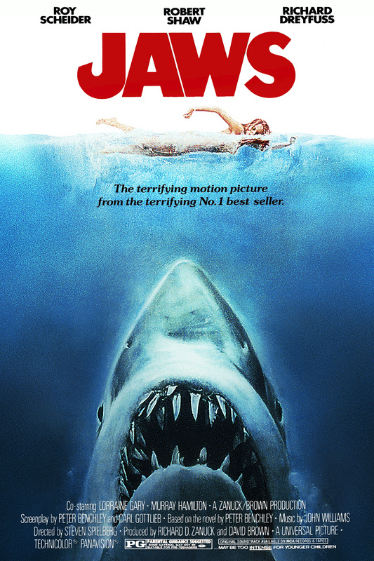
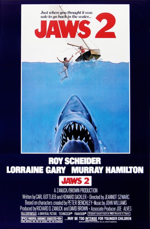
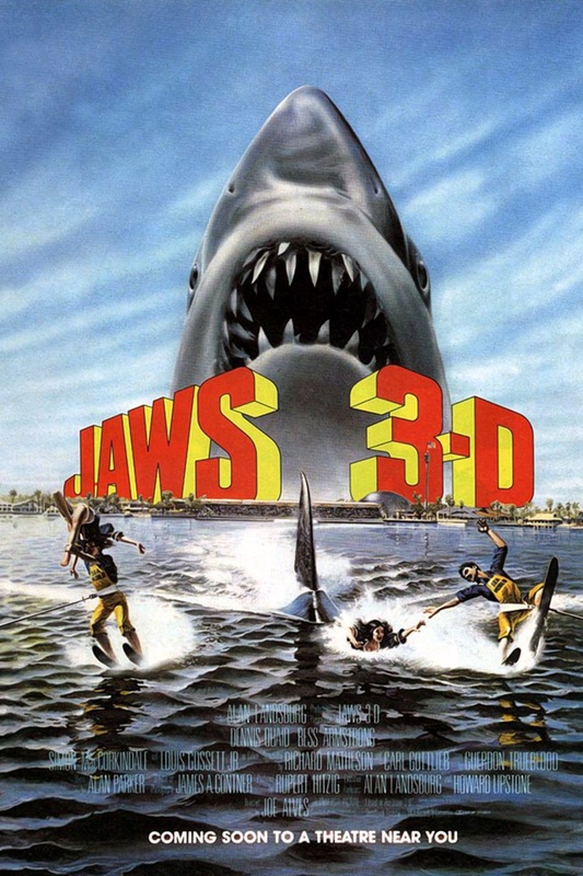
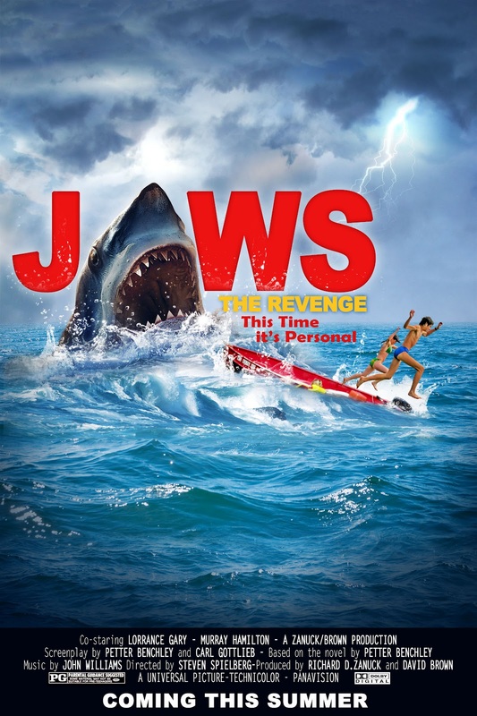
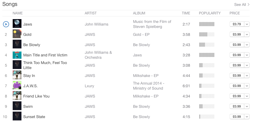
Jaws is an american franchise which started with a 1974 novel that then was depicted into four films and became the father of summer blockbuster films. Distributed by Universal Studios one of the major six of today's film institutes. the first Jaws film directed by Steven Spielberg was the most successful out of the franchise grossing over $260 Million. The success of the first Jaws film led to three sequels, which have amassed almost $800 million worldwide in box office gross. it's a good example of successful use of CMC and Synergy because it has got its very own theme park over in Orlando Universal studios with other tie-in merchandise such as the video game "Jaws: unleashed".
|
|
|
|
|
|
|
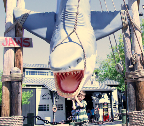
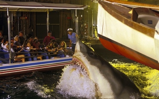
Jaws Theme park Universal studios Orlando
|
not only With the profit they gained from the whole jaws franchise but from the famous universal studio, they had the luxury to create their very own jaws theme park. Around the theme park are a lot of jaws related merchandise such as toys and jumpers. The iconic great white shark was used as the center of attention and their main marketing tool. one of the main attractions is the Jaws ride which featured a shark mechanical shark popping up and Striking disaster to the boat. |
|
|
Unfortunately By early 2012, the theme park closed to make way for a new attraction: harry potter's Diagon alley.
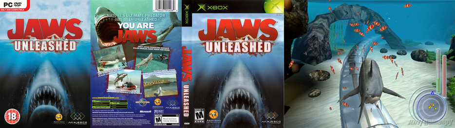
Jaws: Unleashed (2006)
Jaws: Unleashed is a video game created in 2006 inspired by the motion picture: Jaws (1975). it goes to show that even after 30 years since the first jaws, the franchise still seemed to thrive into the early 21st century. On the other hand, it's to be expected as it was the beginning of the age of technology.
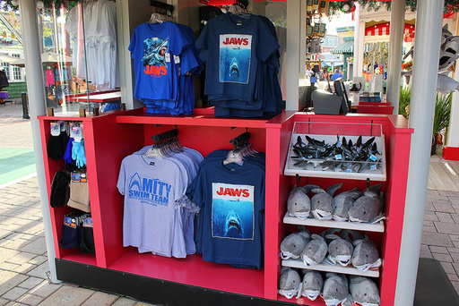
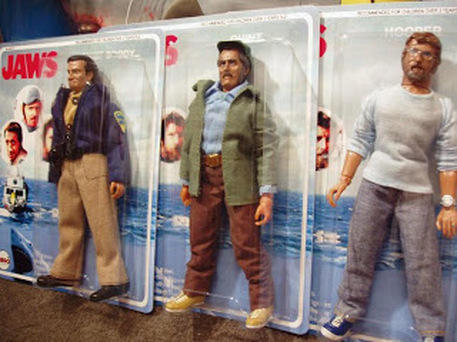
Along with the whole theme park, you can get promotional merchandise. You can recognize the iconic image of the great white shark used in the posters many times to establish this continuity. In addition to the red font of the 'Jaws' title that's very recognizable.
music soundtrack
|
|
|
|
One of the most iconic things about jaws other than the great white shark is the music that coincide with it. The Jaws theme song from John Williams became a renowned piece of soundtrack known to everyone. |
|

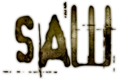
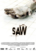
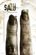
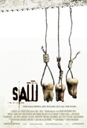
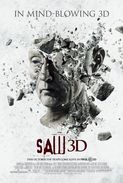
the advent of the saw franchise when comparing CMC & Synergy is to be expected as saw is by far one of the best examples. Produced by Twisted Pictures and distributed by lions gate Entertainment, one of the mini major studios. the whole franchise featured 7 movies in total in addition to it's own merchandise and entertaining rides.
|
|
|
|
|
|
|
|
|
|
|
|
|
|
|
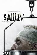
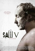
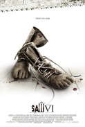
Over the years, the Saw franchise has expanded into a notable franchise that spread across the globe. Their use of CMC & SYnergy is far the most effective of any horror film to date. The continuity they've kept using the same font through the products especially Saw V trailer which looks as if it's specifically created to emphasize and re-enforce the consistency.
|
|
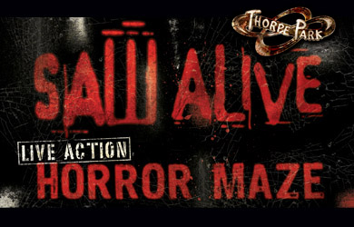
Saw The ride is the first and only horror-film themed roller-coaster in the world to date. With lions gates budget and incoming profit from the franchise, they had the luxury to create their own ride in Thorpe park. due to the brand and identity of the Saw franchise, advertising Saw - the Ride was a particularly easy job as it's already renowned for the 6 films before the release of Saw 3D. |
|
The saw maze comes as a complimentary entertainment for the saw - the ride as the rides are placed fairly close together. This creates that saw theme and atmosphere around the ride before even getting on/in. Although make no mistake, this attraction alone immerses you into the Saw world with sets recreated from the movies.
|
|
|
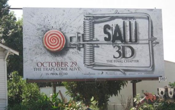
With lions gate distributing the saw franchise, they used billboards to advertise their movie. They went with a similar look as the posters again to be consistent and re-enforce the fact that they're promoting the same thing. the grey background with dirt splatter texture not only fits the saw franchise styling but also sums that it's a splatter film filled fluids for those who don't know about the Saw franchise. |
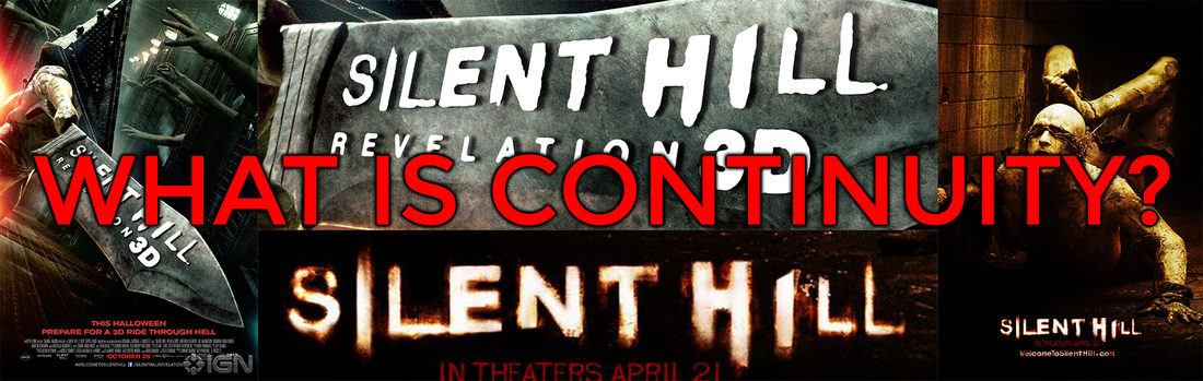
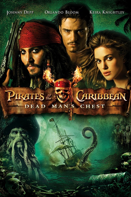
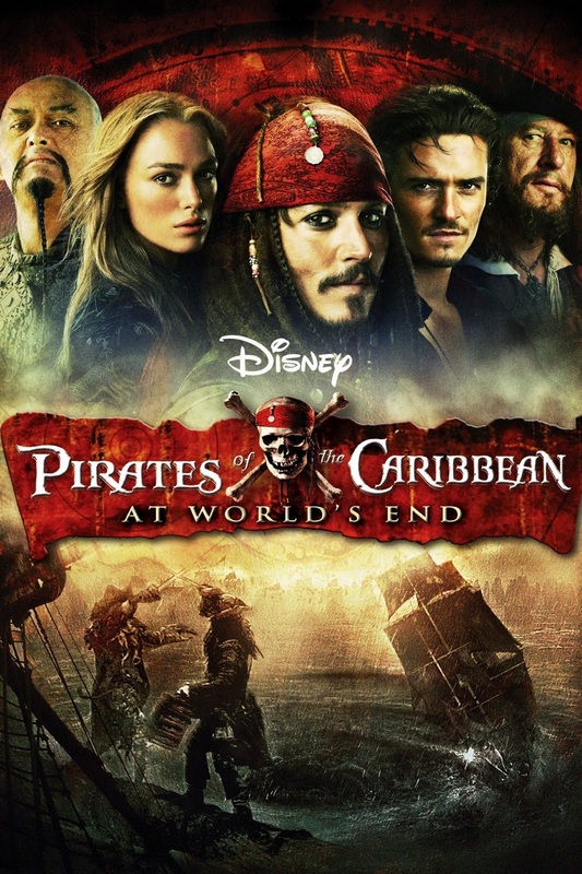
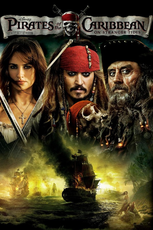
Examples of Continuity ...
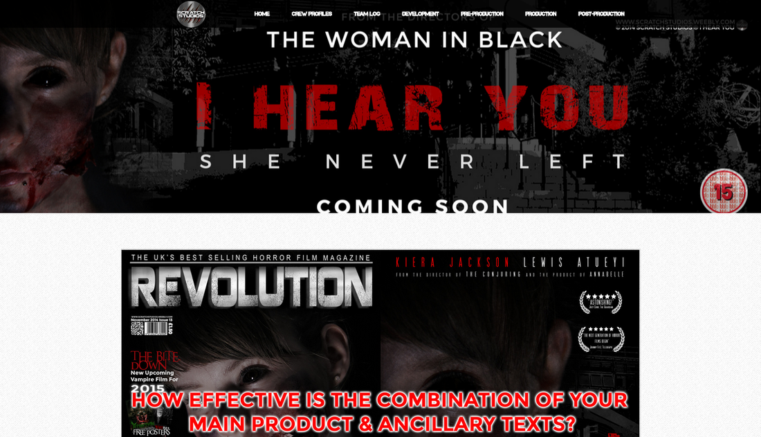
As we have already established, Continuity is the consistency of the conventions throughout all of its products ESPECIALLY THE TRAILER, MAGAZINE AND POSTER. FOR EXAMPLE BELOW:
|
|
|
|
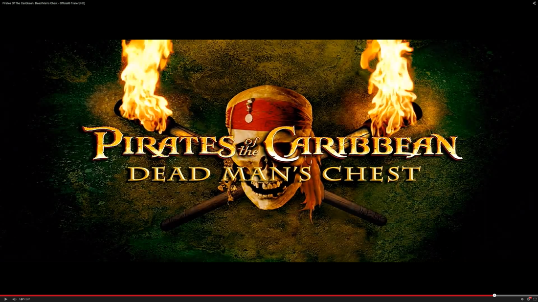
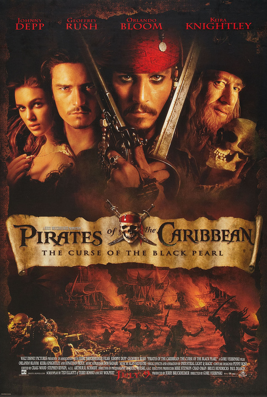
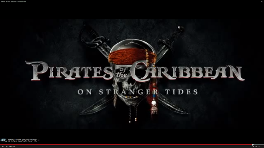
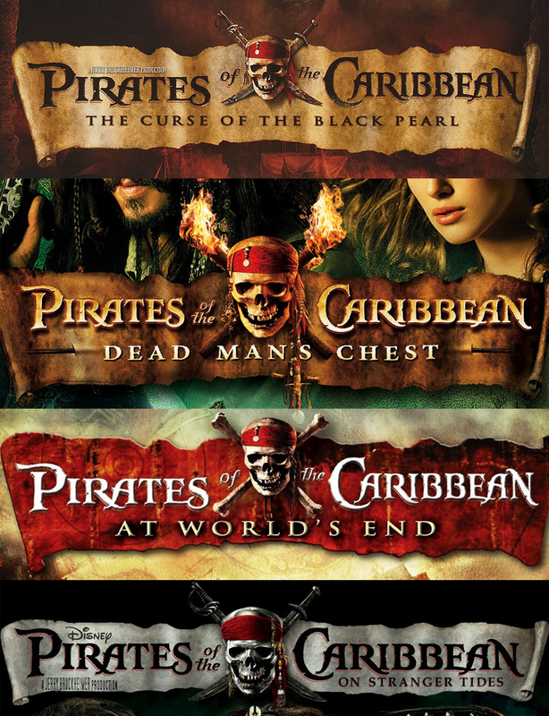
The title for the pirates of the Caribbean has kept the same style throughout all their posters. with a little variance of the skull in different lighting and the old parchment as the background.
|
|
brand identity
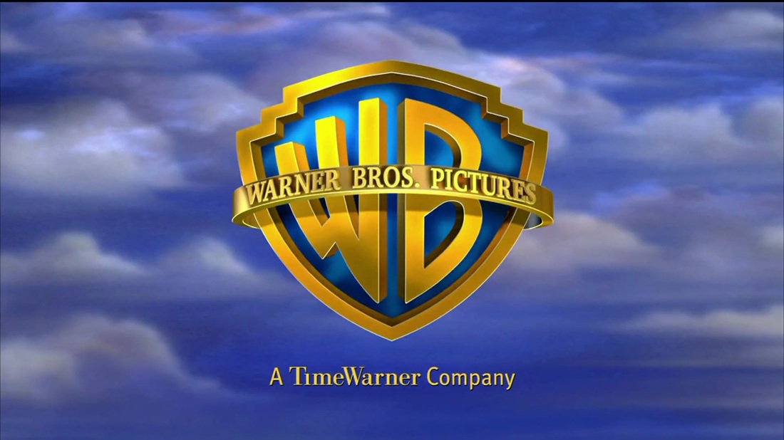
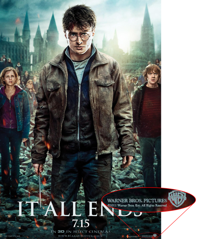
One recognizable thing about a film is the introduction where the films' studios and supporting companies display. Example: Warner Bros pictures.
|
|
|
|
due to Warner Bros pictures being a well established Major film studio. the audience will automatically think that this is a good film due the fact that Warner bros pictures is one of the big six film studios. Therefore, it will be great because it's owned by a big conglomerate who will put a lot of time and money into the film. That's one way of viewing brand identity.
|
|
|
|
|
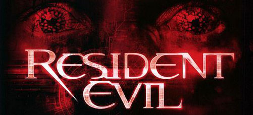
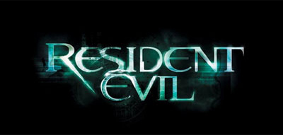
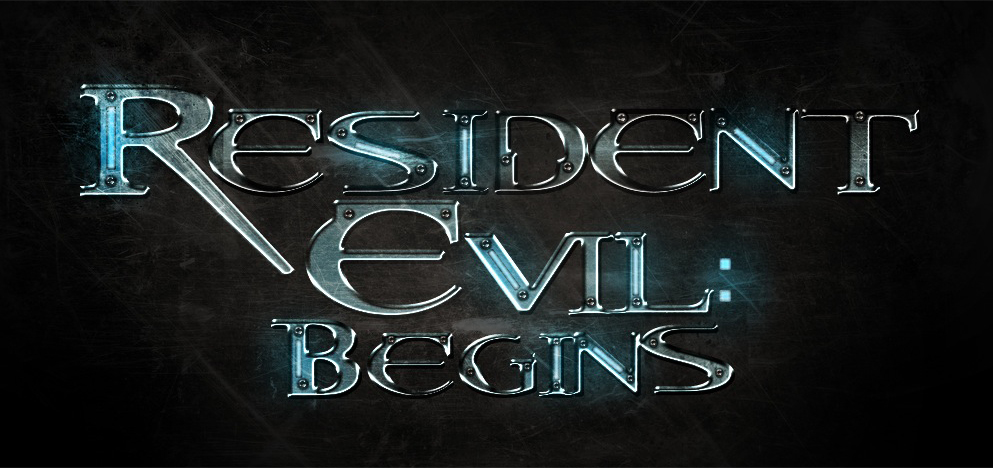
Another way of view brand identity is the film itself or franchise. Even since before the films came out, Resident Evil has a well known brand identity due to it's game franchise starting in 1996. With this background, the audience already knew what to expect from the films but just not to what extent the films could bring. Even without the games franchise, the resident Evil films were quite successful as it released a total of five films as a franchise. Resident evil is the most sucessful based on a video game as it grossed a total of $915 million worldwide.
Trailer & poster
|
|
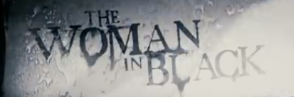
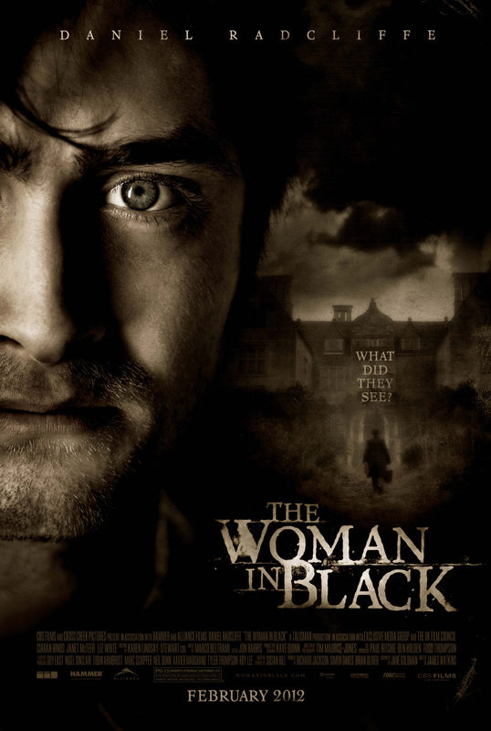
Font: The font is similar to your average serif font used in most horror because it has already established this traditional horror feel to it. Generally, the serif font connotes that the film will be set in an older generation where the world isn't as developed as it is today which is complimentary as the font itself is an old style.
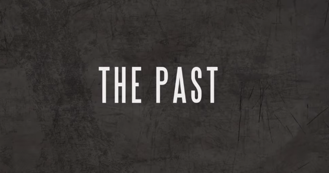
The font used in the trailer is exactly the same font used on the poster. although not much text features in the trailer, the fonts are indistinguishable hence has effectively achieved continuity between the poster and trailer. this also helps to construct the brand identity of the film especially if it becomes a franchise. remarkably, the recent release of "The Woman in Black 2: The angel of Death" indicates it may be starting it's path into a franchise.
The font used in the trailer is exactly the same font used on the poster. although not much text features in the trailer, the fonts are indistinguishable hence has effectively achieved continuity between the poster and trailer. this also helps to construct the brand identity of the film especially if it becomes a franchise. remarkably, the recent release of "The Woman in Black 2: The angel of Death" indicates it may be starting it's path into a franchise.
Colour Scheme: the colour scheme of the poster is that of a dirt colour/texture. similar to white fabric being integrated with dirt that creates this sort of colour. On the other hand, one can connote that it's a old film (celluloid) style used in the poster creating a sense that it is before the creation of coloured photos. additionally, the trailer featured photos of similar styling which portrays the continuity between trailer and poster.
Characters: Majority of the time the poster would preview the character or at least hint to the existence of one. this does both. the person in the poster is the protagonist as featured within the trailer and in the background is a silhouette of someone. Ironically, that's the main plot of the film the protagonist is being haunted by "The Woman in Black".
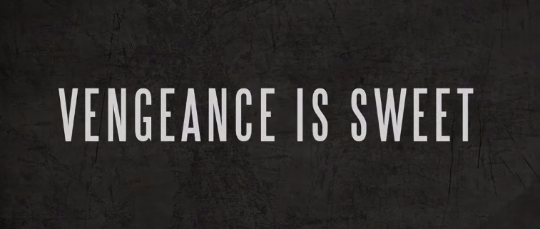
"during afternoon tea, there's a shift in the air, a bone trembling chill, that tells you she's there, there are those who believe, that the whole town is cursed, but the house in the marsh, is by far the worst, What she wants is unknown, But she always comes back, The spectre of darkness, The Woman in Black."
Characters: Majority of the time the poster would preview the character or at least hint to the existence of one. this does both. the person in the poster is the protagonist as featured within the trailer and in the background is a silhouette of someone. Ironically, that's the main plot of the film the protagonist is being haunted by "The Woman in Black".
"during afternoon tea, there's a shift in the air, a bone trembling chill, that tells you she's there, there are those who believe, that the whole town is cursed, but the house in the marsh, is by far the worst, What she wants is unknown, But she always comes back, The spectre of darkness, The Woman in Black."
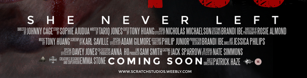
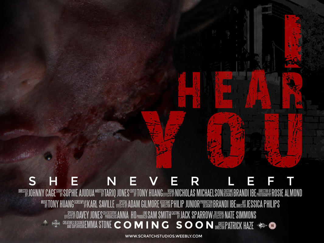
Our Poster and trailer
|

|
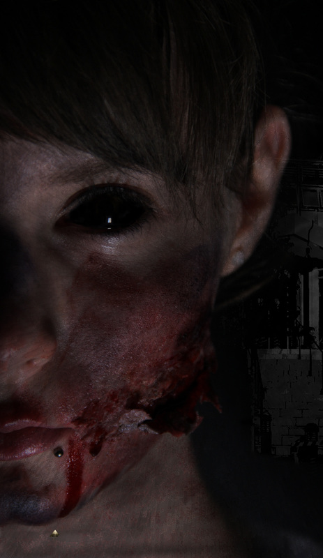
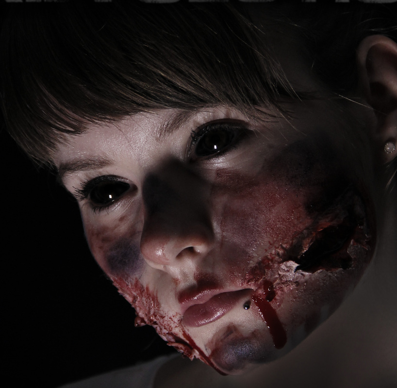
The character in our poster & trailer have been very clearly entrenched; The main image is a close up of our antagonist, a long cut of our antagonist at the beginning of our trailer. Despite being the main focus in our poster and trailer, we kept appearances of this character rather low as frequent shots of her in our trailer would give away too much information as to what else happens in the film.
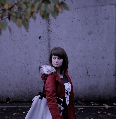
AS it is a horror film we had to colour correct so there aren't many bright colours and keeping saturation to a bare minimum hence why the trailer has this sort of blue tint to it.
AS it is a horror film we had to colour correct so there aren't many bright colours and keeping saturation to a bare minimum hence why the trailer has this sort of blue tint to it.
|
|
|
|
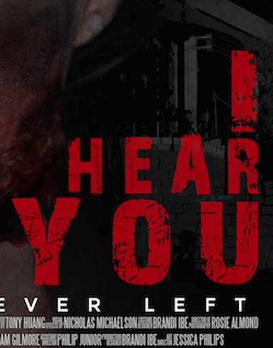
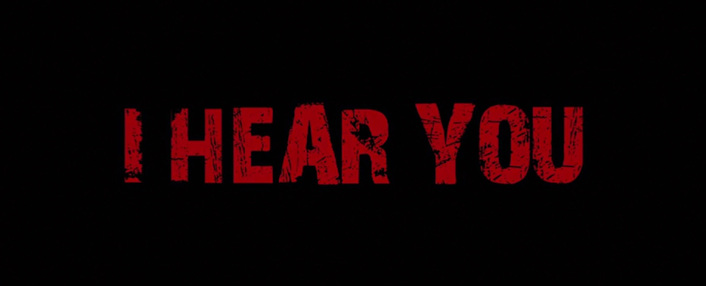
The font used for the title in our trailer and poster are identical in order to preserve the continuity so that the audience will recognise that it's the same film. The font used for our film title is called "28 Days Later" which is somewhat graphic, desolated font. as the font name references, it's citation from the "28 days later" zombie film set in a apocalyptic world.
trailer & magazine
|
|
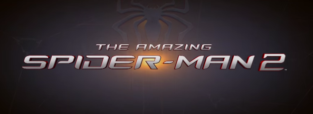
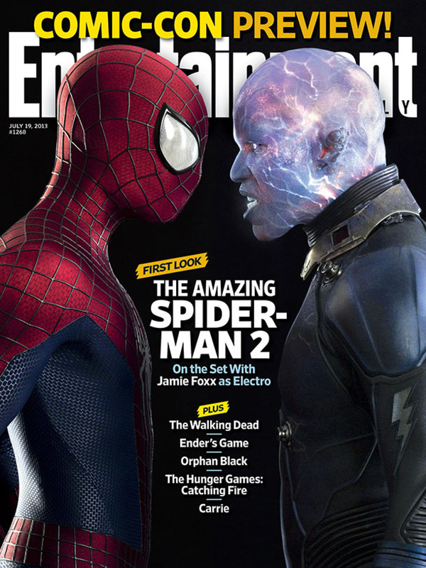
Typography: After looking at existing magazines & trailers, we saw that very few use the exact same typography in the magazine as they do in their other products. in this case, They haven't used the same typography at all. although they did use san serif typeface for both the trailer and magazine to try and at least keep the consistency see up. although for a film like "The amazing spider-man 2" the consistency of typography wasn't too significant as they've already established that brand identity due to it's first film, Sam raimi's spider-man franchise and the marvel comics.
Character: The main image for the magazine is of Electro: the antagonist and Spiderman: the Protagonist. They both feature in the trailer frequently and is quite obvious the film centres around them considering the trailer is catered to showing their inevitable convergence. The continuity is very clearly display as the characters themselves are the key to establishing that continuity between magazine and trailer.
OUr Magazine & Trailer
|

|
Unlike most films and their magazines, usually title of the film on the magazine is different. On the other hand, we have kept the same typography in order to keep the consistency of the ancillary text and Main product. As the brand identity of our film has not been established yet we want the audience to be able to recognise that this magazine is featuring our film.
|
|
We have a close up of our antagonist for our main image on the magazine front cover. AS the trailer centres around a character that doesn't appear that much through the other half of the trailer, we used the ancillary text to portray to the audience what has become of the antagonist however leaving an open ended idea of what happened. By keeping the same character in both the main product and ancillary texts we've entrenched the continuity between trailer and Magazine.
Trailer & website
|
|
|
Typography: The typography is a serif typeface used coherently throughout the trailer as well as the website. The title from the website is identical to the title in the trailer using the exact same font however nuance colour. Again, the serif typeface is the traditional type of font which generally connotes a less developed society or set in a time that's seen as not contemporary.
as a whole, the serif font retains the continuity between trailer and website.
as a whole, the serif font retains the continuity between trailer and website.
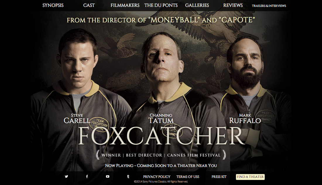
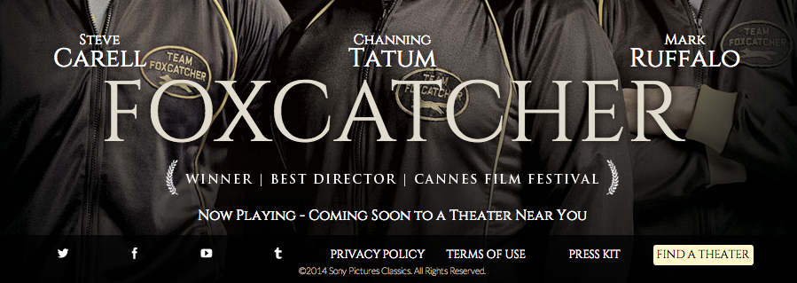
Colour scheme: The colour scheme is similar to the website. not that many lows key lighting in comparison to the trailer however, there is this constant theme of yellow throughout the yellow. You find that there is this constant tone of yellow surround the main characters throughout the trailer apart that's also present on the website. This also maintains the continuity between the trailer and website as it's a matching colour scheme.
Characters: The trailer focuses on Mark & David Schultz and John Du Pont who are the main characters of the film. The same characters and only those characters feature on website as the main preserving the continuity of the trailer and website.
Characters: The trailer focuses on Mark & David Schultz and John Du Pont who are the main characters of the film. The same characters and only those characters feature on website as the main preserving the continuity of the trailer and website.
Our trailer & Website
|
|
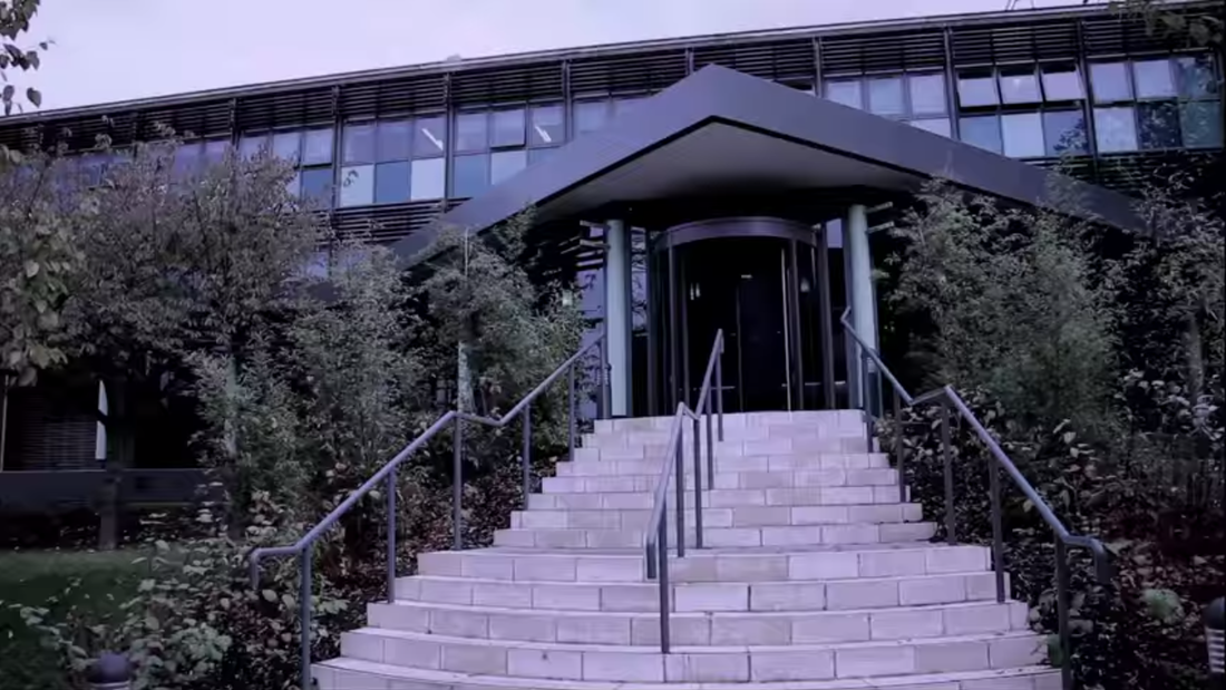
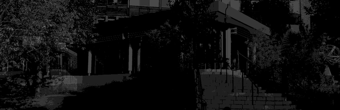
we kept the continuity between the trailer and website by using the same background. although it may not be very clear the background used for the website is the exact same place used for the establishing shot of the trailer. The website is essentially a much darker version of the trailer and is further ahead in terms of timeline thus keeping the consistency of the trailer and website.
|
|
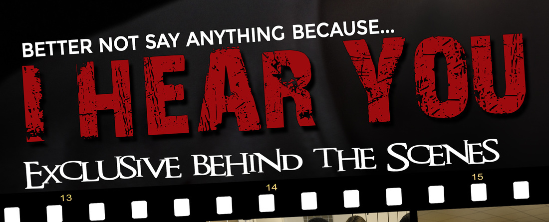
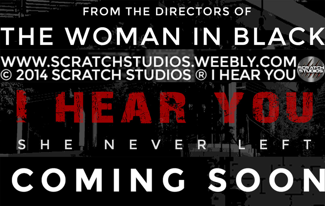
AS you can see the from the captions throughout the trailer and fonts used in the banner, the typography are identical. WE want to keep the consistency through all of our products to maintain continuity as that was key through all our products. the colour scheme is predominantly Red and white; red for the title only and white for the other fonts.
Poster & magazine
|
|
Typography: AS you can see, the typography of the film title aren't the same. After looking at many different film magazines, hardly any magazines used the same typography from the poster and trailer. Instead this magazine featured the iconic costume of the killer of the antagonist(s) for the main image.
Colour Scheme: The colour scheme is very obviously Red, white and black as set firm by the poster. Similarly, the magazine has done the same in order to display the continuity of the two ancillary texts. There are nuances to the colour scheme as it does feature blue and yellow nevertheless, they've made the main colour scheme predominant.
Character: the only character they firmly instigated is the killer. The only other character reference between the poster and magazine are the actor names that are used in the headlines and poster.
OUr poster & Magazine
|
|
|

|
|
Whilst varying in typography for the cover lines, we used the same typography from trailer as we have for the sub-lines. we used the font called "Montserrat" for the captions and sub-lines as we wanted to make explicit to the audience that they're part of the same package.
Unlike most magazines today, the magazine would generally use a different kind of typography for the movie title. in comparison we've used the same "28 days Later" Font to again, entrenched the continuity between our three products.
Poster & website
|
|
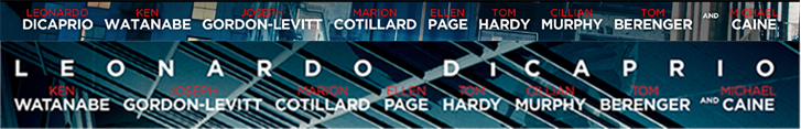
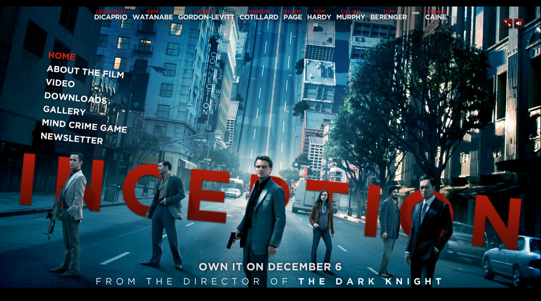
Typography: the typography of the poster and website are the all the same. between only the poster and website, this is by far the best intricately designed products to maintain consistency. The typography for the title seems to be made into 3D and adapts to the surrounds of the subject matters in the image. the shadows from the characters for example. the Main menu interface uses similar if not the same fonts as the same as the credits using a serif style typeface.
Colour Scheme: the colour scheme is primarily red and white for the font whilst having a blue theme for the background. at the transition from poster to website is seamless to the point where the consistency is perfectly forged between the poster and website.
Character: Similarly, the characters that are in the poster are also in the website with a minor change it is missing one person. Despite that, as long as the main characters get full frontage then they've successfully established the continuity of the characters.
OUr Poster & website

|
|
|

|
Apart from the Steel tongs used for the credits, we kept the "Montserrat" font for the tagline, website, director reference and coming soon. the title typography is consistent with the poster however in a different structured layout.
Advertisement
Odeon
|
Sky Movies
|
Odeon
|
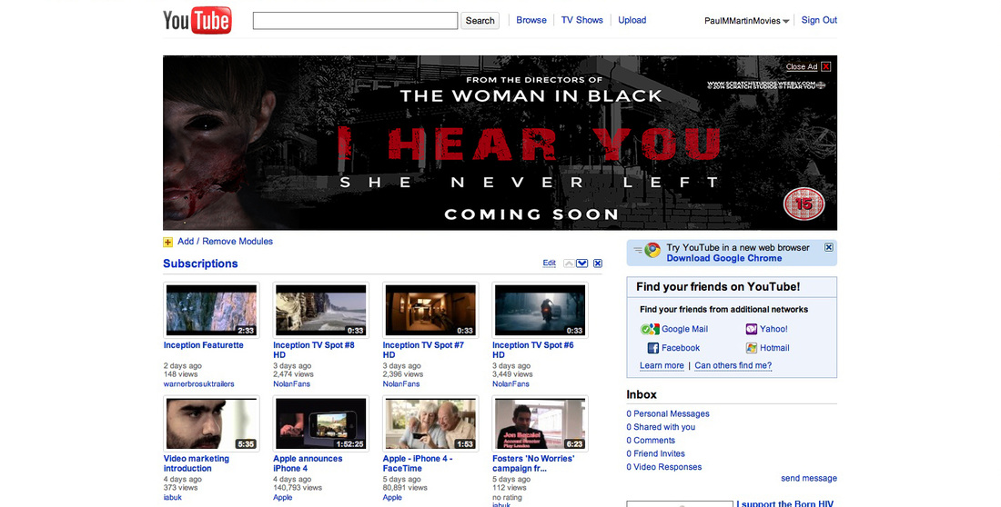
YouTube
|
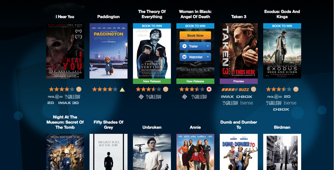
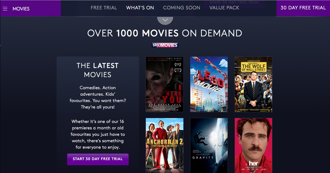
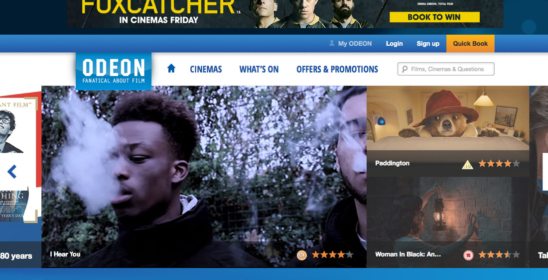
Above, you can see all the different media platforms used to exhibit and advertise our film one of which is odeon, one of the leading chain of cinemas in Europe. Other sources include sky movies available to browse for those that have sky movies and Netflix available to stream online. The front cover is a variation of the poster however is the released version of the film.
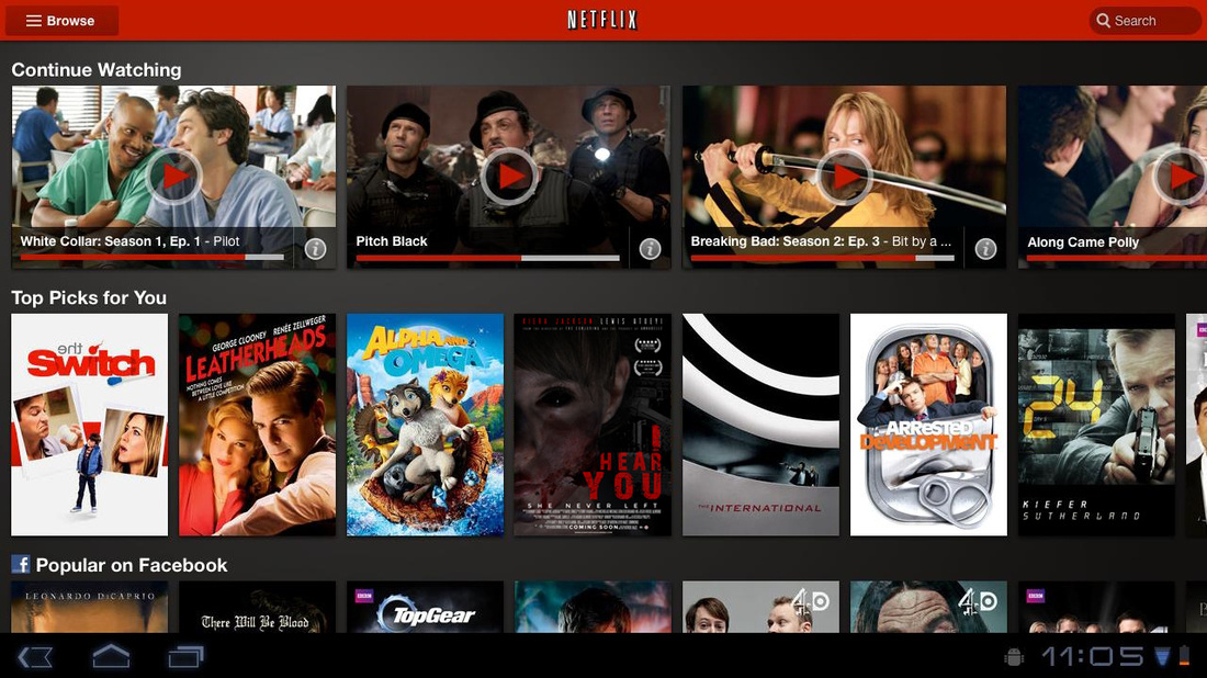
Netflix
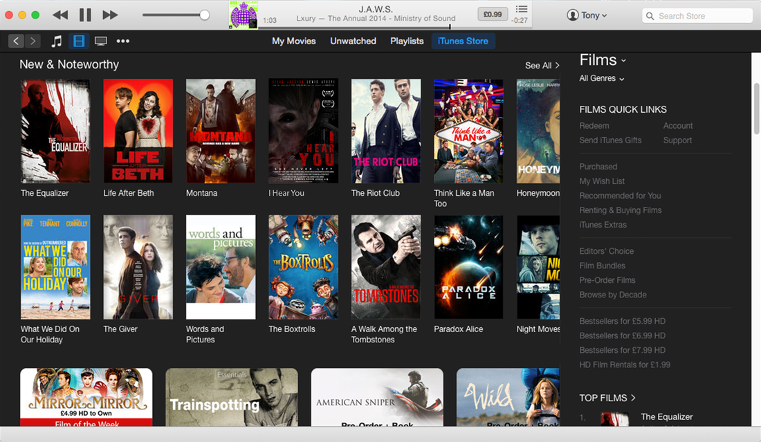
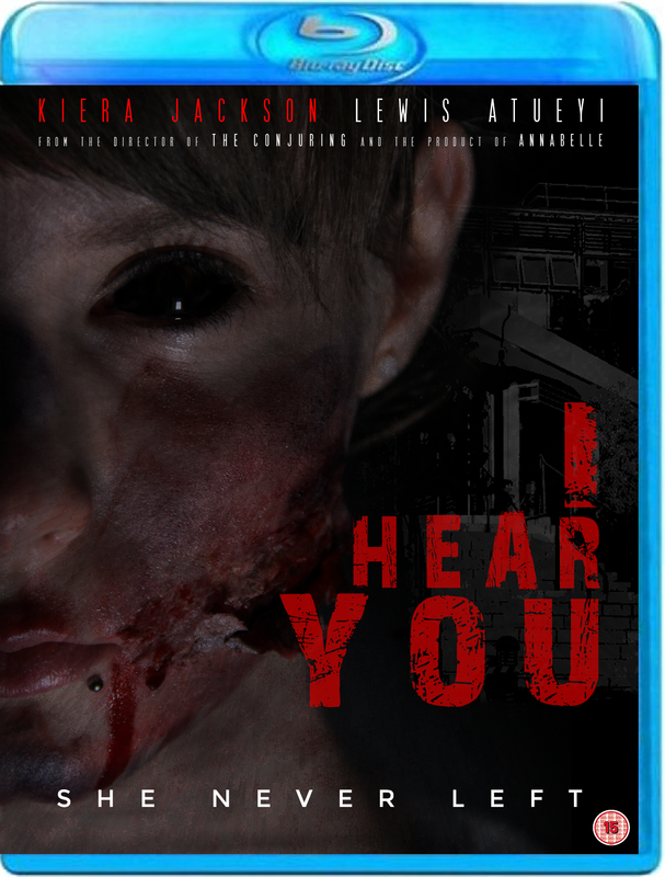
Itunes + Blu-ray
|
|
Using Itunes as one of our mediums to distribute our film digitally. the audience can simply buy the film online and immediately download the digital copy in addition to buy the blu-ray disc.
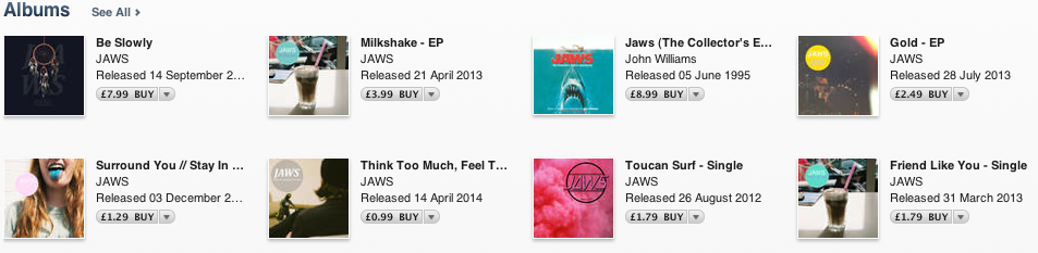
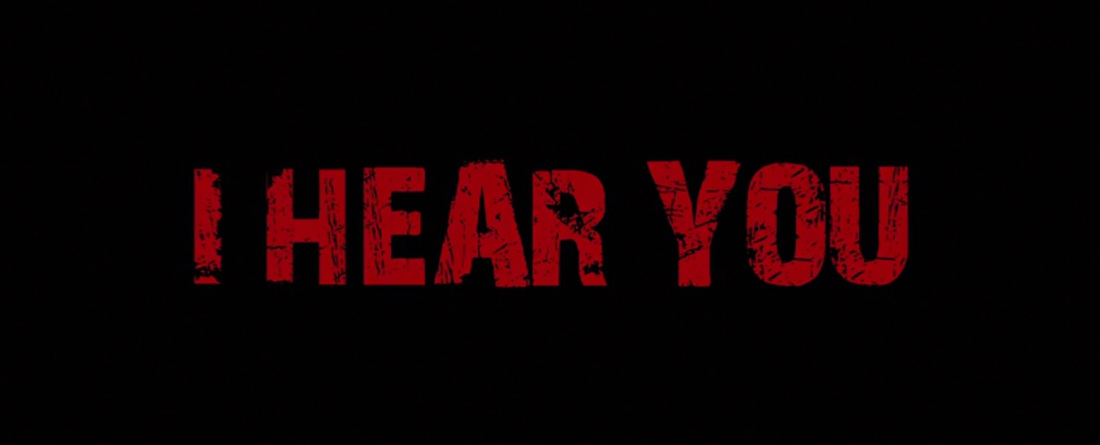
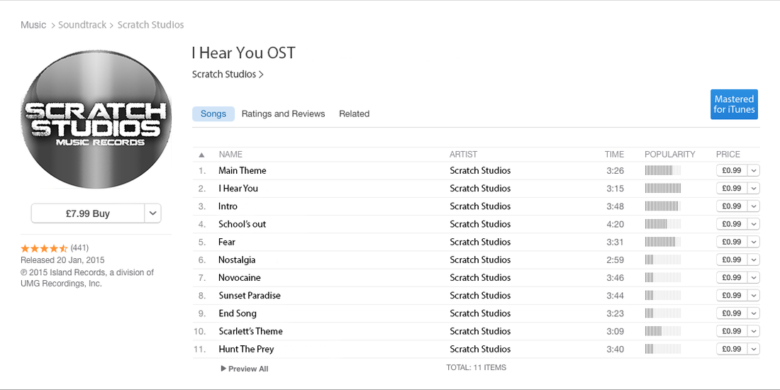
tHe Original soundtrack for "I hear you" is also available for download as an album or if the audience wishes to as a single.
tHe Original soundtrack for "I hear you" is also available for download as an album or if the audience wishes to as a single.
|
|
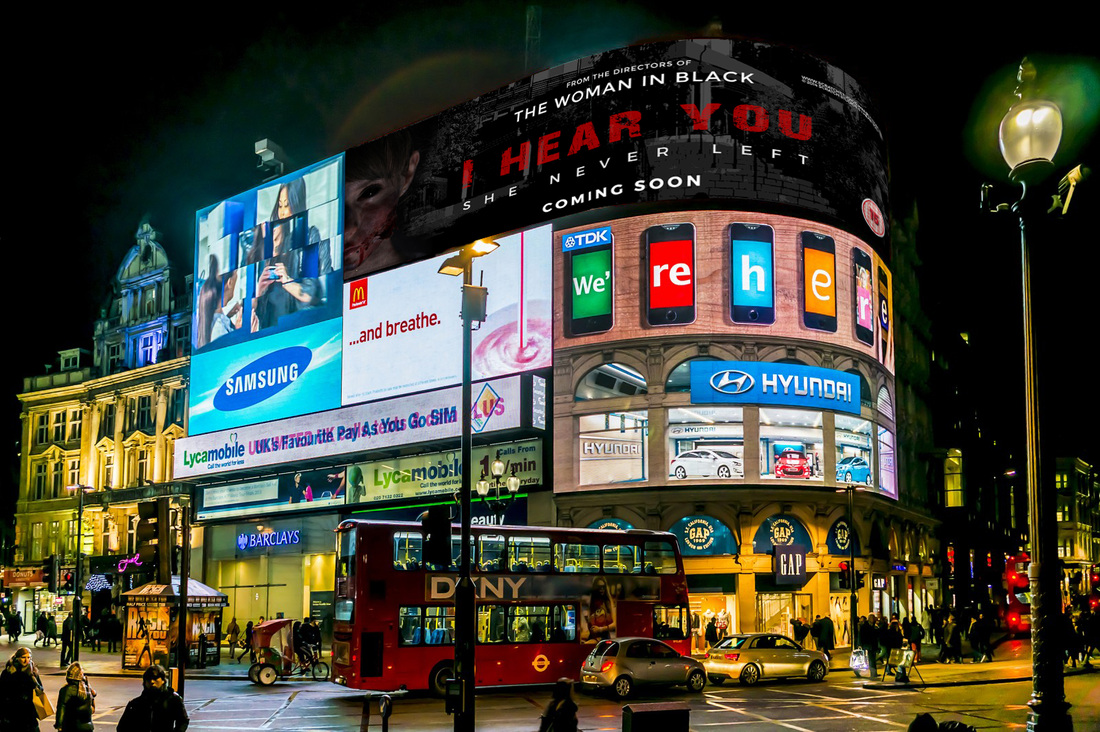
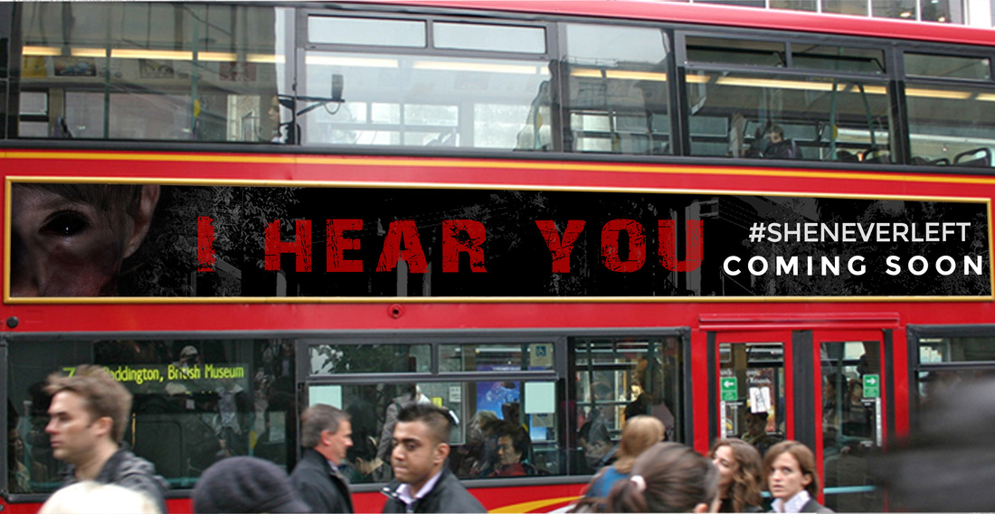
Above is how we've advertised other film around London. Piccadilly Circus is the place for tourist attractions in addition to gain a lot of publicity being advertised in such a big and open manner. we used the bus board to advertise because the London transport system is by far the best in the world hence will be used by many people and a great way to advertise.
|
|
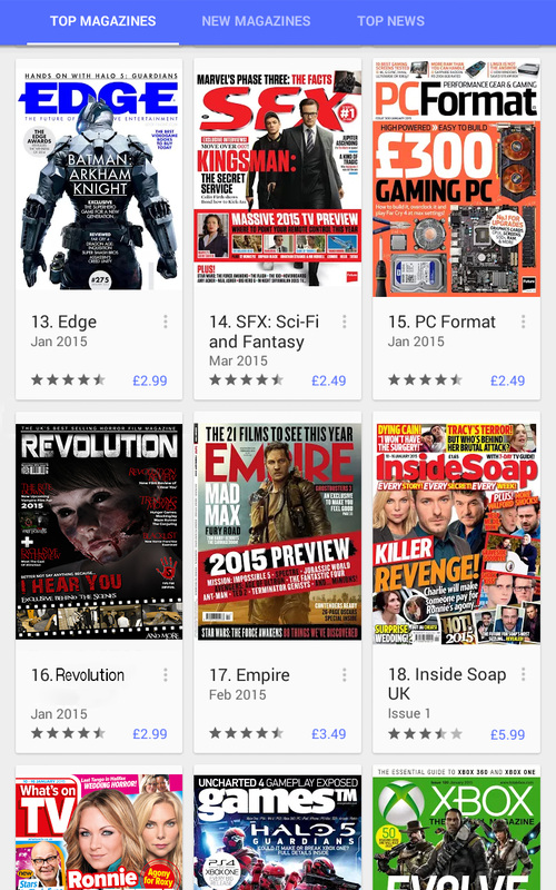
Moreover, we've published our magazine onto Google play store which is available for purchase and download on all smartphones and tablets.
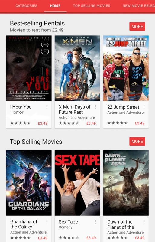
You can see also see that our movie is available to be rented out on Google Play Store. This allows our products are available across different devices and is necessary because of the proliferation of hardware and being connected online.
You can see also see that our movie is available to be rented out on Google Play Store. This allows our products are available across different devices and is necessary because of the proliferation of hardware and being connected online.
Conclusion
Throughout the Evaluation: Question 2 page, we have explored Cross media convergence and synergy of existing real media texts and how they have collaborated to create more promotional merchandise. This covers different types of merchandise or entertainment used across different media platforms such as toys, theme parks, clothes, OST (original Sound track), itunes download and online streaming.
We went through the brand identity and how an entity can be identified as a "brand". one of the ways is the production company or the most known institution that supported the film especially conglomerates such as warner bros. Another way of identifying a brand is something that is symbolic; mocking jay pin of the Hunger Games franchise, Daniel Radcliffe of the Harry potter Franchise.
Thirdly is continuity between the main product and ancillary texts. Using real media texts we've analysed the continuity between the three products and compared what we've done; dominant conventions that we've went with, subverted conventions that have become more liberal over the last decade. expressed continuity sustained throughout our final product and ancillary texts.

