
posters
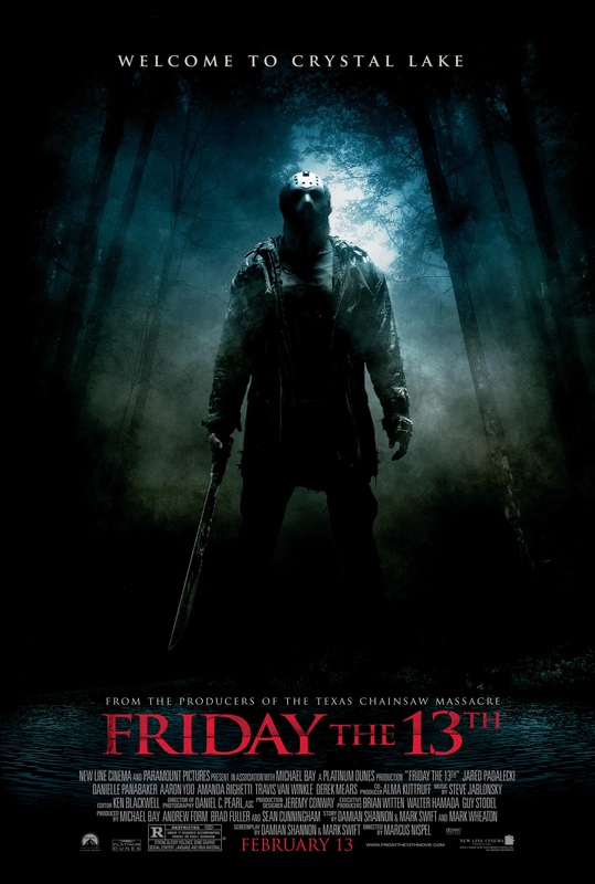
Film Title: Friday the 13th
Release Date: Friday the 13th 2009
Director: Marcus Nispel
Film Info: The film is a remake of the Friday the 13th series which began in 1980 and is the twelfth instalment in the franchise. The film was originally conceived as an origin story but the project evolved into a re-imagining of the first four Friday the 13th films.
Synopsis: Wade, Ritchie, Amanda, Mike and Whitney travel to Crystal Lake to camp but Wade and Ritchie have found a plantation of weed and intend to raise money selling it. However, the group is brutally attacked by Jason Voorhees. Six weeks later, Clay is seeking out his sister Whitney in Crystal Lake, distributing a missing poster with her around the local area. In a gas station, he stumbles into the arrogant Trent that has invited his friends Jenna, Lawrence, Chewie, Nolan, Chelsea and Bree to spend the weekend in the cottage of his wealthy family. Jenna teams up with Clay in his quest and they discover that Jason is killing her friends.
Production/Financing Company: Platinum Dunes – Crystal Lake Entertainment
Sub-genre: Slasher
Principle Cast: jared Padalecki – Clay Miller
Amanda Righetti – Whitney Miller
Danielle Panabaker – Jenna
Travis Van Winkle – Trent
Derek Mears – Jason Vorhees
Mise-en-scene
Lighting: The poster has low key lighting which helps to create tension and a ‘dark’ atmosphere and also helps to add mystery and uncertainty. The low key lighting signifies that the location, Crystal Lake is an isolated area which is a common convention of a horror movie/poster. The high key lighting towards the top of the poster is used to show the mask of the antagonist connoting that he has power over all and that he plays a significant part in the horrific event to come.
NVC: Jason’s NVC is hidden as he is wearing a hockey mask. The hockey masks fails to show his facial expression so leaves the viewers ‘on edge’ as they are unaware of his true emotions. He is also standing firmly on the ground which connotes that he is aware of the power he has.
Setting: The setting shown on the poster is the forest at Crystal Lake which is depicted as a dark and isolated place to be. The forest is filled with tall trees which seem to be surrounded by thick fog connoting that there will be a lot of isolation in the movie and helplessness.
Costume: He is wearing a torn brown jacket with a plain black shirt and trousers that are torn aswell. He is also wearing dirty work boots which connotes that he has been in Crystal Lake in the woods for a very long time and life has been tough for him hence why his clothes are torn. It also shows that his own well-being has not been taken into consideration by him. Jason is seen to be wearing a mask so his identity remain unrevealed. This helps to build tension as viewers may not know what he is capable of.
Props: Jason is seen to be carrying a machete which is what he uses to kill people in the movie. This prop is seen to be very threatening as it is quite a vicious item being used so builds fear in the viewers. His power being portrayed on the poster suggests that Jason is not afraid to use it on anyone.
Camera
The poster is a wide shot of Jason in the woods. This is significant as we are able to see the antagonist in his ‘hunting environment’ where he kills the majority of his victims. The wide shot allows us to see how the environment he has inhabited has had a negative influence on him as it has affected his personality and attitude which is shown by his body language. The shot and the lighting make it seem like Jason is superior to everyone else when he is in the woods as his victims are unaware of what they are about to experience. Also, the poster seems to have Jason’s photo taken at a mid-low angle which connotes that he is above everyone else, giving him even more power.
Colour
the colours that are mainly being used are black and red. The black on the poster is used to signify the terror that the protagonists are experiencing and the dark fantasies that Jason is carrying out. The red that is being used for the text connotes that there will be a lot of blood being shed on that day. Also, the grey/camouflage colours on the poster make Jason blend in with the atmosphere which suggests that he can come out and attack at any time; when you least expect it as its hard for him to be seen.
Typography
The font used throughout this poster is ‘Serif’ which connotes a sense of tradition and history especially as this film is part of the Friday the 13th franchise that began 29 years beforehand. Text such as the release date and film title is in red which signifies death and aggression; suggesting that the characters and viewers should be terrified in advance.
Mood & Styling
The lighting of the poster sets a very dark atmosphere which is very iconic in horror posters. It almost creates a depressing mood for the viewers as it imposes a sense of helplessness; allowing them to empathise with the characters in the film.
Specific Conventions
Majority of horror films have the antagonist with their weapon as the main image of the poster which gives the viewers an idea of what may happen in the film and who or what they should fear. The title of the film ‘Friday the 13th’ is written in a large red serif font in capitals to emphasize that specific day where several horrific events occur. It leaves the viewers wondering what exactly lies behind that day. The tag line says ‘welcome to crystal lake’ in a bold, white serif font which makes it clear to the viewers where Jason will be carrying out his massacres. “From the producers of the Texas Chainsaw Massacre” – this is a common convention of a horror movie poster as it helps to entice the viewers especially if the featured film being mentioned (Texas Chainsaw Massacre) scared the viewers and was given good ratings. As it was very popular film, the poster can be used to attract more customers, making the film more successful. The cast of the film and production companies are also included at the bottom of the poster so that viewers know who are involved in the making of the film. It is usually of a small font so that it doesn’t interfere with the main image.
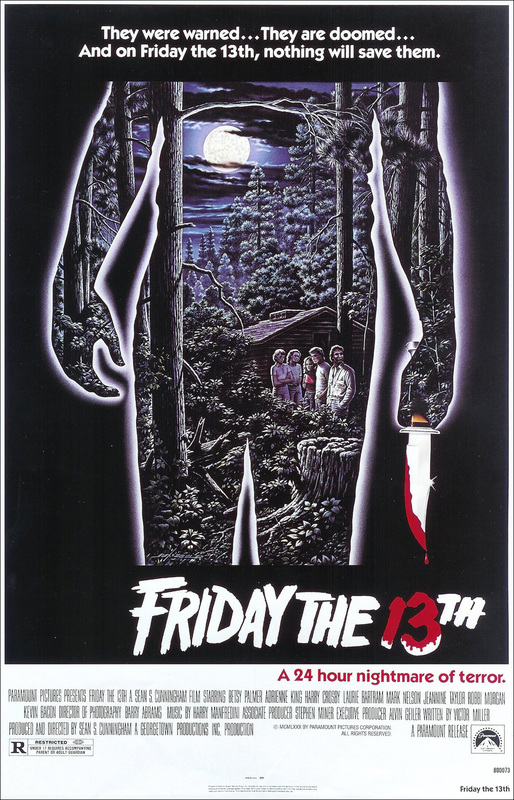
Film title: Friday the 13th
Release Date: February 2009
Director: Marcus Nispel
Film info: Friday the 13th is a 2009 American slasher film written by Damian Shannon and Mark Swift, and directed by Marcus Nispel. The film is a reboot of the Friday the 13th film series, which began in 1980, and is the twelfth installment in the franchise.
Synopsis: A group of young adults set up tent near the abandoned summer camp where a series of gruesome murders are said to have taken place back in 1980. The perpetrator was a grieving mother, driven insane by the drowning of her child, Jason, whom she believed was neglected by the camp counsellors. As legend has it, the last survivor of the attacks beheaded the woman. But then Jason came back, and now he is a vengeful and inexorable killer, wielding crossbows, swords, axes and other sharp instruments. The legend proves horribly true, as these campers quickly discover. Six months later, the brother of one of those campers distributes posters of his missing sister. The police believe she took off with her boyfriend; but he knows better. The brother crosses paths with an uptight young rich guy who is having his girlfriend and friends over at his parents' cabin. The brother ends up at the cabin himself just before his sister's attacker sets upon them all.
Production/Financing Company: Platinum Dunes,Crystal Lake Entertainment
Principle cast: Jared Padalecki
Danielle Panabaker
Aaron Yoo
Amanda Righetti
Travis Van Winkle
Derek Mears
Sub-genre: Slasher
Mise-en–scene:
Lighting: Overall the poster is dim only lighting is used around the body of the antagonist
NVC: Within the body of the antagonist there are the victims of his kills and in the picture they look confused and clueless and lost. They do not know what they are in for and do not know that the antagonist can be lurking in the shadows maybe hence the black background is around him. Also the antagonist has his back to us and looks he is facing the victims showing his goal is to kill them especially the way he is holding the prop of a knife with blood.
Setting: the area is isolated in the surroundings of the victim and there is an abandoned house. This denotes they are vulnerable by being isolated they are not in their normal scenery which is probably urban not rural like in the picture. In addition the background for the antagonist is black which connotes he works behind closed doors-where he can’t be seen. The settings of the victims is in the night time which connotes that dark/evil things happen in the night due to the darkness linking to the black background.
Costume: The costume of the victims looks formal. One male is wearing white shirt the white could connote purity/innocence that’s why evil is trying to kill which is the antagonist enforcing the theme good vs evil. However there are sometimes cases where the victims in the horror movies are doing sinful things normally teenagers.
Props: A knife is the prop which is used to kill the victims the knife connotes fear because it has the power to make someone weak/lose blood even die. This
Camera: Framing and shots: it’s a long shot for the antagonist model this helps show the stature of the killer and also how they are holding the knife. By using the long shot then cropping a wide shot into his body is creative and connotes that he has got them where he wants them which is the isolated area in the woods. Basically his territory.
Colour: It is mainly dark blue, black, red and white. Dark blue and black are the dark colours which are mainly used with the image however with the typography it is a sequence of white and a bit of red. The red dripping on ‘Friday the 13th’ represents blood it links to the image which denotes that the movie is bloody enforcing it is a slasher. The white connotes good, purity and with the red which can connote evil, danger, alert shows that evil can still take do damage to the good. The black connotes how dark hearted the antagonist is or evil he is that’s why he has a background as black. Compared to the victims their settings is the woods which is a bit dark because it is night time. The fact that is blue which can connote coldness and coolness links to how they are not in a good environment that they can within the connotation catch a cold but in reality they can get stabbed by the antagonist. So the cold can make them weak and the antagonist can prey on them.
Typography: The title of the movie is done in a messy way where the writing looks like torn pieces of clothing and there is a drip of red from the daggers blood. This connotes that people die and the movie is a slasher.
Mood and Styling: The effect of the man holding the knife with blood dripping makes me feel like it’s a slasher. The effect of the antagonist having the scenery and victims in him can connote he has control of them. The black background around him enforces he makes his moves when no1s looking maybe and I get a feel he likes to hide because the black can connote hiding and mystery. The cartoon effect makes it is unique not many posters use that effect. That effect enhances that the movie is ancient and creepy in a comical way. The way the antagonist is bigger than the victims connotes his superiority making me feel that he has them in his hands again enforcing control over them.
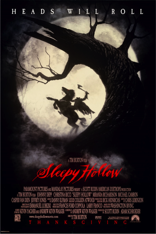
Film title: Sleepy hollow
Released: 17th November (Premiere)/ 19th November 1999 (US) / 7th January 2000 (UK)
Director: Tim Burton
production Company: Mandalay Picture and American Zeotrope.
Distribution Company: Paramount Pictures.
Principle Cast: Johnny Depp, Christina Ricci, Miranda Richardson, Michael Gambon.
Film info: Film adaptation of loosely inspired by 1820 short story “The Legend of Sleepy Hollow” by Washington Irving.
Synopsis: Ichabod Crane (Depp) is sent to Sleepy Hollow to investigate the decapitations of 3 people with the culprit being the legendary apparition, the Headless Horseman. As he investigates the crimes of the infamous 'headless horseman’, he discovers something more sinister as the random attacks aren't so random after all.
Sub-Genre: Slasher
Misè-en-scene
Lighting: The lighting is really dark hence contributes the to mysterious mood/styling. The only light source of light in the poster is the moon in the background that seems to brighten everything else in the poster however leaving a vague silhouette.
Setting: From what I can see, the setting is the dark forest during the night as you can tell by the moon. The moon also illuminates the setting more so you can see the texture of the tree. Moreover, it creates a silhouette of the headless horseman almost like shining a spotlight on him.
Costume: Looks like he’s wearing amour or at least clothes worn for battle indicating peace isn’t his forte or he’s in the war period. The cape looks ragged, as if it’s been worn for a while which adds on to the effect of the antagonist being the undead.
Costume: Looks like he’s wearing amour or at least clothes worn for battle indicating peace isn't his forte or he’s in the war period. The cape looks ragged, as if it’s been worn for a while which adds on to the effect of the antagonist being the undead.
NVC: The way he riding his horse portrays him as an assertive person who likes to be dominant and in control. the way he's raising his arm is also similar to that of ruling or as if he has achieved something significant.
Camera
Long shot of the antagonist including the setting in the shot and is out of focus to an extent. This helps to create an image of what the killer is going to be like however doesn't reveal too much.
Colour
The distinct colours in the poster are red, black and white. The red stand out considerably against the black background, almost intensifying effect the colour red has because it represents danger and blood.
Typography
The choice of fonts used is an old-fashioned style type of writing; most likely the contemporary handwriting of the narrative. The style of writing gives of a creepy aura because of the colour making it look like it’s written in blood.
Mood & styling
The mood portrayed in this poster gives off a mysterious mood because of the low visibility and slightly out of focus.
Tagline
“HEADS WILL ROLL” An ironic/funny tagline considering the subject in the poster doesn't have a head.
Credits
This poster is most likely a teaser poster as if doesn't feature a released date. In addition, there isn't much information about the film other than the main image. The poster itself is to create a mysterious image for the film, this way; it intrigues the audience but not enough to satisfy their curiosity.
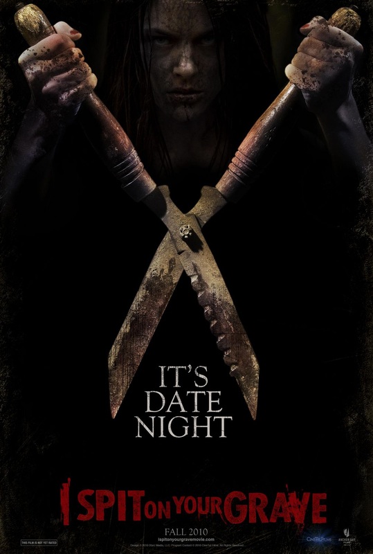
Film Title: I Spit On Your Grave
Release Date: 1st May, 2010 in the USA
28th August, 2010 in the UK
Director: Steven R. Monroe
Synopsis
The writer Jennifer Hills rents an isolated lakeside cabin in the woods of the peaceful mockingbird trail for two months to write a novel. Two days later, she is brutally gang raped by three local bigots, the sheriff and a handyman. Jennifer returns later to revenge against the rapists.
Production: Cinetel Films (presents) (as Cinetel Films)
Anchor Bay Films (in association with),
Family of the Year Productions
Principle Cast; Sarah Butler as Jennifer Hills
Jeff Branson as Johnny Miller
Andrew Howard as Sheriff Storch
Daniel Franzese as Stanley
Rodney Eastman as Andy
Sub-genre: Thriller
Mise-en-Scene
Lighting: The poster is very dark which connotes to low key lighting.
NVC: The female's NVC is very intimidating, serious and looks like she has no remorse on her victims. The stare she is given off connotes to revenge, power and control.
Setting: The setting cannot be identified but if I was to guess it looks as if the female would be in an isolated area like the woods as she is represented with dirt in the poster.
Costume: The female has long black hair and her hands are covered in dirt. Her face is covered with cracks which connotes to dry concrete ground which tend to have cracks on them; this represents something deadly.
Props: The female is holding a big, dirty and rusty shear in hear hands, which suggests that this is her ionic main weapon, she would use to attack her victims with.
Camera: Framing & Shots
The camera shot of the girl is a close up, that only expresses her facial expression and the position of her hands; presenting the tool (shears) she is holding. The angle the camera shot is taken is from a point of view angle, which allows the female to stare directly at the camera lens.
Typography
The font colour of the title is in red, which connoting to blood and deaths. As well as the ‘I SPIT’ and ‘GRAVE’ is in a larger font size, which could have been done to emphasize that the girl has no respect for the people she wants to kill and wants to fulfill her ‘phrase’ of spitting on her victims graves.
Mood & Styling
The mood of the poster from the girl’s NVC portrays anger and revenge. The way she is gripping the shears tightly connotes no mercy and illustrates the film to be a thriller as the weapon looks like it can do a lot of damage to the human body.
Specific Conventions
The tagline on the film poster addresses ‘it’s a date night’. This suggests that it’s just the girl and her victims in one location together, as they die one by one, as no one else will be present at the time. Highlighting that there is nowhere to run nor escape too. Towards the bottom corner of both the left and right hand side of the page are logos. I suspect that the logos are of the production company and any financial or distributors companies of the film. As there’s not much information on the poster, I suggest it’s a teaser trailer as not much has been given off about the film.

