
Magazine front covers
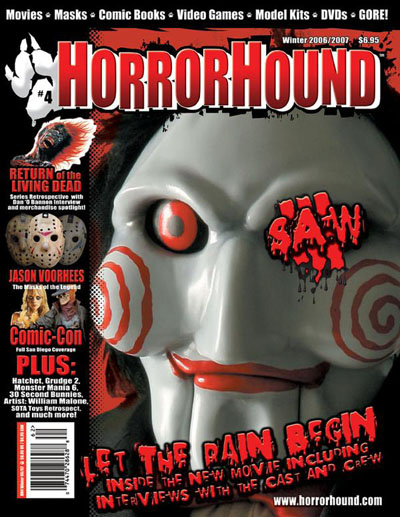
Film title: Saw III
Release date: October 2006
Director: Darren Lynn Bousman
Film Info: It’s the third part of the movie. They change the victims and scenery from each Saws also the way they harm themselves or get harmed/tortured.
Synopsis:
After eluding the cops, psychopathic killer Jigsaw turns an abandoned warehouse on the edge of town into a gruesome torture chamber in this third installment of the horror series. Jigsaw's new protégée Amanda kidnaps a doctor who's forced to keep the evil master alive. Barely clinging to life, Jigsaw begins to carry out his gruesome plans for the lady doc and another helpless victim.
Production/financing company: Twisted Pictures
Principle Cast: Tobin Bell, Shawnee Smith, Angus Macfadyen
Sub-Genre: Thriller
Magazine: Horror Hound
Mise-en-scene
Lighting: The lighting is quite dim
NVC: The character is doing a cunning smile in the main image. This connotes they are plotting something and shows they are evil. Also could show they are sadistic, you can image this character smiling at someone who is receiving pain. The smile also denotes they are happy. The eyes are staring deeply at something which can connote something has got their attention and it is interesting. Due to the eyes bulging out and being open widely can connote they are being entertained e.g. through watching someone suffer.
Setting: The settings are dark-black which connote mystery and fear. Fear because some people are scared of the dark and anything can pop out of the dark leaving the audience off guard or anxious. Also there is a red flames look around the image as a layout maybe to connote danger.
Costume: The costume you cannot really see but by looking at the character closely they are wearing something black which can connote to them blend in with the dark and trying to be hidden.
Props: A mask is used for the characters face which denotes them hiding their identity. The prop has red circles which connote hypnotise him which can bring fear to people because that means he can control them. So basically it gives off a connotation of control. The red Lipstick looks gruesome and can connote blood.
Camera: Framing and Shots
The camera shot is a close up which zooms into the facial expression of the main image which is very interesting. By doing close up can suggest that the photographer wanted more impact and intensity to be brought to the audience. Focusing on the iconic image of a character from saw who is an antagonist (villain). Due to the iconic image people are more attracted to the magazine because it is a familiar face.
Colour
There is a colour scheme of black, red and white mainly throughout the magazine. The red connotes blood mainly which is an iconic prop in horror movies. Loss of Blood leads to death and pain so this can scare people. Also Red captures attention from a far because of it’s a vibrant colour. The white can connote a ghostly feel where the audience don’t know who the person is behind the mask and it mainly dignifies mystery. Black represents darkness which suggest a spooky feel and is iconic in horror movies because anything can take advantage by the fact of us losing our senses of sight in a dark room or a dark place in general.
Typography: Anchorage, Font type
The main cover line text that looks quite inky/bloody this links to horror movies using blood and it being splattered everywhere especially in the sub-genre-splasher. The text looks unorganised and is even done diagonally to make it standout. There is a sequence it of the text going from a large font to a small font which can show the life span of people in horror movies as the blood runs out they are closer to death. In addition there is a shadow effect behind the red writing which can connote following, that an evil person or something can be following a victim e.g. in horror movies before they make their kill this is a stock situation.
Mood and Styling
The Photo makes me feel uncomfortable because of where the eyes of the main image is staring and how unordinary the colour it is normally eye balls are white but on this mask it is red which is interesting and scary. The overall magazine looks nice because of the sequence of red, black and white which is a range and work well together; also having connotations with them. A lot of black is used in the background which makes me feel that there is going to be a lot of darkness in that movie Saw 3. I like the way the typography of saw 3 is over one of the eyes because it makes sense. The word saw meaning seen something and we use our eyes to see it.
Specific conventions
Masthead: The masthead is in a solid and sharp font. Also it looks 3D Due to the white edges. The 3D effect creates the sense of coming up to someone which links to the main image where out of the dark something gruesome can come out of nowhere to scare the audience. The text is not all in one line but it is unsteady this can connote in horror movies things go against the normal such as the way people kill or what people do to survive. The unsteadiness can also link to the audience being unsteady when watching a horror movie because they do not know what is about to happen at any time. The font is large because it is the name of the magazine so the audience can remember it if they liked reading the magazine and so that it can be seen from far away. The alliteration of the name of the masthead has an effect Horror Hound sounds spooky when being said the repetition of the ‘H’ reminds the audience it is about horror movies.
Cover lines: are in the same font and colour as the main cover line to create continuity throughout the magazine. The red colour still connotes blood, danger, alertness and many more.
Selling line: This is at the top of the page and is done in basic ‘impact’ font style and is very small. Also it is white which can connote purity to contrast with the red suggesting evil connotations. White shows the good from Good vs Evil theme which are in horror movies.
Mood and Styling: The Photo makes me feel uncomfortable because of where the eyes of the main image is staring and how unordinary the colour it is normally eye balls are white but on this mask it is red which is interesting and scary. The overall magazine looks nice because of the sequence of red, black and white which is a range and work well together. Also having connotations with them. A lot of black is used in the background which makes me feel that there is going to be a lot of darkness in that movie Saw 3. I like the way the typography of saw 3 is over one of the eyes because it makes sense. The word saw meaning seen something and we use our eyes to see it.
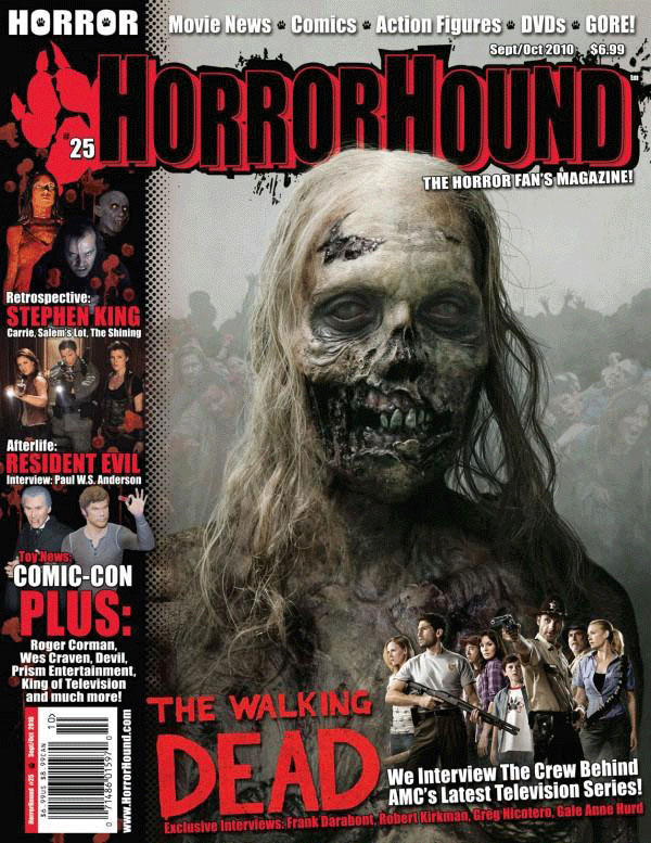
Film Title: The Walking Dead
Release date: 31st October 2010
Director: Frank Darabont
Film info: TV Series
Synopsis: the walking dead is an American post-apocalyptic horror drama television series that is based on the comic book series of the same name by Robert Kirkman, tony moore and charlie adlard. the series starts Andrew Lincoln as sheriff's deputy Rick GRimes who awakens from a coma to find a post-apocalyptic world dominated by flesh-eating zombies. he sets out to find his family and encounters many other survivors along the way.
production/financing company: AMC studios, circle of confusion, darkwood productions & Valhalla motion pictures
principle cast: Andrew lincoln - Rick grimes
norman reedus - daryl dixon
Lauren cohan - maggie greene
steven yeun - glenn rhee
Danai gurira - michonne
sub-genre: zombie
Mise-en-scene
Lighting: The lighting on this front cover is quite high key although it used dull colours such as grey to make the zombie stand out more to the viewers. There is also a smoky, blurry background making it hard for the viewers to see the other zombies behind the main image. This helps to build tension as it connotes that us as readers are unaware of the number of zombies there are – not just one.
NVC: The NVC of the zombie is more or less plain as if the main image is lifeless (no pun intended), showing no emotion at all. Part of its face is worn off so looks unappealing to the audience. The zombie is them feel a bit uncomfortable especially as prolonged eye contact can be perceived as threatening and eyes are frequently referred to as ‘windows of the soul’.
Setting: The setting is most likely a white screen in a studio. However, several other zombies have been edited into the background to make the main image look like more of a threat to the reader.
Costume: There seems to be no clothing at all on the zombie as CGI and make-up has been used to make the zombie’s face and body very graphic which adds to the success of the film as the antagonist look unbelievably realistic, terrorizing the viewers even more.
Props: N/A
Camera: The magazine cover has a mid-close-up shot of the zombie which enables the reader to see the zombie in a lot of detail which is terrifying.
Colour: The main colours being used are black and grey which give the magazine a sort of dark, isolated atmosphere. However, the text is in black or red which connotes blood will be shed when the zombies attack.
Typography
The main font that is being used for this magazine front cover is ‘Sans Serif’ capitals which make the magazine look more modern and less traditional which subvert the typical horror magazine fonts as it doesn't appear scary at all.
Mood & Styling
The colours being used tend to set a dull mood and bring a sense of mystery as the antagonist is not the usual kind – human; so is even more terrifying.
Specific Conventions
Masthead: The masthead is in black and red which symbolises blood/death. Around the text, there is some blood splatter which connotes that the victim death will be messy. The choice of colours also allows the masthead to stand out well against the dull, spooky background/atmosphere.
Coverlines: The coverlines on the front cover are the same colour as the masthead and the main coverline which helps to create a consistent, simple colour scheme. The main coverline ‘The Walking Dead’ at the bottom of the page is connected with the main image. This is obvious as zombies are often referred to as ‘the walking dead’. As there are not many coverlines, red and white is used for the text in order for them to stand out against the general depressing background on the page. Red is seen as an iconic colour in the horror genre so is used as often as possible.
Selling Line: The selling line for this magazine is ‘The Horror Fan’s Magazine’ and it is noticeable directly underneath the masthead especially as it doesn’t blend in with the black background. The selling line identifies its target audience in just a few words so makes it easier for the reader to remember it.
Main Image: The main image is a mid close-up shot of a female zombie from the TV series ‘The Walking Dead’. She has grey, decaying skin which adds to the theme of graphic terror and evil.
Left Third: This is a common convention of a magazine. The left third on this magazine cover includes iconic horror characters such as Carrie and Jack Torrance from The Shining which will help sell the magazine as that is the first thing customers would see when it’s on shelves in stores.
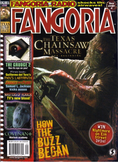
Film Title: The Texas Chainsaw Massacre; the beginning
Release Date: 13th October, 2006 in UK
Director: Jonathan Liebesman
Synopsis; On one last road trip before they're sent to serve in Vietnam, two brothers and their girlfriends get into an accident that calls their local sheriff to the scene. Thus begins a terrifying experience where the teens are taken to a secluded house of horrors, where a young, would-be killer is being nurtured.
Production: New Line Cinema (presents)
Platinum Dunes
Next Entertainment
Vortex/Henkel/Hooper
Texas Chainsaw Productions
Principle Cast: jordana Brewster as Chrissie
Taylor Handley as Dean
Diora Baird as Bailey
Matt Bomer as Eric
R. Lee Ermey as Uncle Charlie Hewitt / Sheriff Hoyt
Andrew Bryniarski as Thomas Hewitt / Leatherface
Sub-genre: Slasher/Splatter
mise-en-scene
Lighting: The lighting used for this horror film magazine is low key lighting. This is to connote to darkness, mysteriousness, torture and bad events occurring.
Setting: The setting cannot be identified but if I was to guess I would guess the setting of the main male character to be in a basement. As the equipment he is holding is normally used in the basement to saw wood. From the small image in a box on the left hand side of the film magazine, the male creature looks like he is outside as we can see some trees, which connotes to nature and outdoors. And from the angle the image is taken, it seems as if the male character may be sitting in a car, but this is a wild guess.
Costume: The male character is wearing a long sleeve, greenish t-shirt, which has been rolled up to his elbows. Along with a greenish apron and mask to cover his mouth and nose. The mask is used to hide the identity of the male character. Whilst his hair looks un-kept and long, which enhances his hidden identity as it falls on his face allowing us to see just his eyes. On the male characters arm there’s blood, a log scar and some black dirt, this connotes to death, danger, pain, torture and unhygienic.
Props: The male character is holding a chainsaw, which could be signify his main iconic weapon, he uses to kill his victims and is like his signature tool. The chainsaw connotes to limbs of a human body being tampered with by the killer. Which will lead to high levels of torture as the victims are likely to be alive and awake whilst a limb is being sawed off. The mask on the man’s face is also a prop.
Nvc: The subject's body language looks as if he's going to thrust the chainsaw into something. Judging by all the blood, it is most likely being thrusted into a person. MOreover, the way he's holding the chainsaw in a delicate way and paying careful attention portrays that this is like a surgery to him. Although, it contradicts this careful behaviour because he's using a chainsaw for this 'surgery' hence, one can connote that he's insane and psychotic.
Camera: Framing & Shots
The image of the man is a direct point of view, mid-shot frame. As we can see from the man’s waist and above. This shot was taken to allow us to see the man’s costume and not so much of his face as there would be no facial expression to see as his face and identity is very much hidden. The image of the male character in the small box on the left, is an extreme close up, this was to express the facial expression of the character to be very deadly, not of human kind and more of a creature. As its eyes are pure white and the mouth is attached together with some skin. This is not a normal characteristic form of the human body.
Typography
The title if the magazine is in a huge font size, this is so its audience can quickly identify the horror magazine they are viewing. Whilst the title of the horror film advertised is in an old English skinny font, disguising with the image.
Specific Conventions
Masthead: The masthead "fangoria" is an established masthead using a specially designed typeface specifically for the magazine's masthead.
Main Image: the main image is medium long shot of a male holding a chainsaw all bloody indicating he maybe torturing someone. the male is the antagonist of the film "Texas Chainsaw massacre: The beginning".
Main Cover-line: the main cover-line "How the buzz began" which is a pun because the of the chainsaw sound that can be described as a buzz sort of noise. Additionally, this correlates to the main image.
barcode: The standard barcode is located on the bottom left within the left third used by retailers.
selling Line: the selling line for this magazine is "shock the airwaves" just above the masthead. the colour its in (yellow) contrasts with the black background however, the font is too small too the point where it doesn't look noticeable.
dateline/price tag: the dateline and price of the magazine is just above the barcode showing the publication date of the magazine as well as the retail price of the magazine.
left third: The left third have other cover-lines made short and concise to advertise parts of that isn't shown full frontage.
Specific Conventions
Masthead: The masthead "fangoria" is an established masthead using a specially designed typeface specifically for the magazine's masthead.
Main Image: the main image is medium long shot of a male holding a chainsaw all bloody indicating he maybe torturing someone. the male is the antagonist of the film "Texas Chainsaw massacre: The beginning".
Main Cover-line: the main cover-line "How the buzz began" which is a pun because the of the chainsaw sound that can be described as a buzz sort of noise. Additionally, this correlates to the main image.
barcode: The standard barcode is located on the bottom left within the left third used by retailers.
selling Line: the selling line for this magazine is "shock the airwaves" just above the masthead. the colour its in (yellow) contrasts with the black background however, the font is too small too the point where it doesn't look noticeable.
dateline/price tag: the dateline and price of the magazine is just above the barcode showing the publication date of the magazine as well as the retail price of the magazine.
left third: The left third have other cover-lines made short and concise to advertise parts of that isn’t shown full frontage.
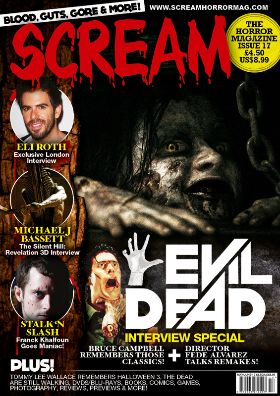
Film Title: Evil dead
Released: 5th April 2013 (USA)
Director: Fede Alvarez
Principle Cast: Jane Levy, Shilo Fernandez, Lou Taylor Pucci, Jessica Lucas, and Elizabeth Blackmore.
Film Info: Remake/reboot of “The Evil Dead (1981)”
Synopsis: Five friends head to a remote cabin, where the discovery of a Book of the Dead leads them to unwittingly summon up demons living in the nearby woods. The evil presence possesses them until only one is left to fight for survival.
Production Company: Ghost House Pictures and Film District
Distributer: TriStar Pictures
Sub-Genre: Psychological/Supernatural
Mise-En-Scene
Lighting: The lighting is quite low key - so dark that you can barely even differentiate the parts of her head and the background. The low key also helps to create a sense of fear because you can’t see her fully which frightens the audience as to what she’s doing.
NVC: The main image’s NVC is rather daunting because of the on her face - a sinister smile that’s frightening and euphoric to anything nefarious.
Costume: Her make-up is done to the point where she looks like a zombie which conveys that she is among the dead however, her face suggests that she’s something more than dead due to the disturbing smile she has. Additionally, it’s almost like it’s trying to meet the requisites of the film name “Evil Dead”.
Setting: Not much can be said about the setting because very little is revealed in the main image. Although, if I was to guess, I can assume she’s in a dungeon sort of setting because of the dark background and rusted chains which may suggest that she’s chained to a wall underground. Moreover, this would explain why the subject looks so ragged and deteriorated.
Props: One prop you can barely make out is the rusted old chain next to her, which connotes that she’s chained up and possibly for a long why because she looks like a zombie.
Typography: Most of the cover-line font except the main cover-line looks like they’re in Calibri that is somewhat boring and dull. In comparison to the main cover-line, they’ve got similar looking fonts used with the yellow and white colour scheme. The film name has it’s own unique font signifying its importance and hinting its centre of attention.
Conventions
Masthead: The masthead for this front cover is ‘SCREAM’ as you can see; it’s followed the typical magazine conventions and is placed at the top. The masthead used is an established masthead: the known masthead for ‘Scream Horror Magazines’ used frequently for their magazines and usually doesn't vary however only to colour scheme. What’s recognizable about the masthead is the typeface design specifically for this magazine as it’s unique.
Main Image: The main image is a close up of the antagonist of ‘The Evil Dead' placed in the center of the front cover and occupies the most space in order to capture the audiences’ attention. The subject is making direct eye contact with the viewers for more of a visual effect and realism.
Main Cover-Line: The main cover-line is placed in the middle just underneath the main image because it links in with it. It also mentions a special interview with the director: Fede Alvarez.
Left Third: The left third have other cover-lines made short and concise to advertise parts of that isn't shown full frontage.
Barcode: The standard barcode is located on the bottom right of the page used retailers.
Selling Line: The selling line can be found at the top of the magazine “Blood, Guts, Gore & more!” This goes along well with the masthead as well as describing what this magazine is like.

